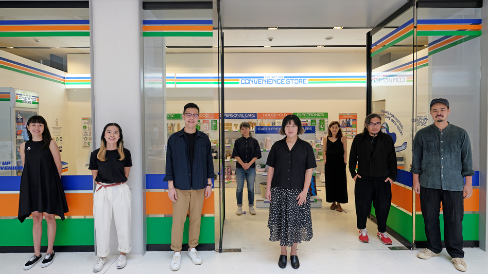
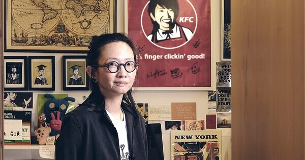
Kelley Cheng
Creative Director
The Press Room
DISCIPLINE
Exhibition Design
Visual Communication
Advertising Design
Creative Director
The Press Room
DISCIPLINE
Exhibition Design
Visual Communication
Advertising Design
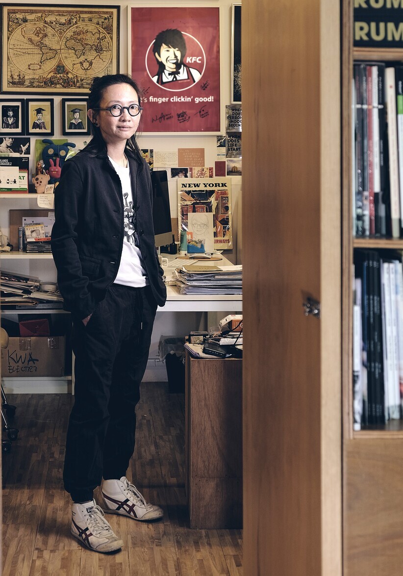
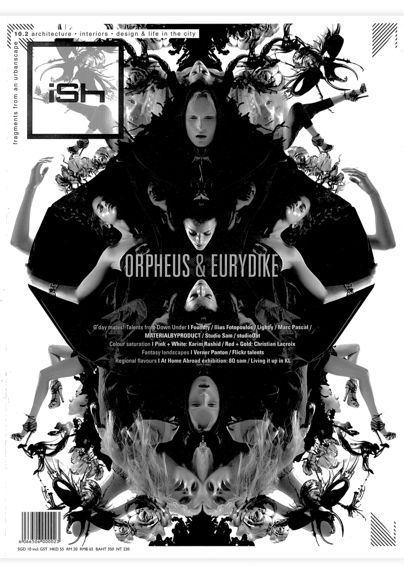
Kelley started the magazine iSh in 1999 to showcase Singapore architecture and design. It ran for a decade with her as the Editor-in-Chief and Creative Director.

Through her magazine and
publication work, Kelley has helped to document Singapore architecture and
design culture. As the Editor and Creative Director of Singapore Architect, she interviewed many pioneering local architects. In 2015, she designed Our Modern Past, a comprehensive visual survey of Singapore’s modern architecture heritage by Ho Weng Hin, Dinesh Naidu, Tan Kar Lin and Jeremy San.
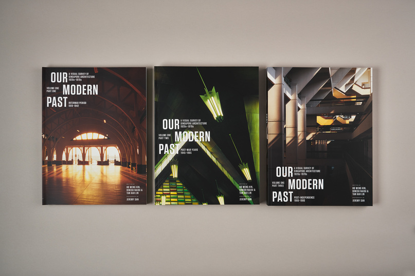
Through her magazine and
publication work, Kelley has helped to document Singapore architecture and
design culture. As the Editor and Creative Director of Singapore Architect, she interviewed many pioneering local architects. In 2015, she designed Our Modern
Past, a comprehensive visual survey of Singapore’s modern architecture heritage
by Ho Weng Hin, Dinesh Naidu, Tan Kar Lin and Jeremy San.
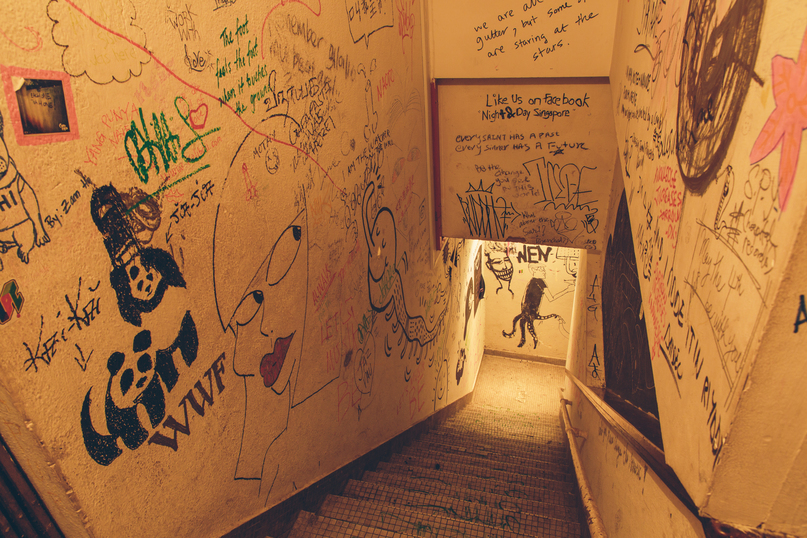
Night & Day was a space set up by Kelley and some friends in 2007 for creatives in Singapore to showcase their works and to network. The edgy bar located in a shophouse along Selegie Road was known for its eclectic and free-spirited setting.
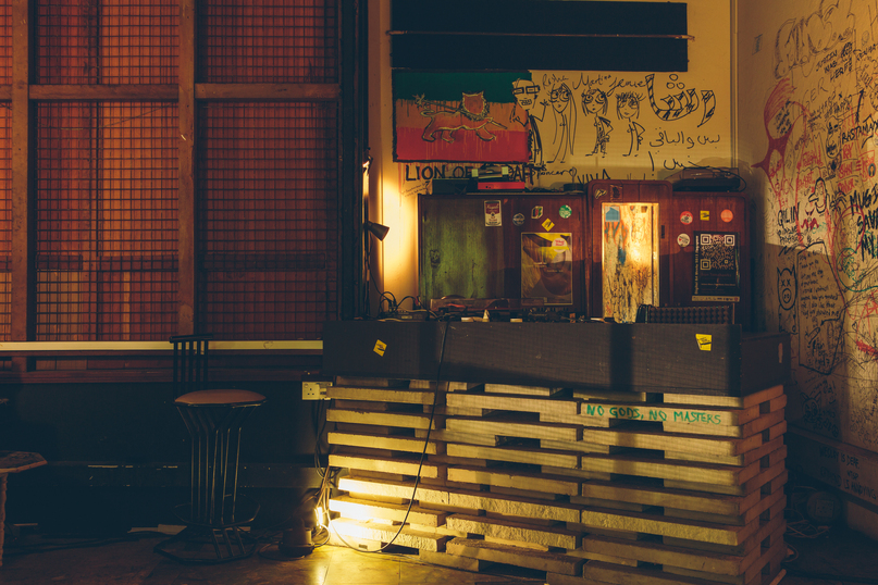
Night & Day was a space set up by Kelley and some friends in 2007 for creatives in Singapore to showcase their works and to network. The edgy bar located in a shophouse along Selegie Road was known for its eclectic and free-spirited setting.
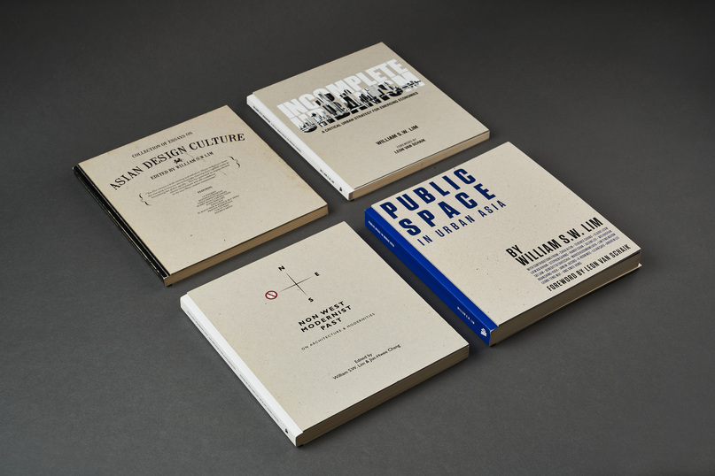
Although Kelley gave up practising architecture, she has designed for many in the industry such as Singapore’s pioneer architect, Ar. William Lim. He co-founded the Asian Urban Lab and Kelley designed several books published by this non-profit to facilitate multidisciplinary research on life in Asian cities.
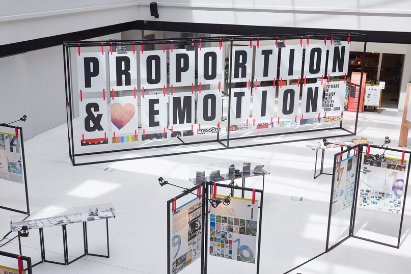
To celebrate Kelley’s 20 years in design in 2019, DesignSingapore Council co-presented a retrospective exhibition of her work at the National Design Centre. She curated and designed the show – summing up her design approach as a balance between proportion (form) and emotion (content).
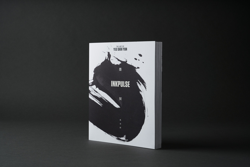
Having had no formal training in graphic design, Kelley found her own design approach. As seen in this monograph for artist Yeo Shih Yun, the designer treats pages as canvasses where she freely places elements rather than rely solely on formulaic grids.
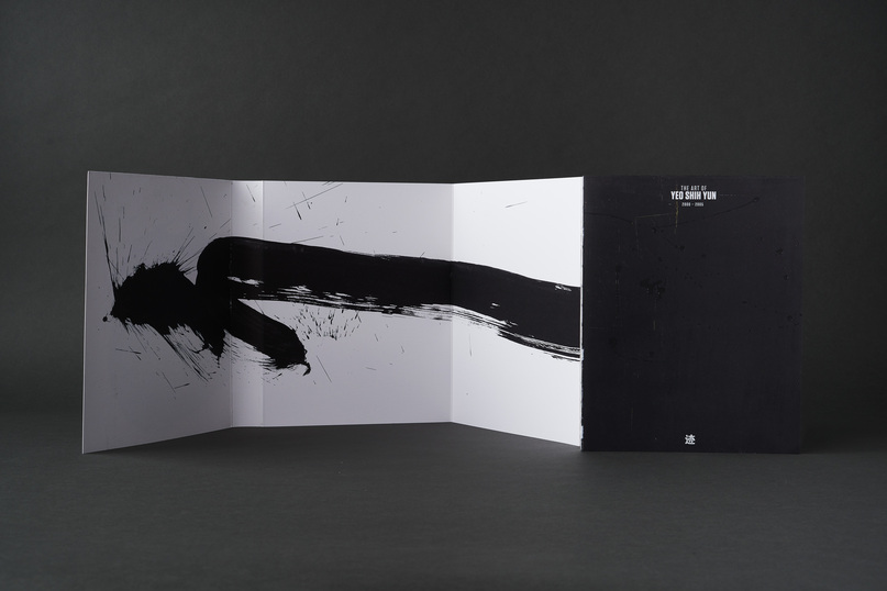
Having had no formal training in graphic design, Kelley found her own design approach. As seen in this monograph for artist Yeo Shih Yun, the designer treats pages as canvasses where she freely places elements rather than rely solely on formulaic grids.
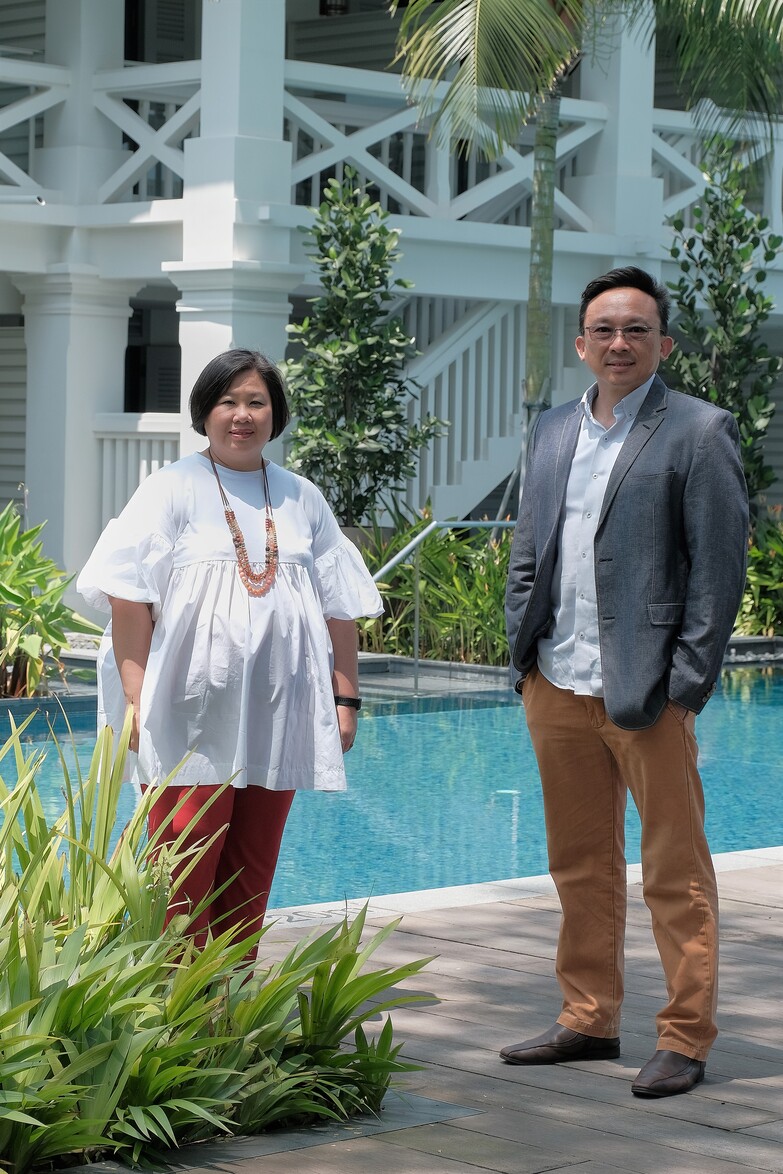
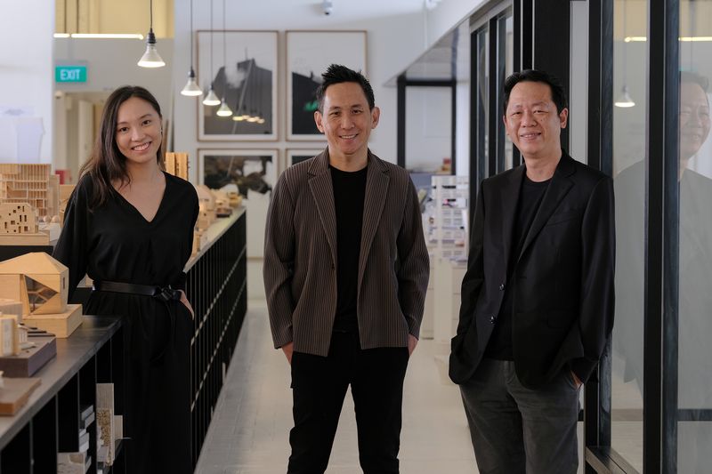
Directors
ARC Studio Architecture + Urbanism Pte Ltd
DISCIPLINE
Architecture
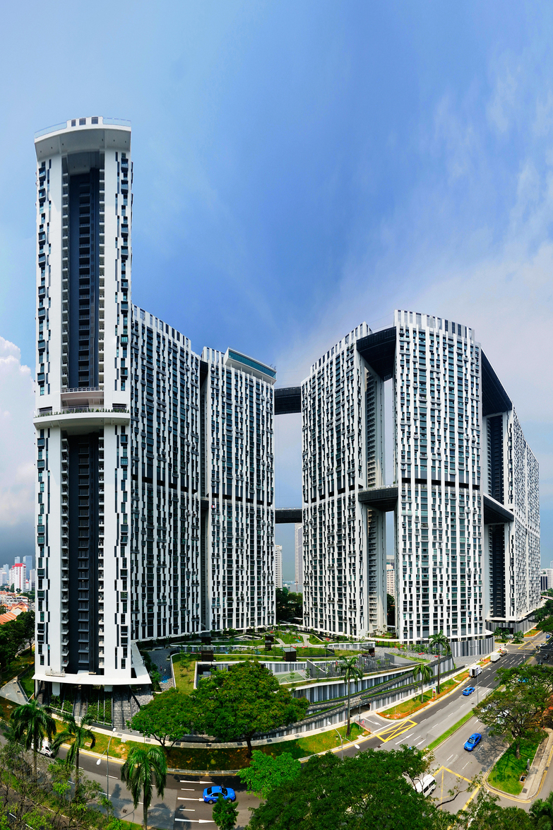
ARC Studio’s Pinnacle@Duxton (2009) scaled new heights for Singapore public housing by reaching 50 storeys in height. The studio also pioneered new ideas for high-density living, including connecting its seven towers with sky links to offer new and exciting communal spaces in the air.
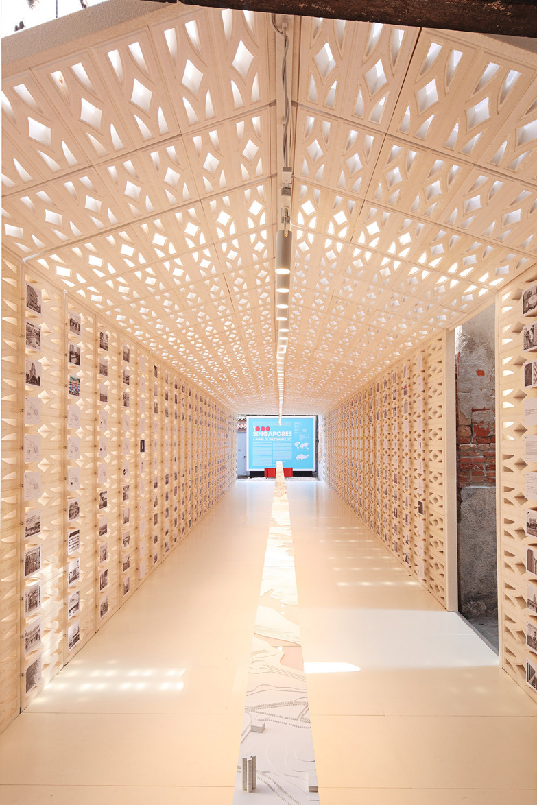
1000 Singapores: A Model of the Compact City was co-curated by ARC Studio for the Venice Architecture Biennale on 2010.The exhibition postulated how Singapore’s way of high-density urban planning could house the world’s 6.5 billion people in a space equivalent to just 0.5 per cent of its land area.
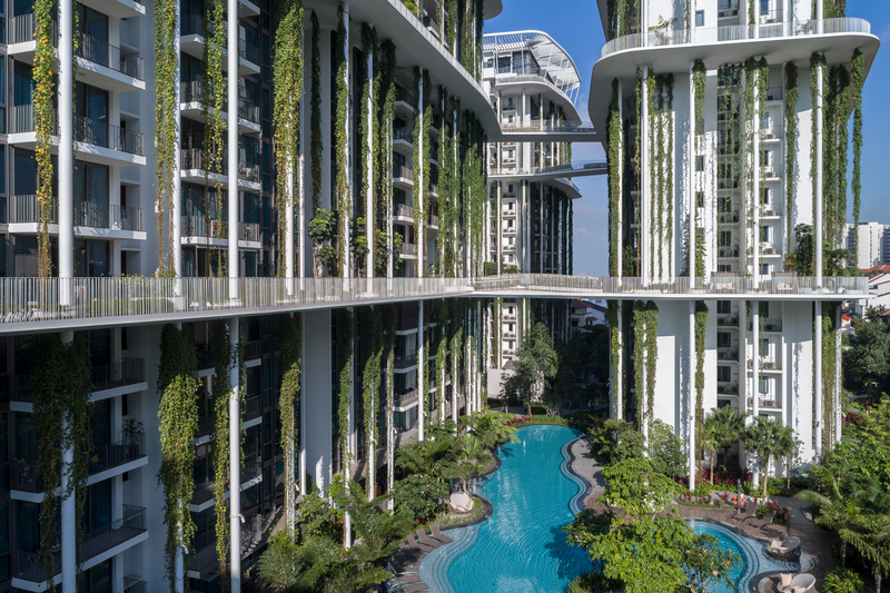
In 2016, ARC Studio completed The Tembusu and its “living façade”. Greenery flows down its 18-storey residential towers, and a series of sky links with decks creates opportunities for residents to interact even aboveground.
The Village Hotel Sentosa (2019) located in Singapore, showcases ARC Studio’s ability to create unique designs out of simple elements. The former is based on the lightness and ethereal quality of the sea as it is located on an island resort, while the latter unites the owners’ contradicting love for definite geometries and fluid lines.
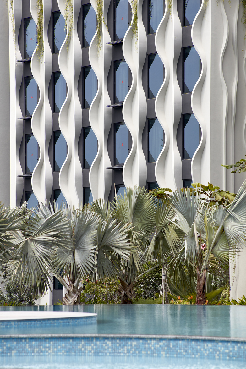
The Village Hotel Sentosa (2019) located in Singapore, showcases ARC Studio’s ability to create unique designs out of simple elements. The former is based on the lightness and ethereal quality of the sea as it is located on an island resort, while the latter unites the owners’ contradicting love for definite geometries and fluid lines.
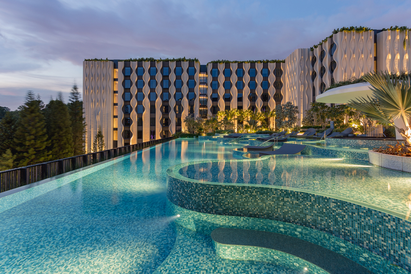
The Village Hotel Sentosa (2019) located in Singapore, showcases ARC Studio’s ability to create unique designs out of simple elements. The former is based on the lightness and ethereal quality of the sea as it is located on an island resort, while the latter unites the owners’ contradicting love for definite geometries and fluid lines.

The Bao Bao House (2012) located in Singapore, showcases ARC Studio’s ability to create unique designs out of simple elements. The former is based on the lightness and ethereal quality of the sea as it is located on an island resort, while the latter unites the owners’ contradicting love for definite geometries and fluid lines.
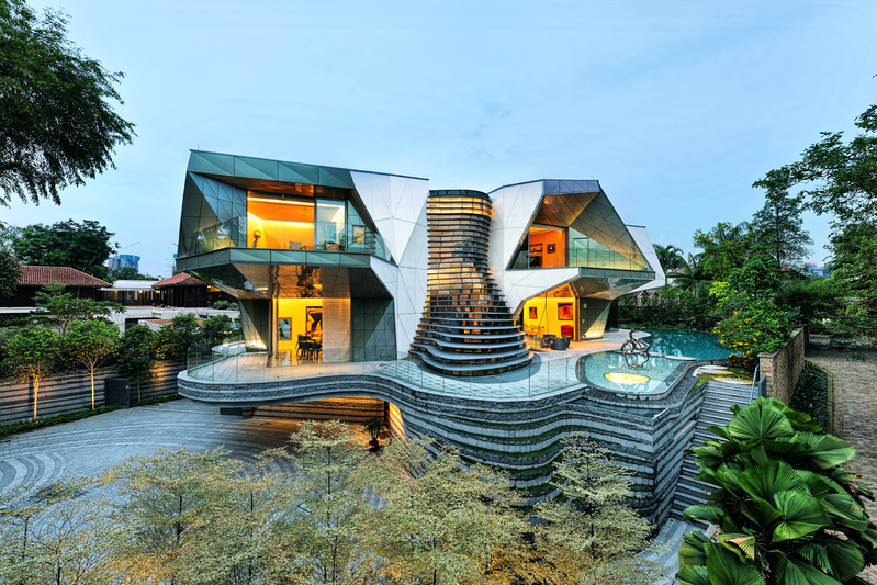
The Bao Bao House (2012) located in Singapore, showcases ARC Studio’s ability to create unique designs out of simple elements. The former is based on the lightness and ethereal quality of the sea as it is located on an island resort, while the latter unites the owners’ contradicting love for definite geometries and fluid lines.
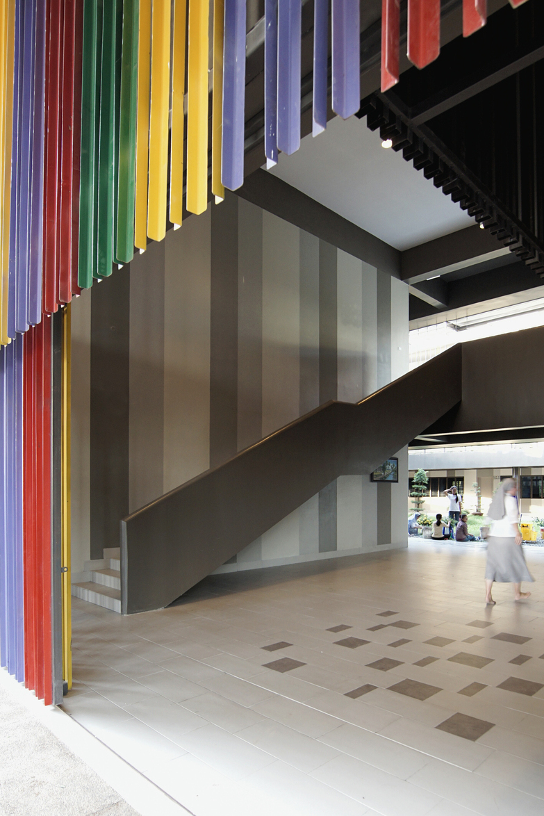
In its pursuit to harness the power of architecture to better humankind, ARC Studio has embarked on socially meaningful projects in less developed economies – one of which was the Don Bosco School – Teuk Thla in Cambodia (2014), which has many students from disadvantaged backgrounds.
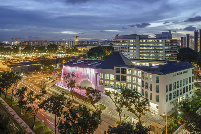
ARC Studio seeks to create lively spaces for people. The cafe and club rooms at Nee Soon East Community Club (2015) are lined at the edges of the basketball court to make the activities visible to all.
Designer
AirLab @ Singapore University of Technology & Design
Zhejiang University
DISCIPLINE
Engineering Design
Landscape Design
Systems Design
Digital Design

The pavilion is designed to frame three viewpoints around Gardens by the Bay, including its Dragonfly Lake, Marina Bay Sands and the Future of Us Pavilion. It is veiled with a white nylon net in order to recede into the lush, natural landscape.

The pavilion is designed to frame three viewpoints around Gardens by the Bay, including its Dragonfly Lake, Marina Bay Sands and the Future of Us Pavilion. It is veiled with a white nylon net in order to recede into the lush, natural landscape.
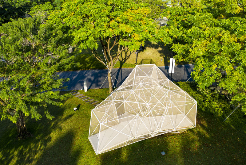
By disrupting traditional design and construction of space frames with a fully digital workflow, the pavilion could easily take on complex forms. A parametric script calculated the angles of the bars and nodes needed to achieve its geometry and generated digital files for 3D printing.

By disrupting traditional design and construction of space frames with a fully digital workflow, the pavilion could easily take on complex forms. A parametric script calculated the angles of the bars and nodes needed to achieve its geometry and generated digital files for 3D printing.
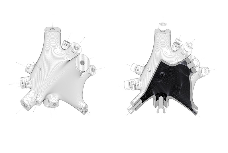
Each node in the pavilion was printed with rivet threads to allow for quick and simple assembly. It is one example of how the technology can integrate multiple components to enable new and more free-form designs.

The pavilion consists of 54 bespoke nodes and 216 bars of different lengths and sections. The customised parts give the design the most optimal configuration and distribution of material.

The pavilion consists of 54 bespoke nodes and 216 bars of different lengths and sections. The customised parts give the design the most optimal configuration and distribution of material.
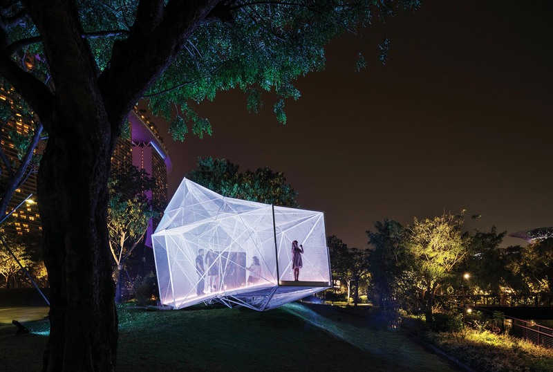
By making it easier to construct complex structures with less material wastage, the technology behind the pavilion promises a more sustainable form of construction in the future.
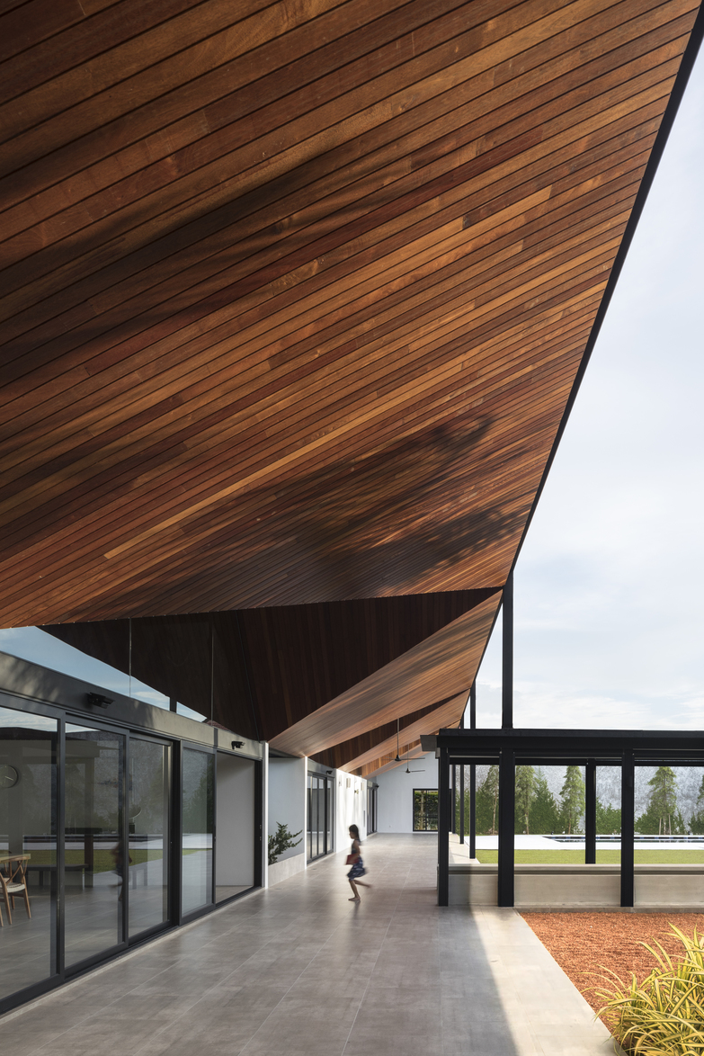
The house, located in a gated community in Johor Bahru, Malaysia, offers a safe environment for the owners’ children to freely run around, and for the family to host communal gatherings with the extended family.
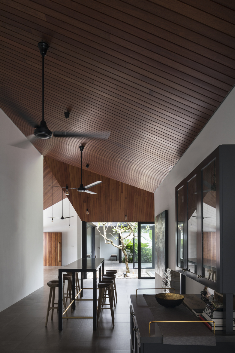
The house, located in a gated community in Johor Bahru, offers a safe environment for the owners’ children to freely run around, and for the family to host communal gatherings with the extended family.
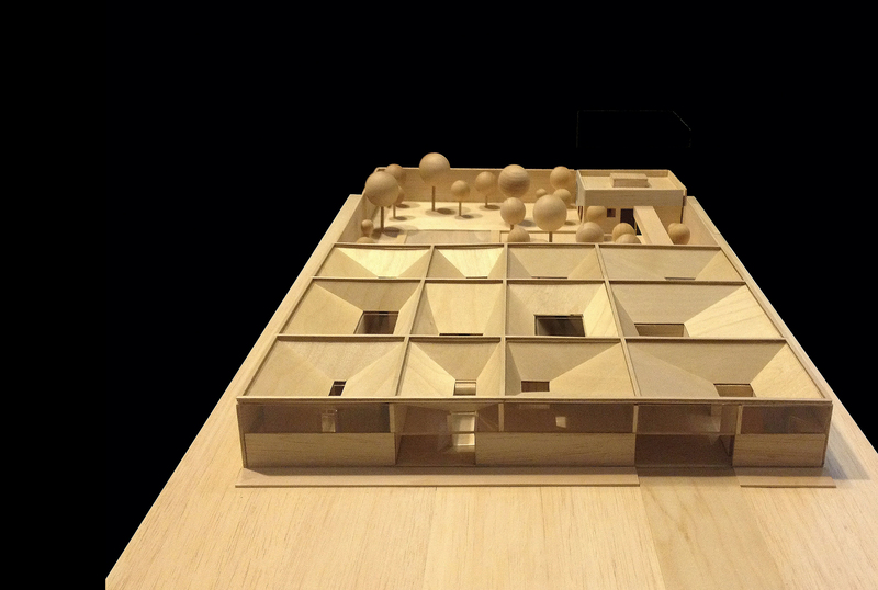
The architects researched into a variety of courtyard houses to arrive at their design. They divided the house into a matrix of 12 rectangles made up of a series of courtyards and cloisters. They are covered with a series of inverted pitched roofs that allows an accessible roof terrace, daylight and ventilation.
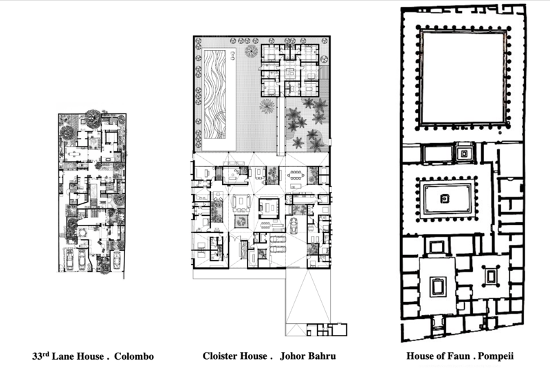
The architects researched into a variety of courtyard houses to arrive at their design. They divided the house into a matrix of 12 rectangles made up of a series of courtyards and cloisters. They are covered with a series of inverted-pitched roofs (overleaf) to allow daylight and ventilation.
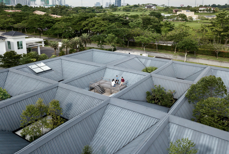
The architects researched into a variety of courtyard houses to arrive at their design. They divided the house into a matrix of 12 rectangles made up of a series of courtyards and cloisters. They are covered with a series of inverted-pitched roofs (overleaf) to allow daylight and ventilation.
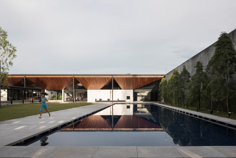
To allow its inhabitants to fully experience the vast 4,500 sq m land, the house is kept to a single storey. The communal living block leads to a back garden with a pool and a smaller annexe for private rooms.
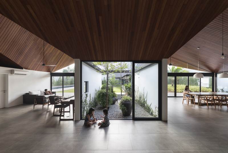
The house’s multiple courtyards have helped the inhabitants gain a deeper appreciation of nature and learn to live comfortably with the climate.

A single craftsman constructed the ceiling of the house with Merbau timber. The sloping design brings light, ventilation and rainwater into the courtyards while it shapes and differentiates the different cloisters within the house.
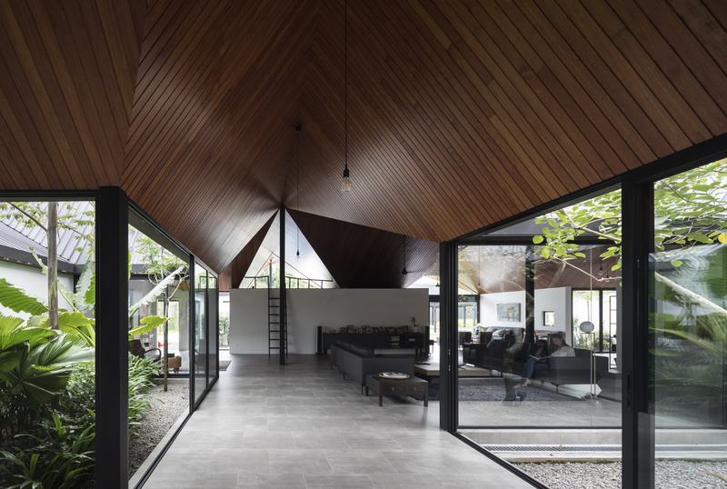
A single craftsman constructed the ceiling of the house with Merbau timber. The sloping design brings light, ventilation and rainwater into the courtyards while it shapes and differentiates the different cloisters within the house.
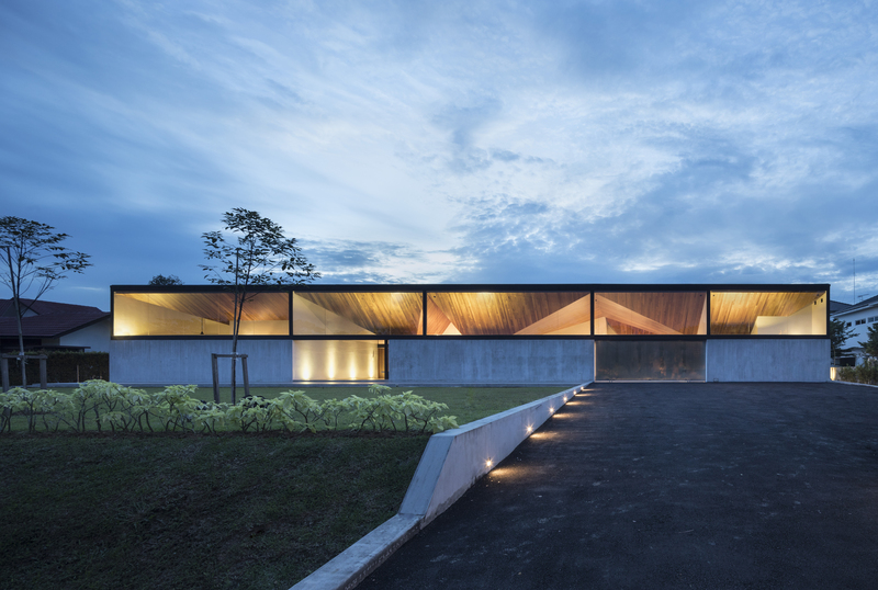
The single-storey house and its understated design offer a new interpretation of what it means to live luxuriously in the tropics.
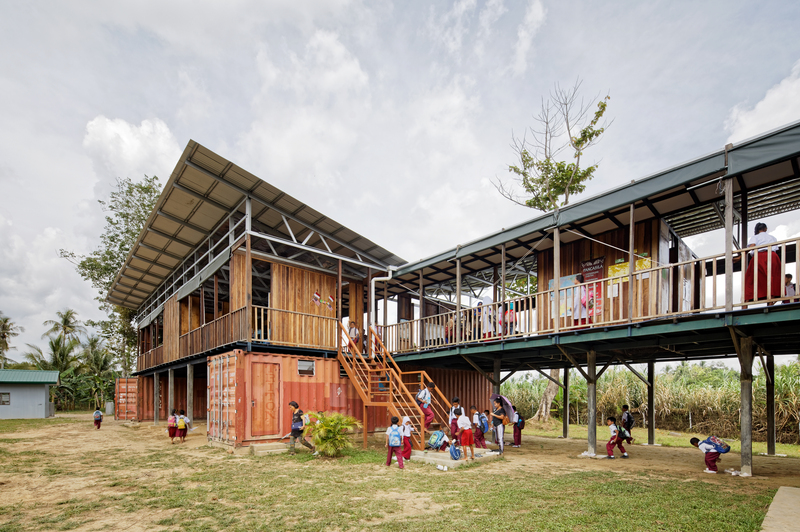
The school in Sabah, Malaysia, serves children of migrant labourers who have no access to formal education because of their legal status. There are an estimated 50,000 such children in the state.

Beyond designing buildings, the designers made full use of the surrounding natural landscape to create an environment for the children to learn through exploration and social interactions.
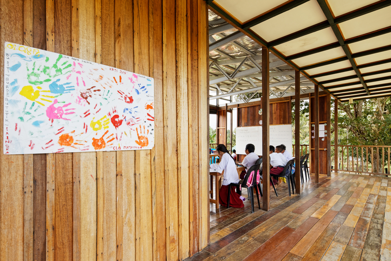
To keep operating cost low for the client, all classrooms face the river to let in light and a natural draft. The open, flexible spaces can be easily configured for students of multiple age groups to be taught in the same classroom.
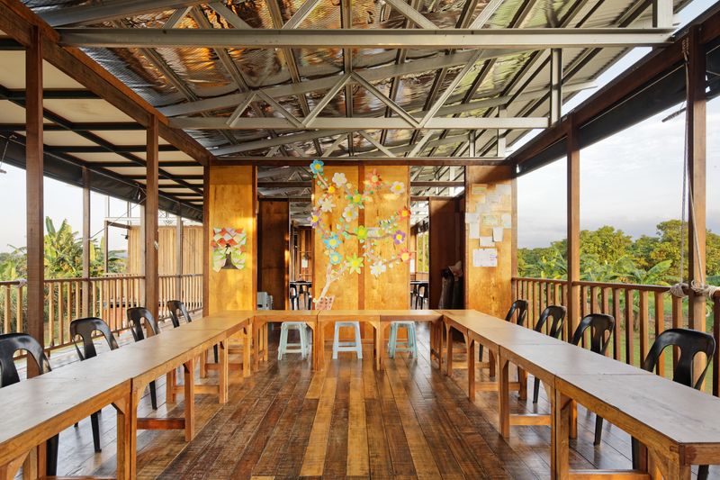
To keep operating cost low for the client, all classrooms face the river to let in light and a natural draft. The open, flexible spaces can be easily configured for students of multiple age groups to be taught in the same classroom.
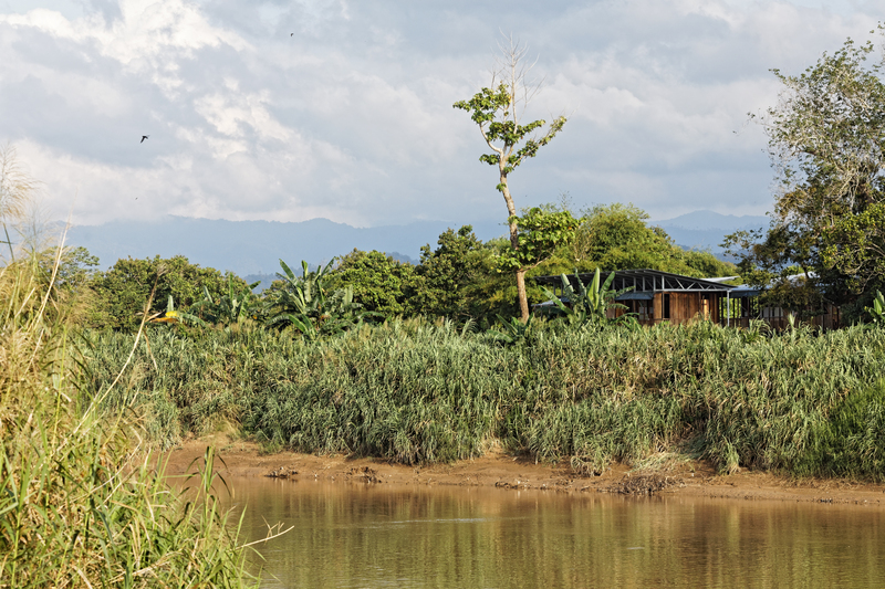
To keep operating cost low for the client, all classrooms face the river to let in light and a natural draft. The open, flexible spaces can be easily configured for students of multiple age groups to be taught in the same classroom.

The school harnesses its environment to be self-sustaining. A water source was created by digging up a rainwater harvest pond and installing a larger gutter on site to collect rainwater from the roofs. There are also solar panels to power lighting during cloudy days as well as computers and night camps.
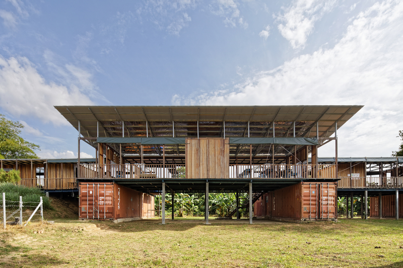
For ease of future expansion, the school was designed as a set of modular components that were made from locally available materials. They include five decommissioned shipping containers that act as an extended foundation, classroom units constructed out of recycled timber and a galvanised iron roof.
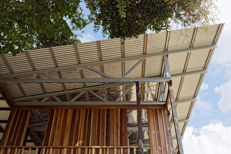
For ease of future expansion, the school was designed as a set of modular components that were made from locally available materials. They include five decommissioned shipping containers that act as an extended foundation, classroom units constructed out of recycled timber and a galvanised iron roof.
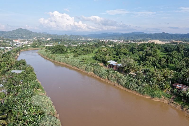
The school is located next to a river in the Borneo rainforests where erosion and flooding risks are increasing because of deforestation. Thus, it is raised from the ground like traditional longhouses on stilts in Sabah.

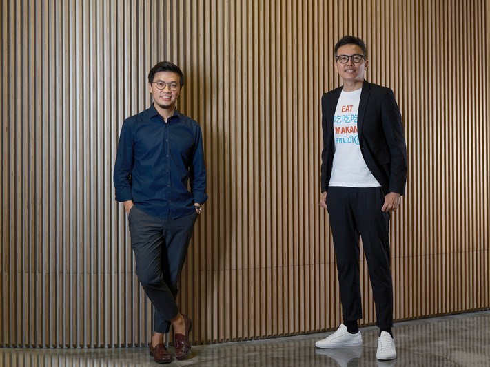
(L-R) Prasoon Kumar and Robert Verrijt
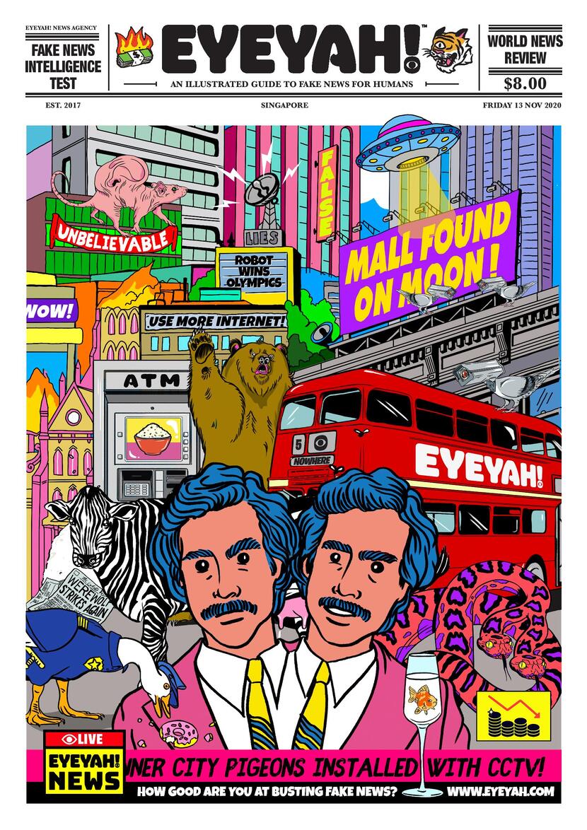
From food to the internet, each edition of EYEYAH! tackles issues in a visually exciting and accessible manner to effect change among its readers.

From food to the internet, each edition of EYEYAH! tackles issues in a visually exciting and accessible manner to effect change among its readers.

Based on the learning pedagogy of “See, Think, Wonder”, EYEYAH! employs a variety of methods to educate its readers. For instance, this illustration by Matt C Stokes on a future powered by devices is hidden with surprises and meanings to train observation skills.
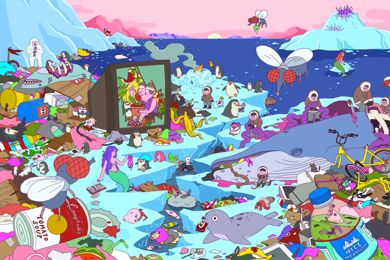
The educational platform uses a visual approach to deconstruct social issues and develop creative thinking. For the issue on Trash , Singapore illustrator Ann Gee Neo was commissioned to highlight its impact on the Arctic.

Since its launch in 2019, many children have encountered the educational platform through its print editions as well as exhibitions. Its worksheets have also been featured in the South China Morning Post’s educational newspaper, Posties, in Hong Kong.

Since its launch in 2019, many children have encountered the educational platform through its print editions as well as exhibitions. Its worksheets have also been featured in the South China Morning Post’s educational newspaper, Posties, in Hong Kong.

Since its launch in 2019, many children have encountered the educational platform through its print editions as well as exhibitions. Its worksheets have also been featured in the South China Morning Post’s educational newspaper, Posties, in Hong Kong.

While based in Singapore, EYEYAH! features work by illustrators from around the world. They include the Brisbane-based YeahYeahChloe, Lilly Friedeberg from Düsseldorf and Singaporean Kristal Melson.

While based in Singapore, EYEYAH! features work by illustrators from around the world. They include the Brisbane-based YeahYeahChloe, Lilly Friedeberg from Düsseldorf and Singaporean Kristal Melson.

While based in Singapore, EYEYAH! features work by illustrators from around the world. They include the Brisbane-based YeahYeahChloe, Lilly Friedeberg from Düsseldorf and Singaporean Kristal Melson.

EYEYAH! is published in a variety of formats depending on the topic. For its Internet issue, it created an interactive iPad app that was listed by Apple as the top free app of the week when it was launched.

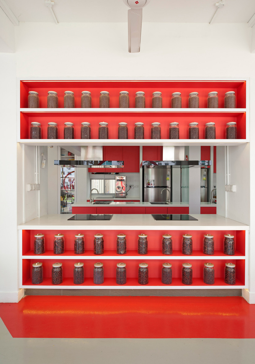
This Senior Activity Centre uses a community kitchen and living room concept to bring together stay-alone senior residents in Marine Terrace estate.

This Senior Activity Centre uses a community kitchen and living room concept to bring together stay-alone senior residents in Marine Terrace estate.
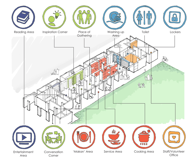
The centre is organised around the different cooking rituals, from preparing ingredients to cooking, dining and washing up. This creates opportunities for its users to interact with one another.
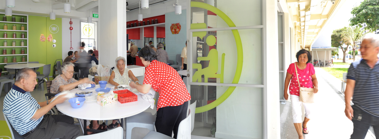
Full-height doors, which are kept fully open during the facility’s operation, are a key design feature. It creates an inviting environment, unlike similar centres elsewhere which are typically enclosed.

By allowing seniors to voluntarily cook for and with one another, the centre reinstates their self-worth and helps them overcome social isolation.
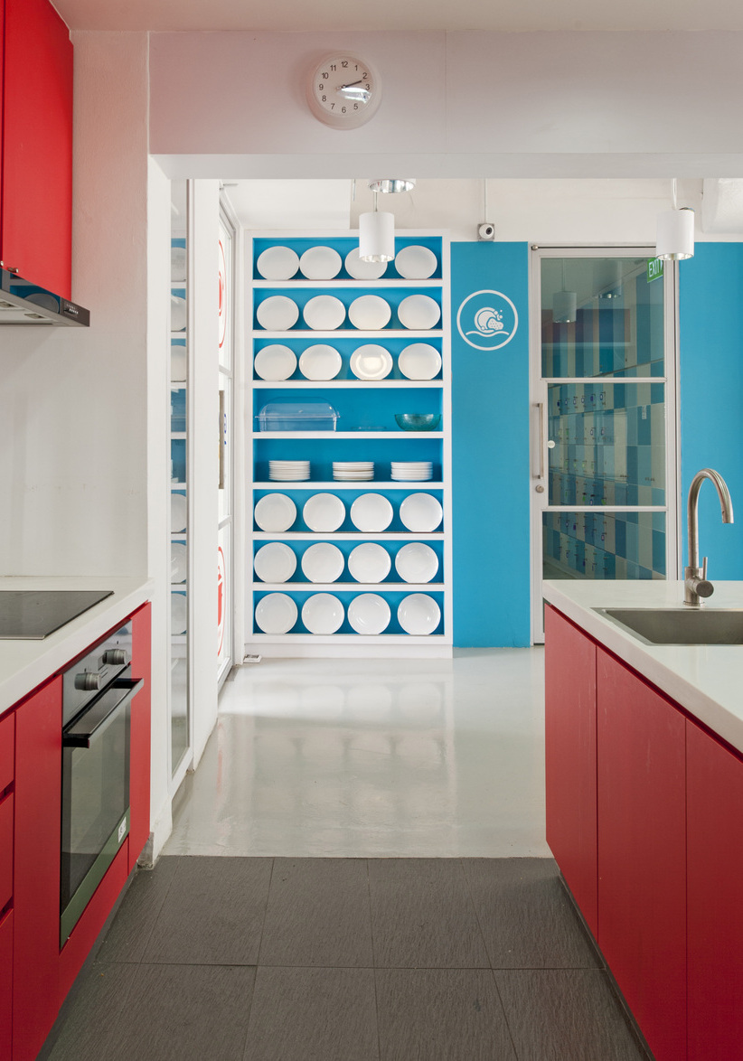
Unlike traditional aged living facilities which usually have muted colour schemes, the centre adopts a palette of vibrant colours. Various icons were also designed to help seniors of different language groups communicate easily with one another.
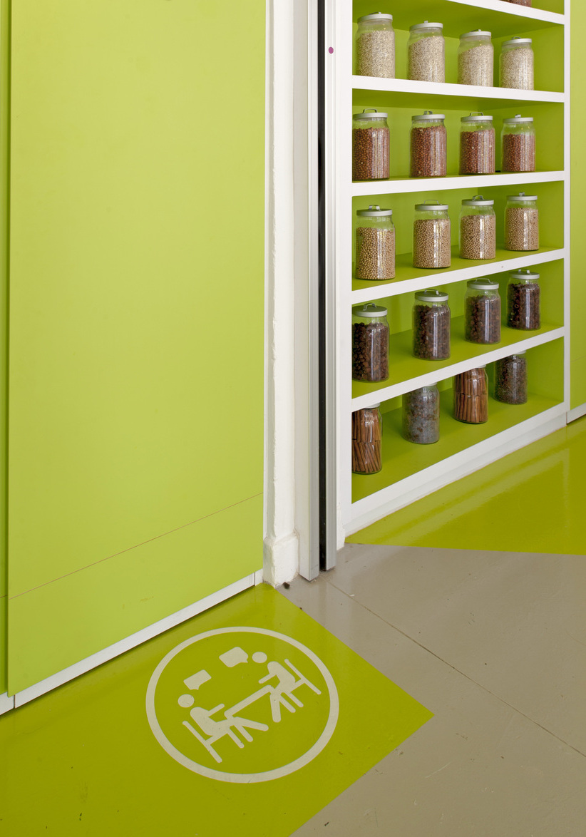
Unlike traditional aged living facilities which usually have muted colour schemes, the centre adopts a palette of vibrant colours. Various icons were also designed to help seniors of different language groups communicate easily with one another.
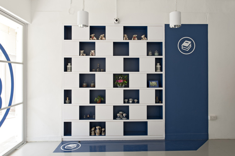
Unlike traditional aged living facilities which usually have muted colour schemes, the centre adopts a palette of vibrant colours. Various icons were also designed to help seniors of different language groups communicate easily with one another.

The centre’s open design retains the original character of the void deck, a common feature in public housing estates in Singapore. It offers a prototype for transforming similar spaces across the island into ageing-in-place facilities.

The centre’s open design retains the original character of the void deck, a common feature in public housing estates in Singapore. It offers a prototype for transforming similar spaces across the island into ageing-in-place facilities.
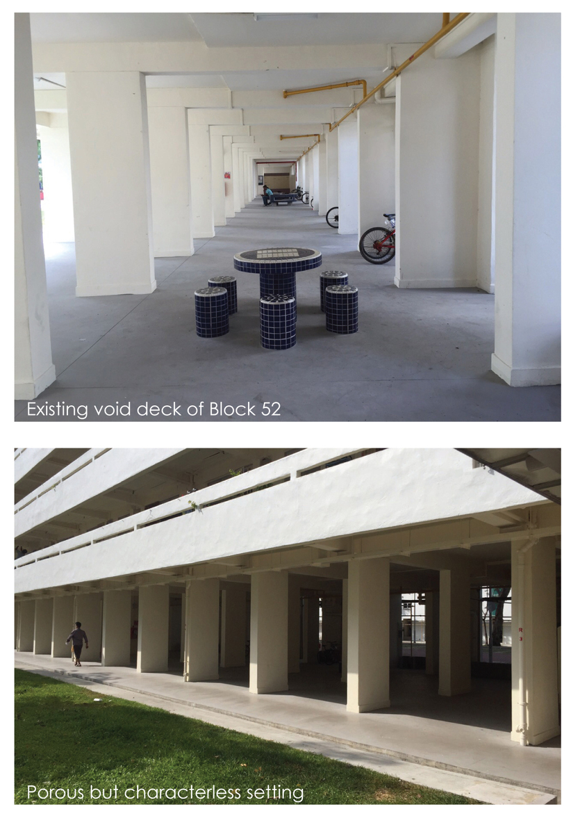
The centre’s open design retains the original character of the void deck, a common feature in public housing estates in Singapore. It offers a prototype for transforming similar spaces across the island into ageing-in-place facilities.
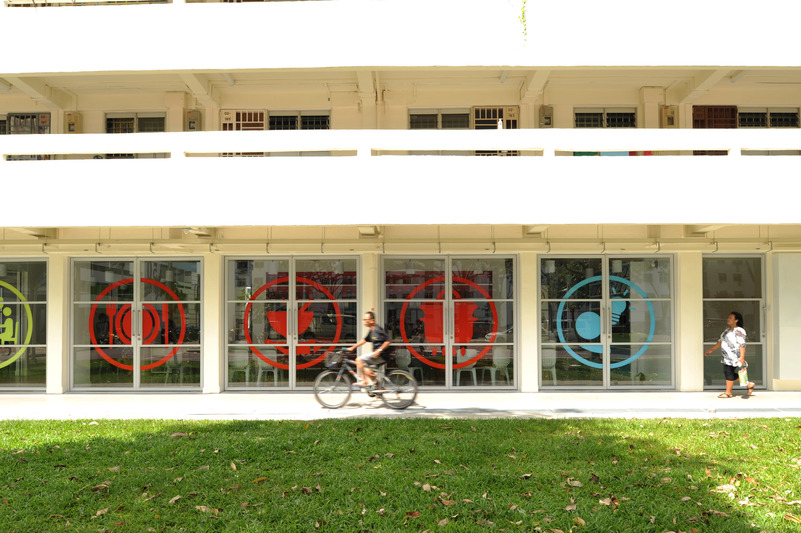
The centre’s open design retains the original character of the void deck, a common feature in public housing estates in Singapore. It offers a prototype for transforming similar spaces across the island into ageing-in-place facilities.
Designer
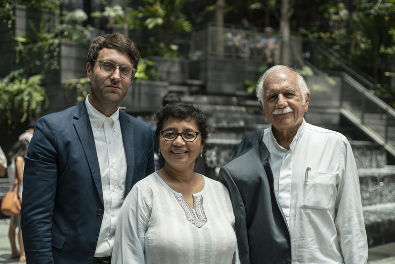
Safdie Architects
In collaboration with RSP Architects Planners & Engineers (Pte) Ltd
DISCIPLINE
Architecture
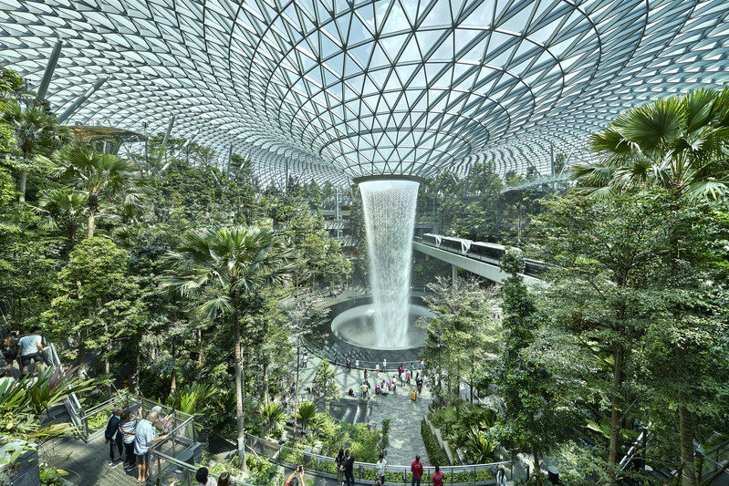
With its spectacular five-storey garden, 40-metre-high indoor waterfall and over 280 shops and restaurants, Jewel takes the Changi Airport experience to new heights.

With its spectacular five-storey garden, 40-metre-high indoor waterfall and over 280 shops and restaurants, Jewel takes the Changi Airport experience to new heights.
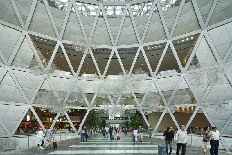
Its torus geometry helps Jewel to connect to the airport’s different terminals. At each of the cardinal axes, a gateway garden with a public artwork orientates visitors and offers visual connections to the surroundings.
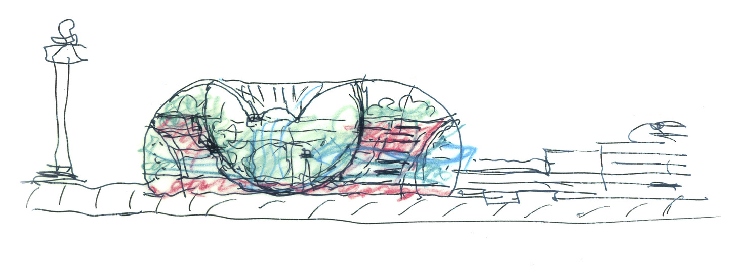
Its torus geometry helps Jewel to connect to the airport’s different terminals. At each of the cardinal axes, a gateway garden with a public artwork orientates visitors and offers visual connections to the surroundings.
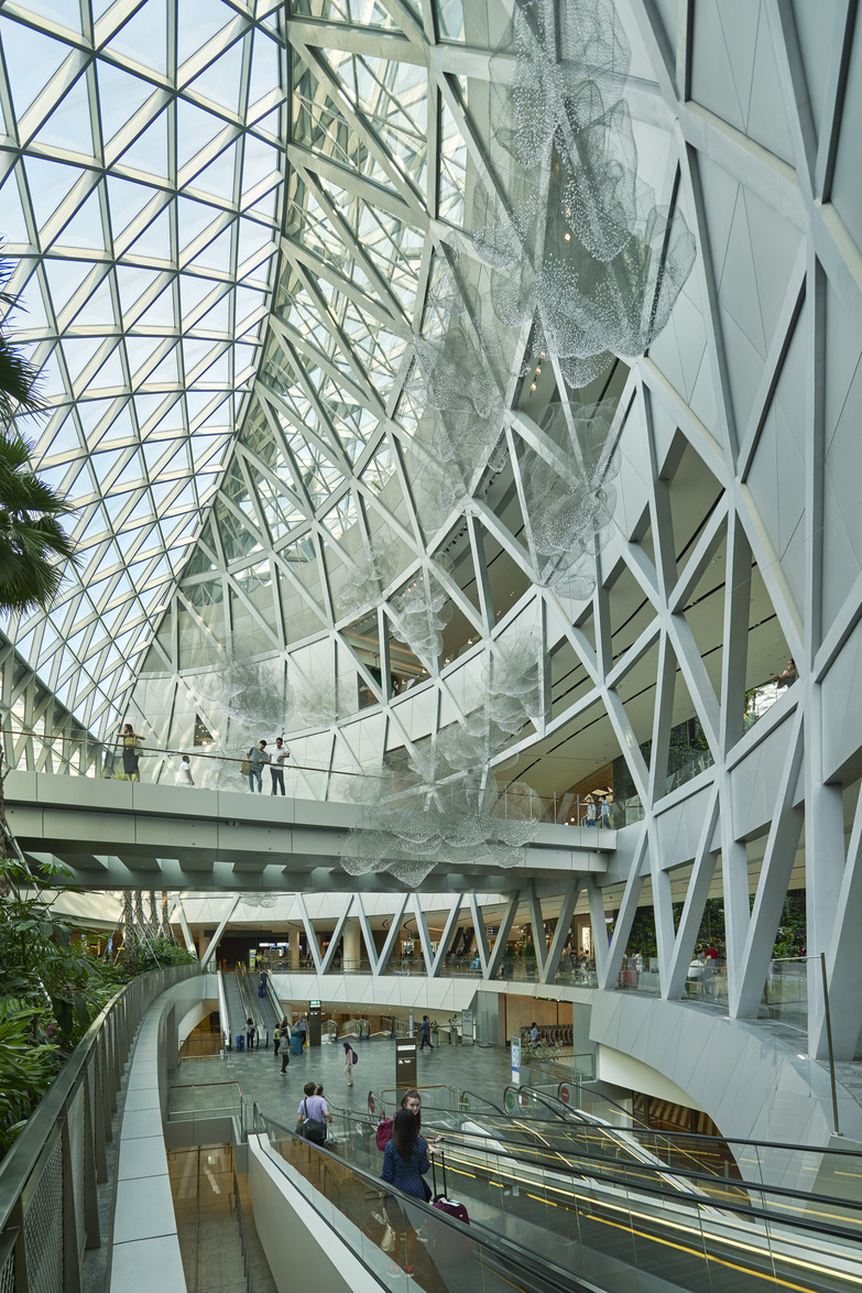
Its torus geometry helps Jewel to connect to the airport’s different terminals. At each of the cardinal axes, a gateway garden with a public artwork orientates visitors and offers visual connections to the surroundings.

Jewel replaces a former carpark in front of the airport’s Terminal 1 and is connected to Terminals 2 and 3 by a series of pedestrian bridges. Its distinctive façade is made from over 9,300 custom cut double-glazed panels – none of which is the same.
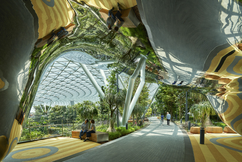
At the top of the 10-storey Jewel, of which five levels are underground, and five aboveground, is an over 14,000 sq m garden. It contains various attractions including net structures suspended within the trees, a planted hedge maze and a hanging glass-bottom bridge walk.
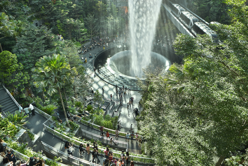
The five-storey terrace garden has approximately 2,000 trees and 100,000 shrubs specially selected to thrive in Jewel’s controlled subtropical environment. Visitors can walk on two trails that cut through the “valley” and also catch glimpses of the landscape from the shopping area through the “canyons”.
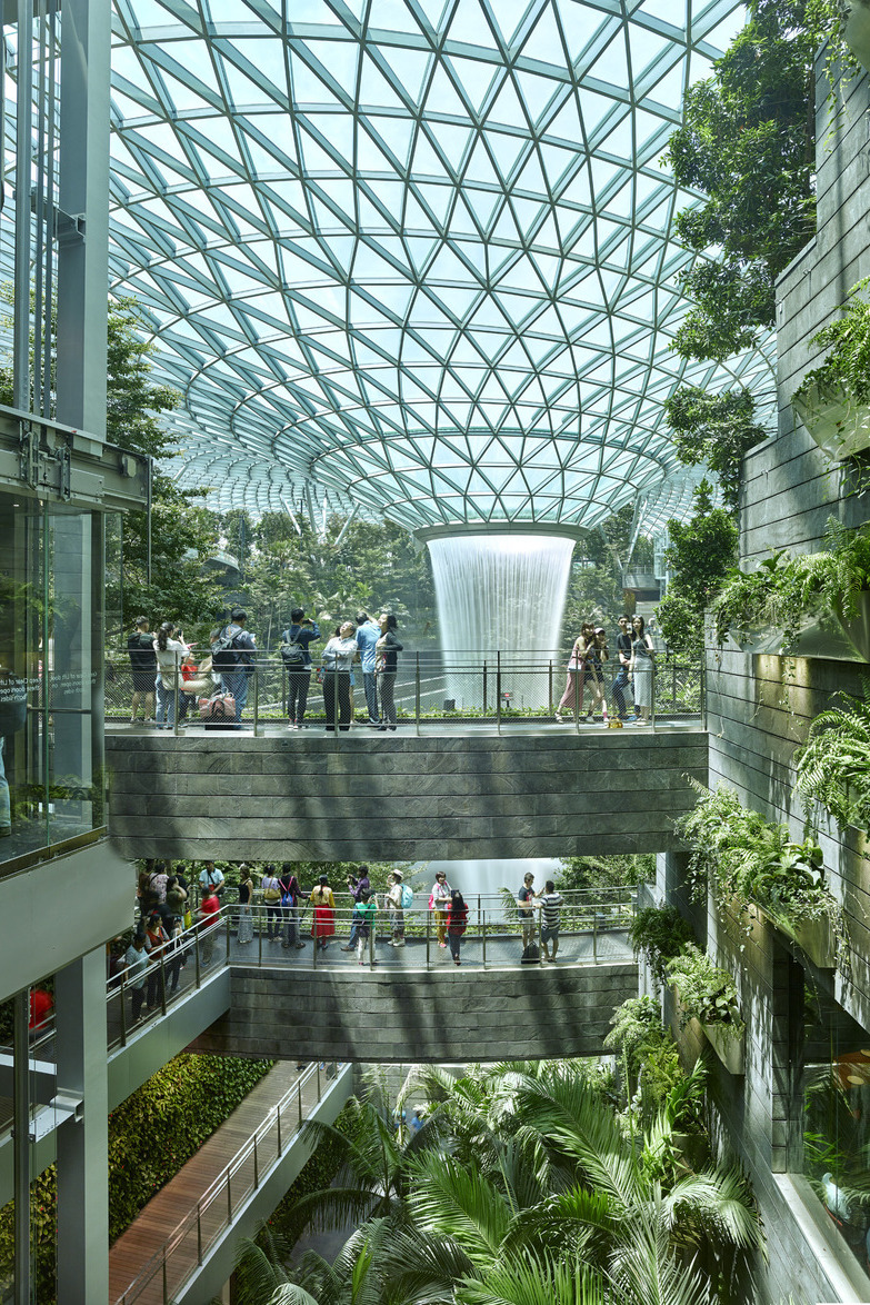
The waterfall descends from Jewel’s roof all the way to its basement. During a thunderstorm, up to 10,000 gallons per minute can flow in through an oculus opening on the roof, helping to cool the environment and collect water for reuse.

The waterfall descends from Jewel’s roof all the way to its basement. During a thunderstorm, up to 10,000 gallons per minute can flow in through an oculus opening on the roof, helping to cool the environment and collect water for reuse.


The 11-storey complex offers a new type of retirement village for seniors in Singapore. It brings together housing with various social, healthcare and commercial facilities as well as lots of greenery.
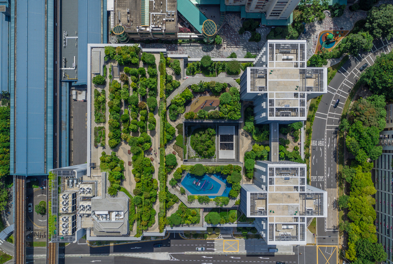
The lush landscaping not only gives back greenery that was lost as a result of the development. It also insulates the rooftop to cool the building, serves as an urban farm for residents and creates a welcoming environment overall.
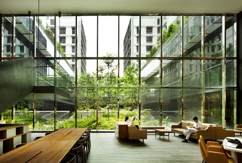
Residents of the complex may visit the medical centre located on the third and fourth levels to consult a specialist or get a simple day surgery done. It also looks out to a garden to help calm anxious patients.
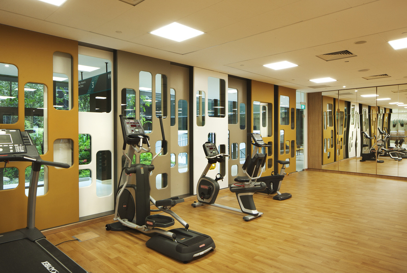
Residents of the complex may visit the medical centre located on the third and fourth levels to consult a specialist or get a simple day surgery done. It also looks out to a garden to help calm anxious patients.
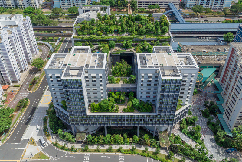
The complex’s different programmes are organised as horizontal layers within a singular structure. It is a highly efficient design for land-scarce Singapore.
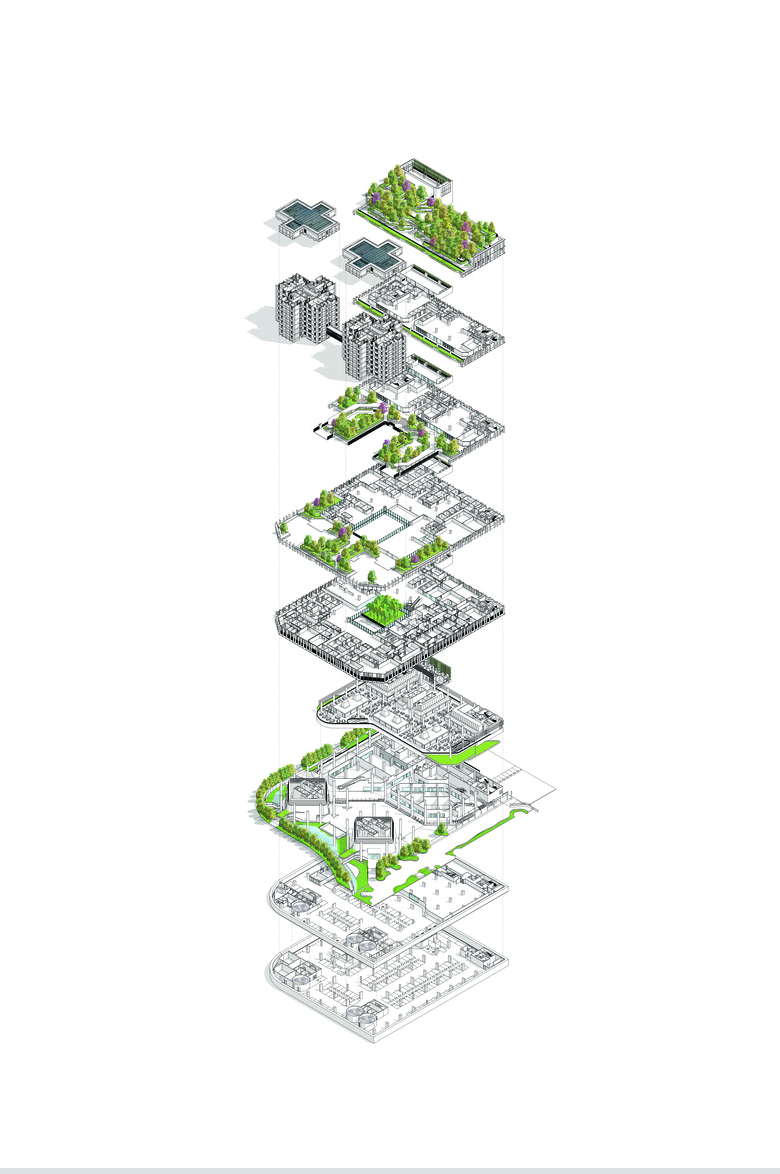
The complex’s different programmes are organised as horizontal layers within a singular structure. It is a highly efficient design for land-scarce Singapore.

By curating the right mix of greenery and ensuring landscaping is accessible throughout the design, the complex has successfully attracted rich biodiversity.

On the ground level is a community plaza that links to the neighbouring MRT station and is a popular space for people to gather. Its covered and open-side design can also host events whether rain or shine.
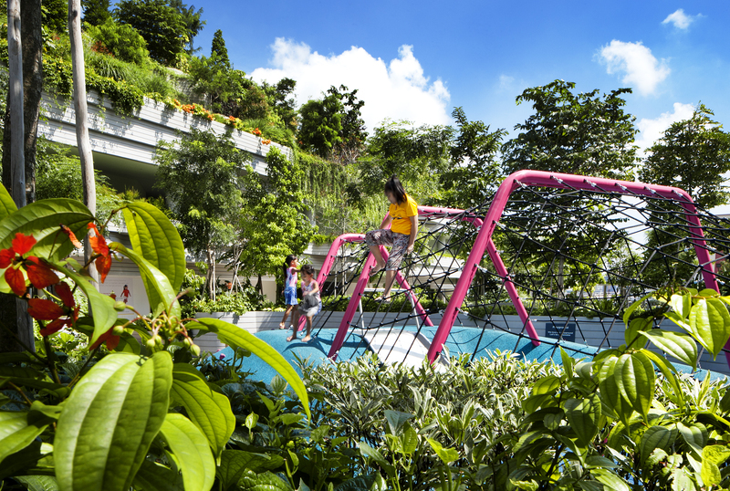
The complex has a childcare centre and playground, which are co-located on the same level as the senior care centre to allow the different generations to interact and bond.
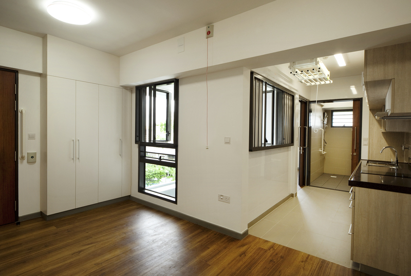
The complex has 104 units which are studio apartments or two-room flats of either 36 or 45 sq m. They come with elderly-friendly features to help the residents aged 55 years and above to live independently.
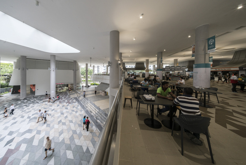
Overlooking the community plaza is a 900- seat hawker centre on the second storey. Together with the community plaza, it has made the complex a popular hangout spot for the neighbouring residents.

Designer
LAUD Architects Pte Ltd
DISCIPLINE
Architecture
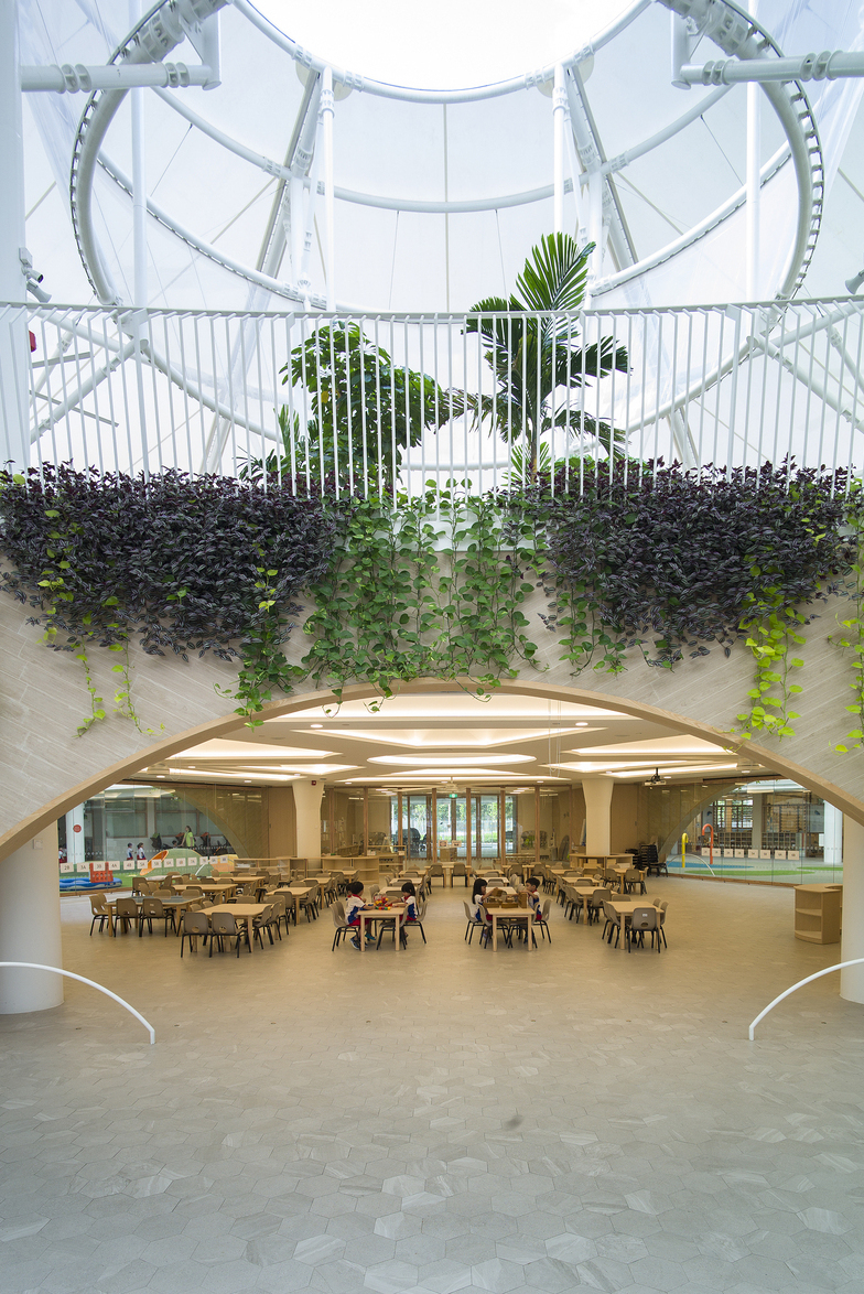
The three-storey preschool in Punggol Shore is designed for up to 1,000 children aged two months to four years. Its large capacity compared to what had previously existed, called on the architects to come up with an entirely new design.
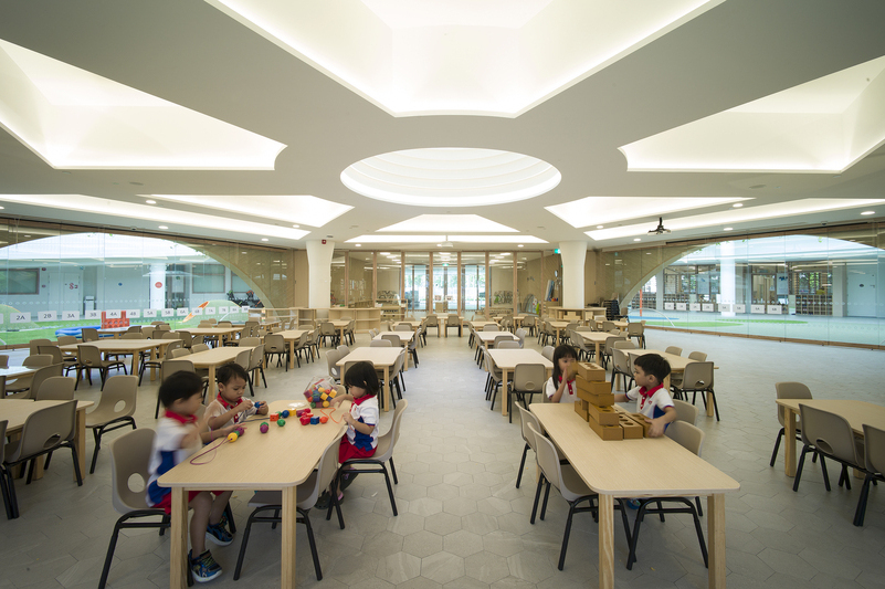
The three-storey preschool in Punggol Shore is designed for up to 1,000 children aged two months to four years. Its large capacity compared to what had previously existed, called on the architects to come up with an entirely new design.
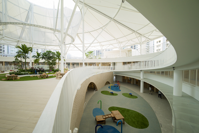
The preschool’s built-up area of 8,400 sq m houses varying spaces for children of different age groups to learn through experience. This includes a water play area and an artificial turf playground for infants.
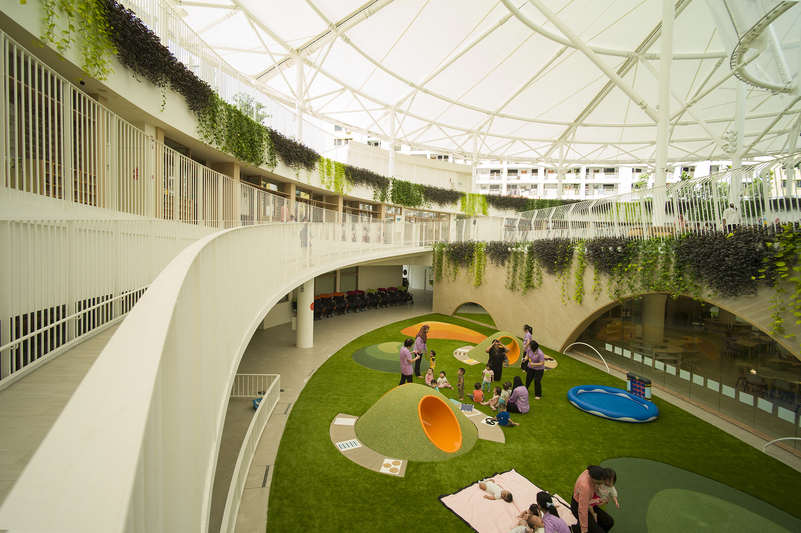
The preschool’s built-up area of 8,400 sq m houses varying spaces for children of different age groups to learn through experience. This includes a water play area and an artificial turf playground for infants.
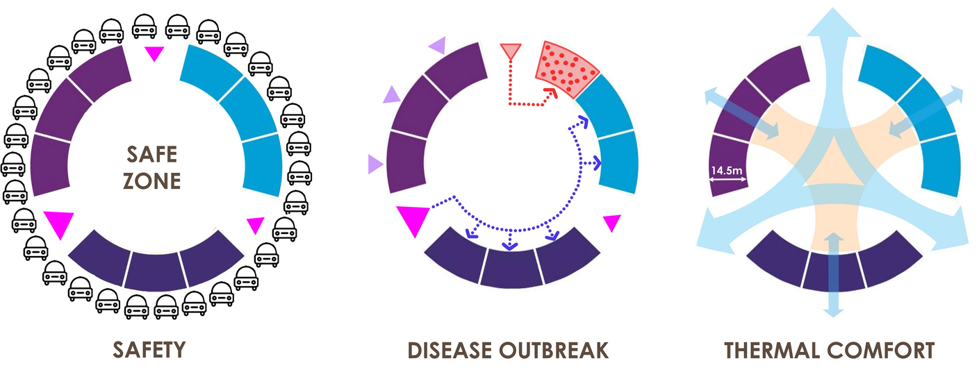
A circular geometry resolved a variety of safety issues: high vehicular traffic in the mornings could flow smoothly; the preschool could be segmented for parts to be closedoff in case of a disease outbreak; and it also allowed for airflow and environmental comfort.
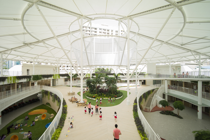
At the centre of the preschool is a three-point triangular bridge covered by a large Teflon canopy for children to learn and play in a semi-outdoor environment. Underneath it are various shared facilities including a multipurpose hall.

A variety of play areas on the rooftop offer children a safe space for exploratory experiences. It also offers residents of the surroundings blocks pleasant views of the activities.
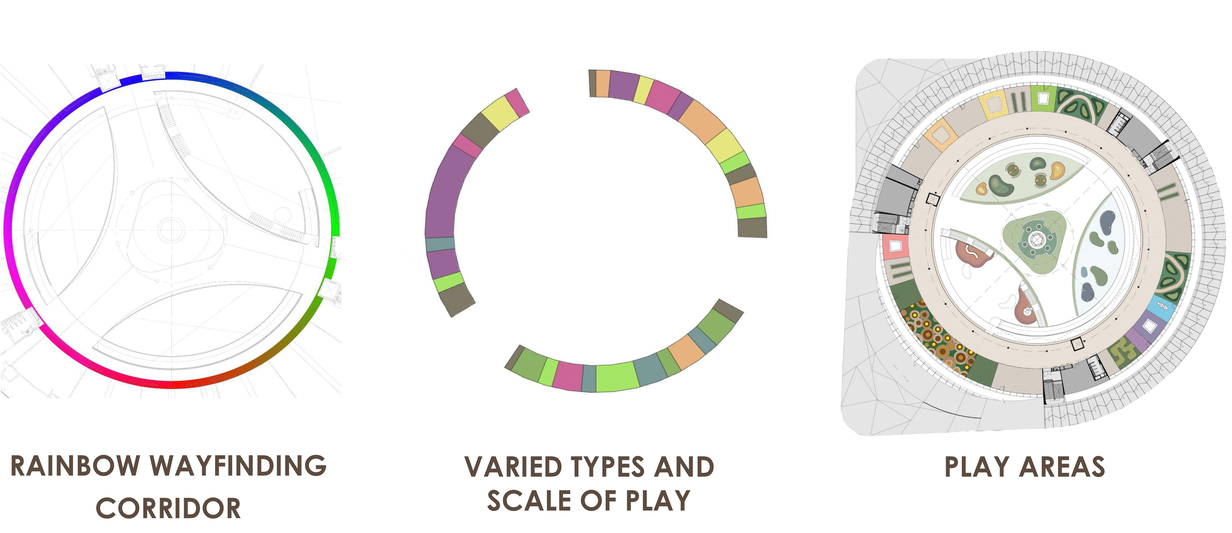
Various playful details make the preschool fun for learning. Each of the classrooms have a coloured mosaic floor tile that form a rainbow ring together. They also have animal signages made out of geometric shapes. Besides taking the stairs, the children can also slide their way down.
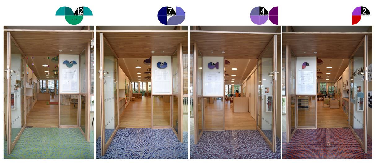
Various playful details make the preschool fun for learning. Each of the classrooms have a coloured mosaic floor tile that form a rainbow ring together. They also have animal signages made out of geometric shapes. Besides taking the stairs, the children can also slide their way down.
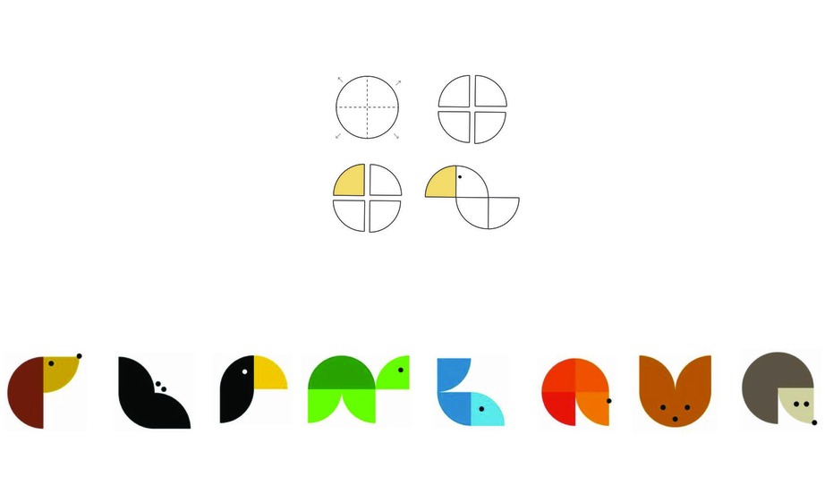
Various playful details make the preschool fun for learning. Each of the classrooms have a coloured mosaic floor tile that form a rainbow ring together. They also have animal signages made out of geometric shapes. Besides taking the stairs, the children can also slide their way down.
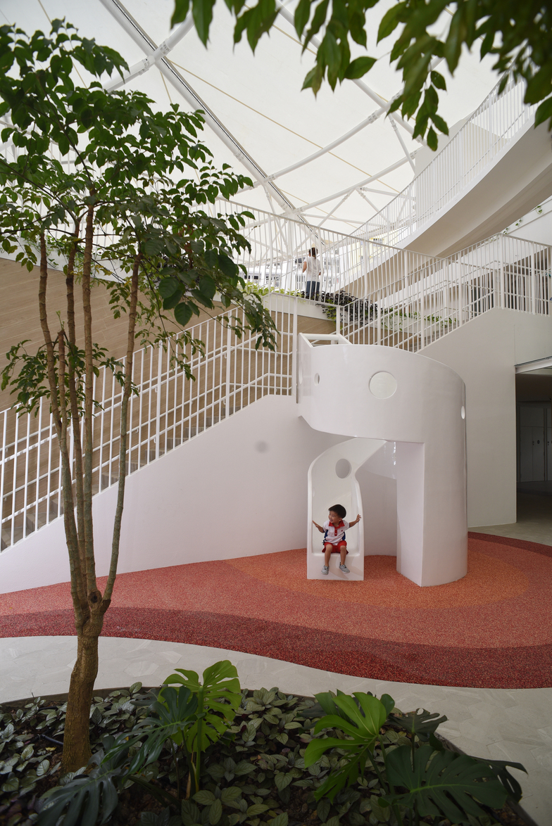
Various playful details make the preschool fun for learning. Each of the classrooms have a coloured mosaic floor tile that form a rainbow ring together. They also have animal signages made out of geometric shapes. Besides taking the stairs, the children can also slide their way down.
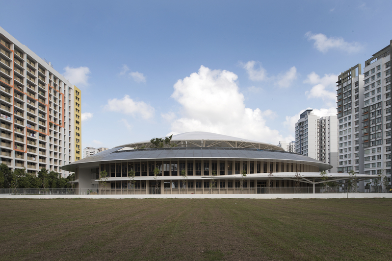
Located between two rectilinear
public housing blocks, the preschool stands out with its circular geometry. The
simple shape has also been etched on the minds of the students who painted this
impression of the school for its official opening.
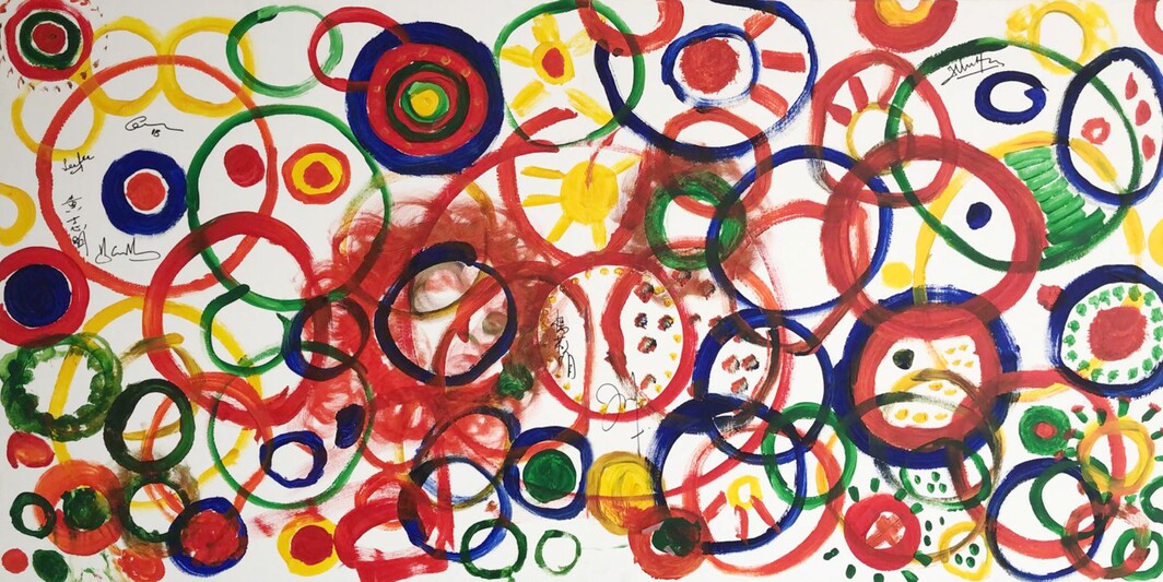
Located between two rectilinear public housing blocks, the preschool stands out with its circular geometry. The simple shape has also been etched on the minds of the students who painted this impression of the school (left) for its official opening.

Designer
Kinetic Singapore
DISCIPLINE
Design Strategy & Management
Exhibition Design
Visual Communication
Advertising Design

This is no convenience store but an exhibition on how the culture of convenience gives rise to our wasteful and unsustainable habits.
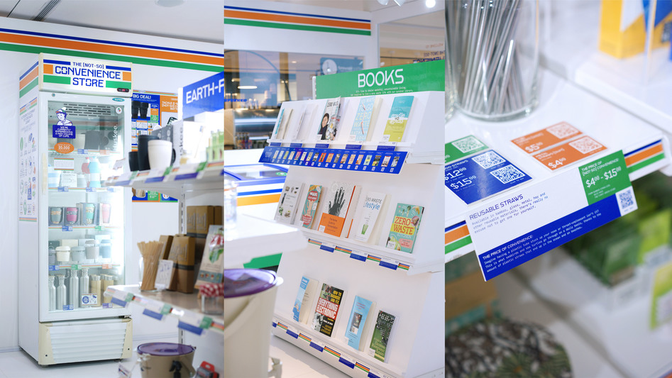
The exhibition showcases various everyday products with tags outlining the environmental problem as well as two prices. The “Price of Convenience” shows what Earth is paying for our wasteful habits, while the other shows the price of the sustainable alternative on display.
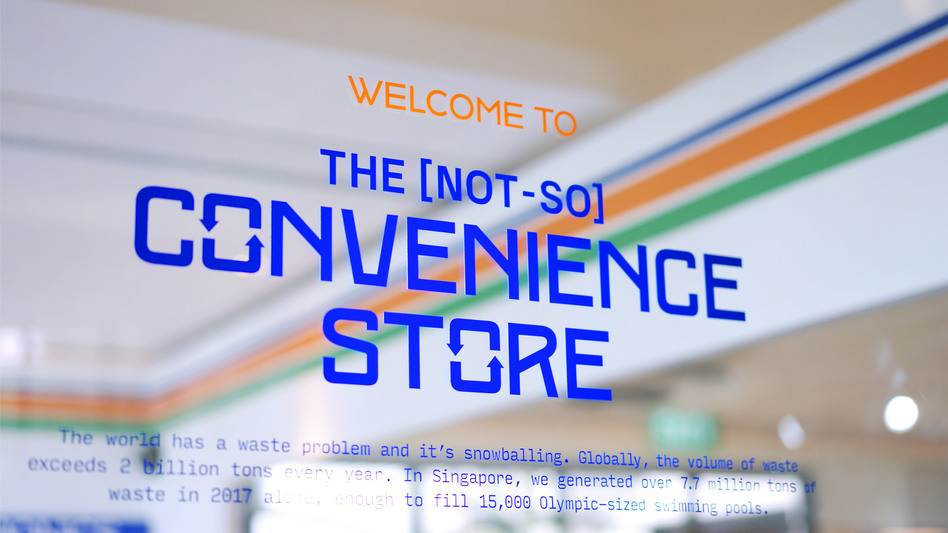
The design of the exhibition adheres closely to that of convenience stores, from the branding graphics to the way products are displayed. It creates an immersive environment for the message to shine through.
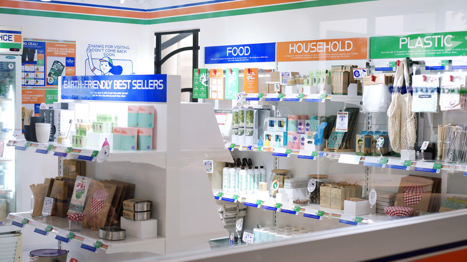
The design of the exhibition adheres closely to that of convenience stores, from the branding graphics to the way products are displayed. It creates an immersive environment for the message to shine through.
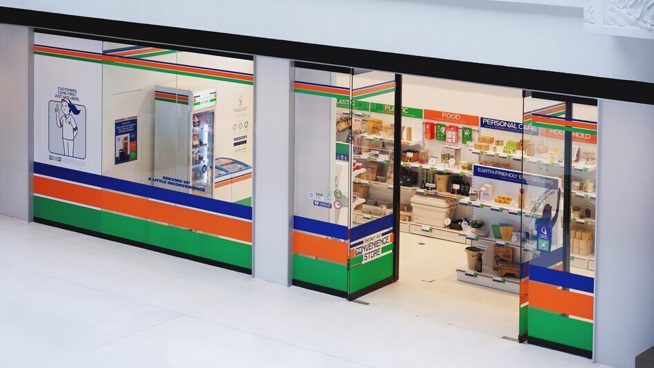
The exhibition was originally commissioned in 2019 for the inaugural exhibition of the Temasek Shophouse, a social impact hub in Singapore. Two years later, it popped up at the National Design Centre.
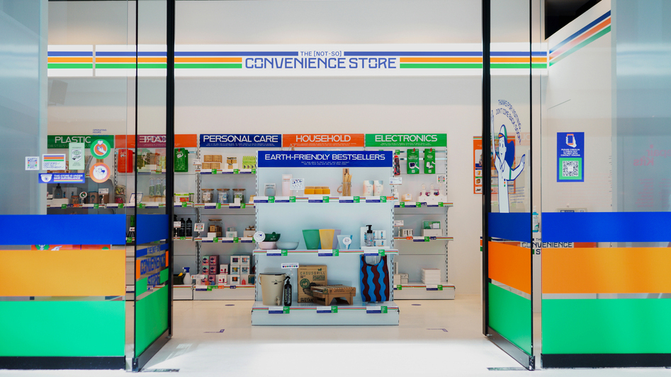
The exhibition was originally commissioned in 2019 for the inaugural exhibition of the Temasek Shophouse, a social impact hub in Singapore. Two years later, it popped up at the National Design Centre.

Mindful of how the public might have already been overwhelmed by the same messages about sustainability, the designers sought out a more subtle and unexpected way to communicate the issue instead.

Mindful of how the public might have already been overwhelmed by the same messages about sustainability, the designers sought out a more subtle and unexpected way to communicate the issue instead.
