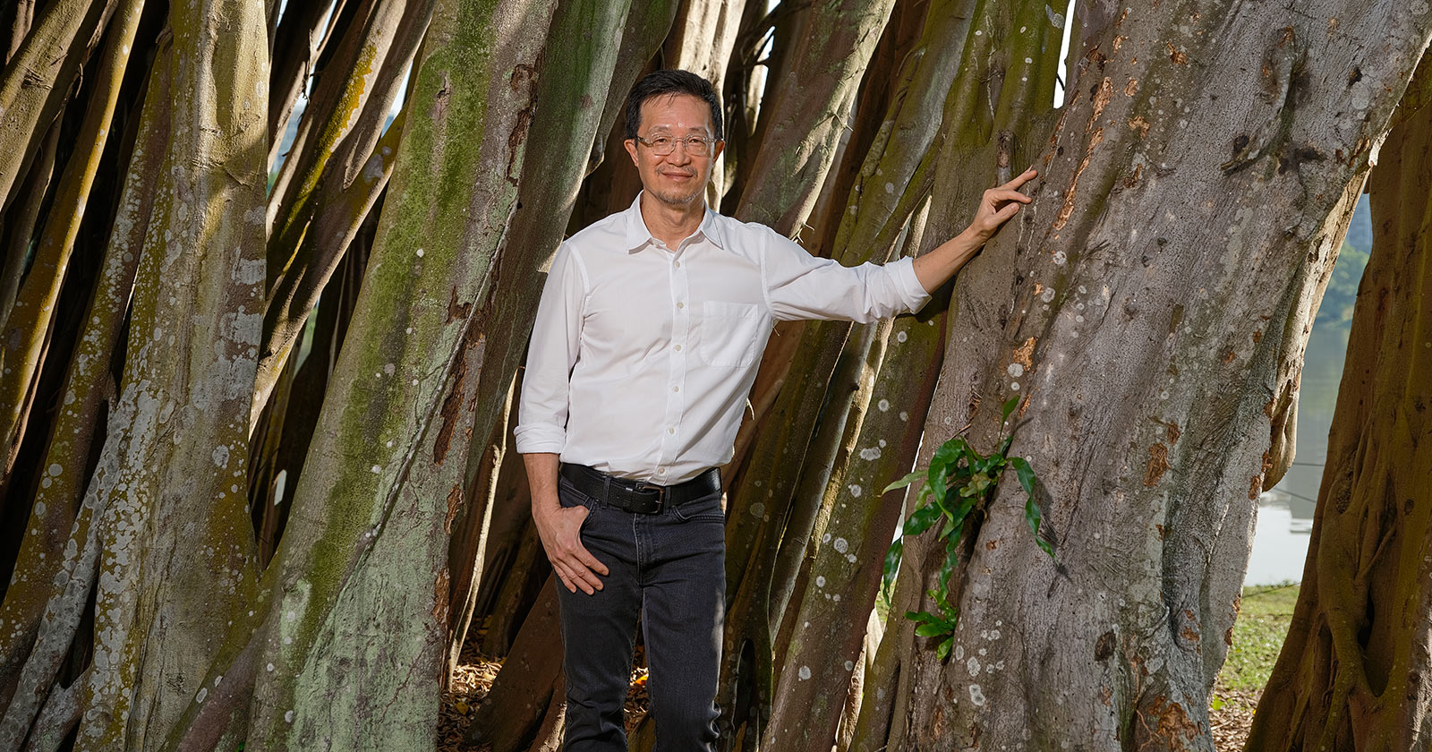
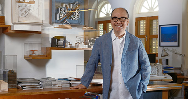
Leonard Ng Keok Poh
Country Market Director
Henning Larsen, APAC
DISCIPLINE
Landscape Design
Country Market Director
Henning Larsen, APAC
DISCIPLINE
Landscape Design
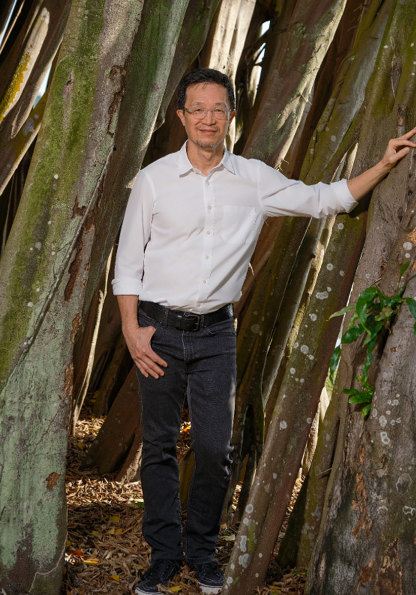
Bishan-Ang Mo Kio Park (2012) was a breakthrough project for Ng and helped him develop the approach of “water as a driver in design”. This involves creating landscapes in the city to slow down, collect, and even treat water and runoff from storms, resulting in an urban environment that is more resilient and adaptable to climate change. The project received a P*DA Design of the Year in 2012.
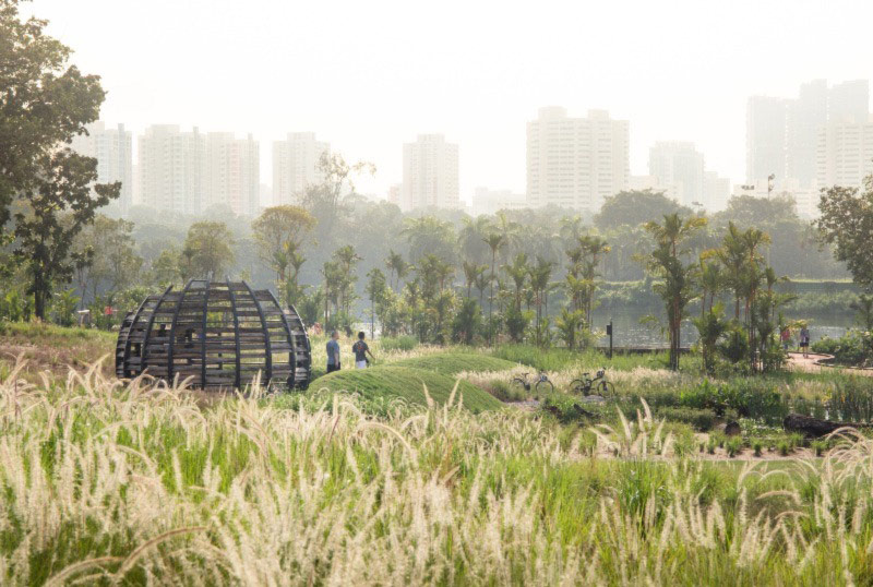
Ng’s approach of connecting people with other species and the environment can be seen in his work on the revamped Lakeside Garden at Jurong Lake Gardens (2019). A bird hide located within grasslands allows visitors to observe the birds without disturbing them.
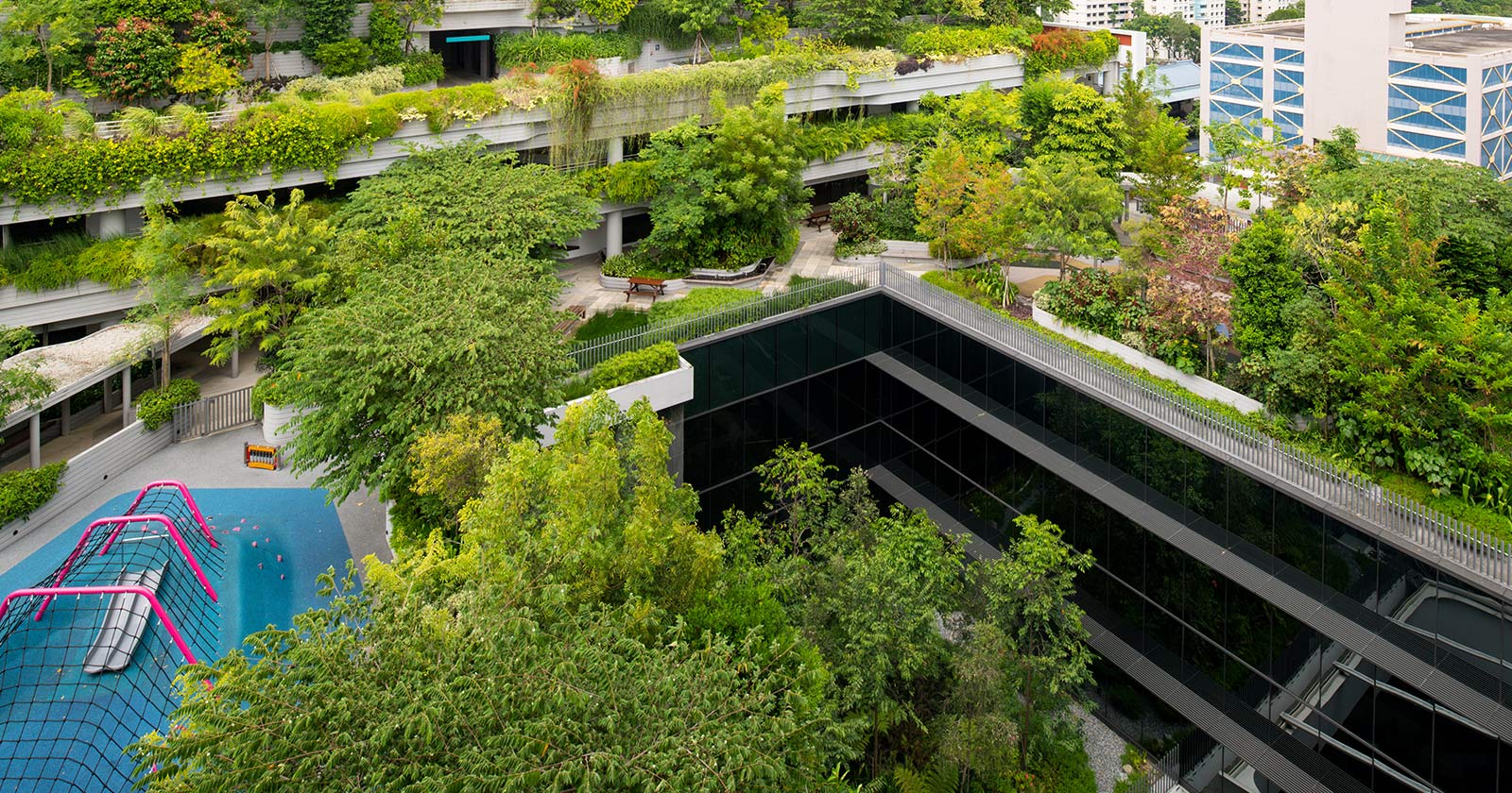
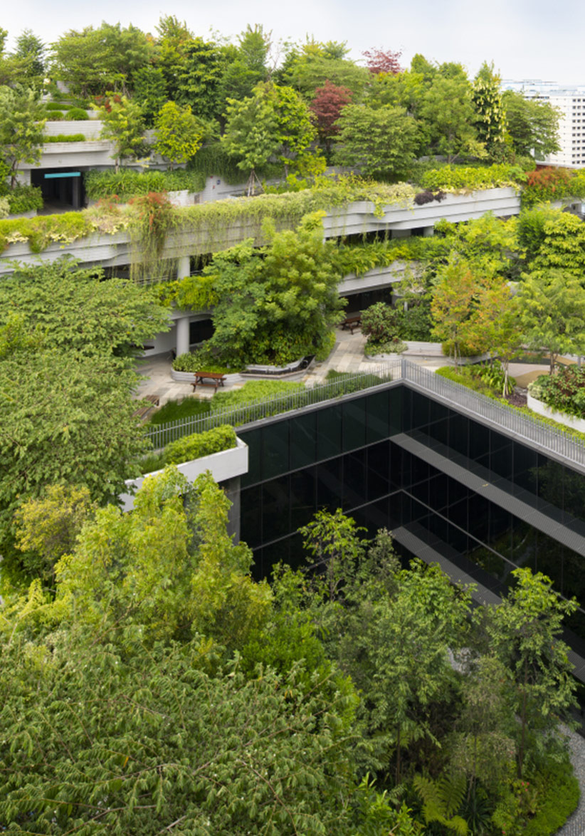
Ng believes landscaping can help create more spaces for nature even with increasing urbanisation. He led the landscape design for Kampung Admiralty (2017), a pioneering development in Singapore that integrates apartments and care facilities for seniors. The greenery insulates the rooftop and offers residents a space of respite. The carefully curated landscape has attracted rich biodiversity.
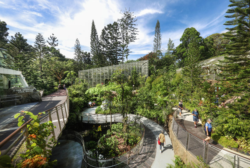
Beyond landscapes and parks, Ng has also designed some of Singapore’s best known green destinations. One example is the recently revamped National Orchid Garden (2021). Enhancements include an improved visitor experience, better circulation, and spaces to facilitate orchid naming and other events. The existing orchid nursery was also improved and a new Tropical Montane Orchidetum added.
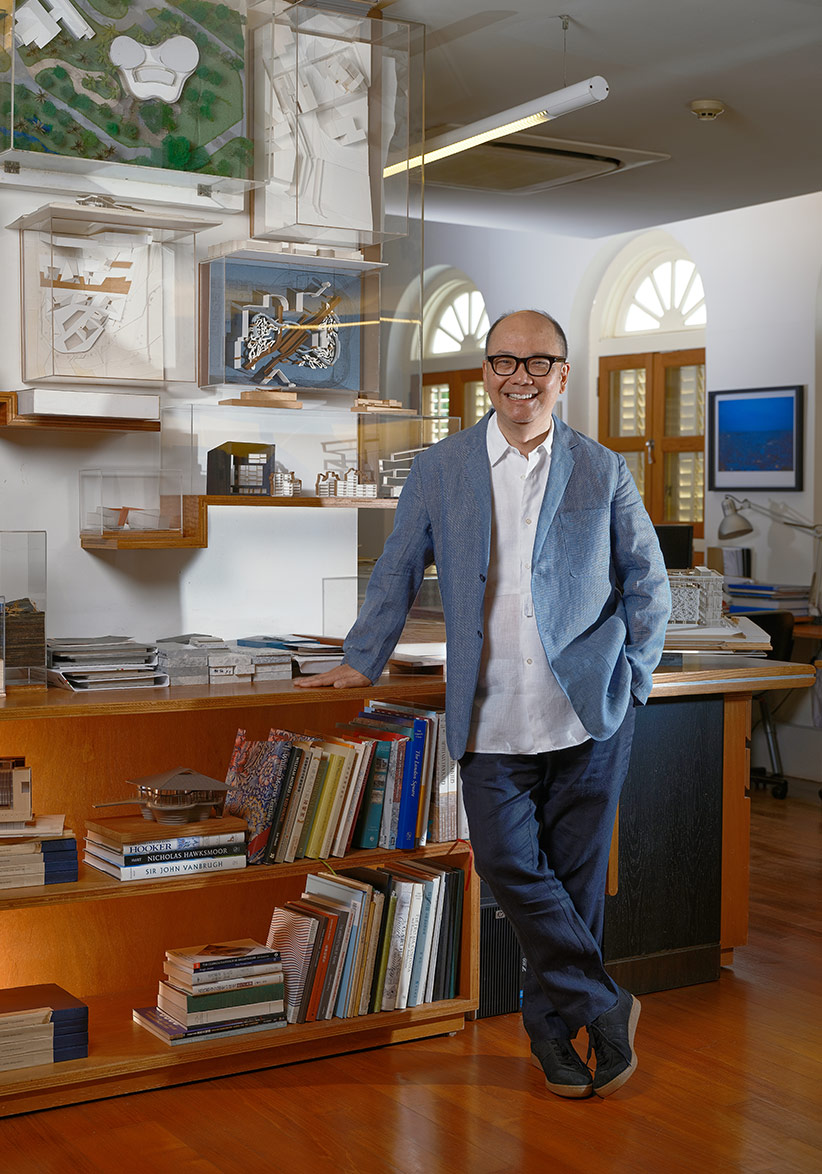
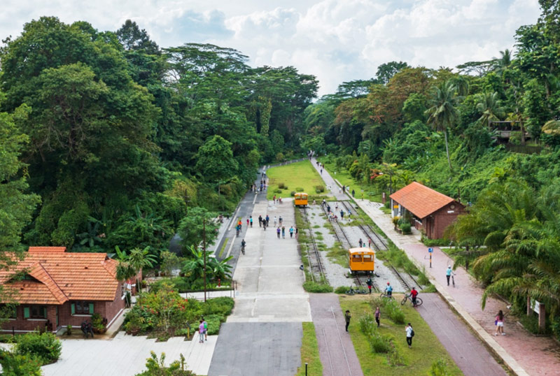
Every person must be aware and knowledgeable of architecture and design in order for the profession’s standards to be raised, says Tan. His design for the adaptive reuse of the Old Bukit Timah Railway Station (2022) turns the former station and staff quarters into a heritage gallery and cafe respectively – offering new ways of connecting to Singapore’s rail heritage.
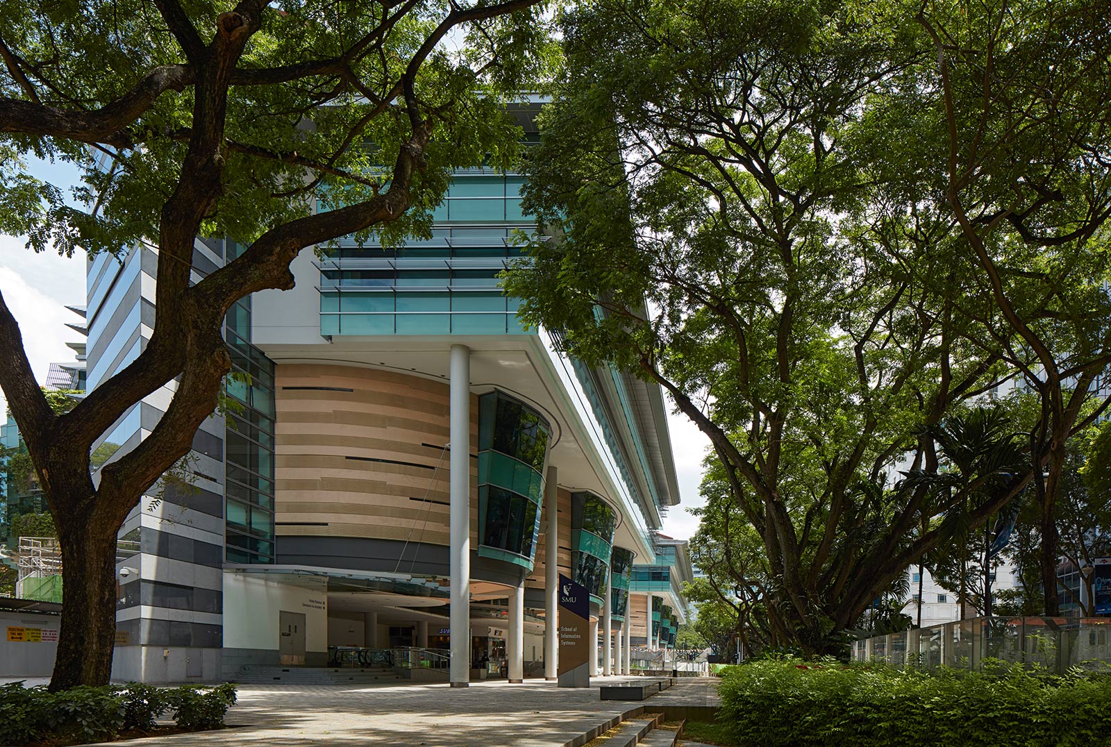
Whether it is a factory or a school, Tan believes all buildings should have spaces for their inhabitants to enjoy. For the Singapore Management University (2005), he created sheltered walkways that provide transparency and breathing space as students and staff get around the city campus.
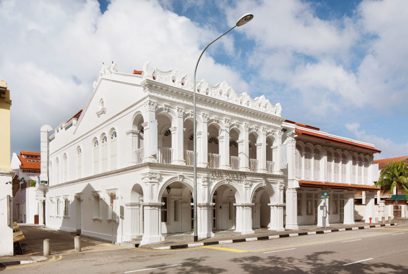
A vibrant city for Tan is one where old and new architecture coexists. This is why he enjoys working on conservation projects. One early example is the transformation of 10 conserved shophouses in Kampong Glam into a boutique hotel, The Sultan. The project, completed in 2011, won the Urban Redevelopment Authority’s Architectural Heritage Awards and paved the way for his firm to take on other adaptive reuse projects.
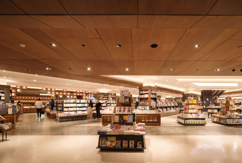
Tan has designed many bookshops in his career. This includes some 37 outlets across nine countries for the Japanese bookstore chain Kinokuniya with the latest to have opened in CentralWorld, Bangkok, in 2022. Every bookshop design is informed by the culture and identity of its locale.
Designer
Bjarke Ingels Group
In collaboration with RSP Architects Planners &
Engineers (Pte) Ltd and Carlo Ratti Associati
DISCIPLINE
Architecture

CapitaSpring is the latest addition to the growing number of biophilic skyscrapers in Singapore. The tower houses over 80,000 plants and its total landscaped area of over 8,400 sqm is equivalent to 140 percent of its site area – a standout amongst its glass-and-concrete neighbours.

The tower takes skyrise greenery to new heights. A 30-metre-tall “Green Oasis” between levels 17 and 20 offers an open-air garden for work, strolls, exercise, and events.

A sleek pinstripe facade runs from the top to the bottom of the tower. On the roof is Singapore’s tallest public observatory deck and an urban farm with over 150 species of fruits, vegetables, and flowers, which are used by the building’s restaurants.
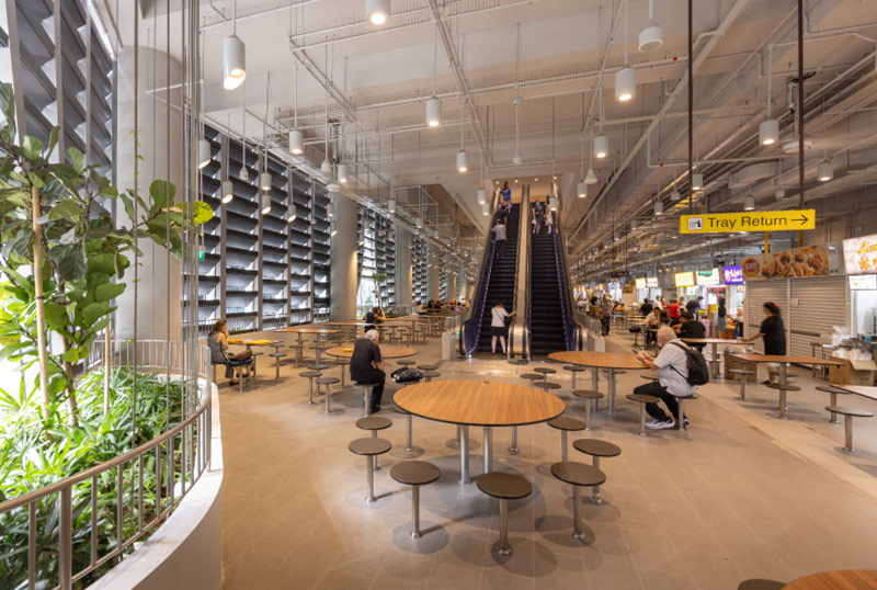
Prior to the redevelopment of the site, the beloved Market Street Hawker Centre sat within the Golden Shoe Car Park. The food centre has been rehoused in the new tower. Many of the original hawkers have returned, enjoying the better ventilation and lighting of the new facility. 56 stalls are spread across the second and third storeys of CapitaSpring.
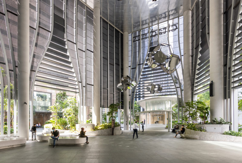
An 18-metre-high “City Room” on the ground floor allows the tower to host events, ranging from fitness sessions to temporary art installations. Within the space are two food and beverage kiosks, and seats which make it a popular hangout spot for the public.
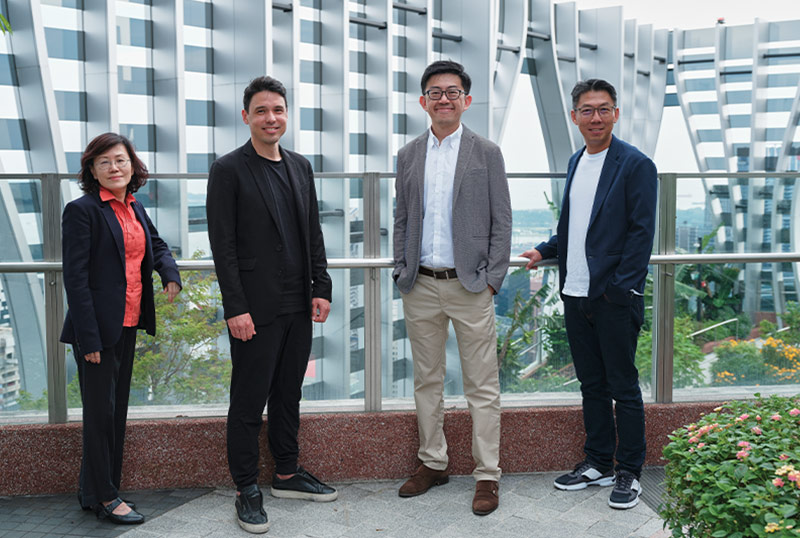
(L-R) Ar. Nina Loo (RSP), Brian Yang (BIG), Lee Yi Zhuan (CapitaLand), and Gregory Chua (CapitaLand).
Designer
Lekker Architects
In collaboration with Lanzavecchia + Wai
DISCIPLINE
Digital Design
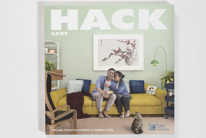
Inspired by the inventiveness of caregivers and their own personal experience, Lekker Architects initiated this toolkit to share ways of adapting and modifying objects and spaces to create a friendlier environment for people with dementia.

A starting point for the project was hacking a chair for care recipients who have lost their mobility. The designers explored a variety of hacks that could allow this piece of furniture to function as a “second home”, including prototyping ways to make it sturdier so that care recipients can stand more easily.

Unlike many existing design guides, which can seem abstract to readers not trained in design, the toolkit is styled like a furniture and product catalogue – enticing and easy to read. It offers practical advice and is accompanied by four do-it-yourself guides on how to hack commonly owned furniture as well as stationery to encourage readers to get started.
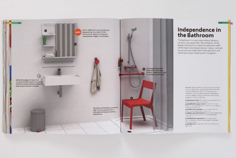
The toolkit encourages readers to see design as something they can carry out for themselves. While explaining key design principles, it offers interventions that are simple to carry out. For instance, to ensure the bathroom is “visually legible” for people with dementia, one can choose contrasting colours for important items such as grab bars.

The “Daily Rituals” section of the guide outlines activities that caregivers can organise throughout the day. For example, they can get care recipients involved in the preparation of meals, using widely available kitchen equipment to ensure the experience is safe and enjoyable.
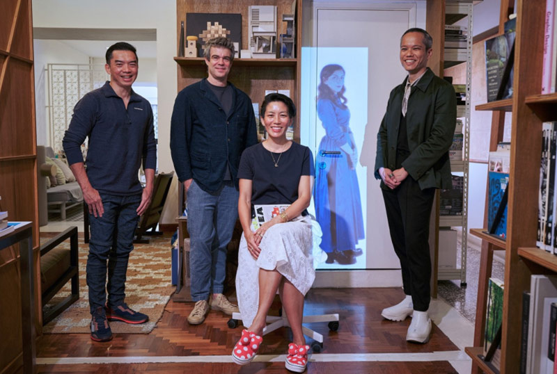
(L-R) Lee Poh Wah (Lien Foundation); Joshua Comaroff and Ar. Ong Ker-Shing (Lekker Architects); Francesca Lanzavecchia and Hunn Wai (Lanzavecchia + Wai).
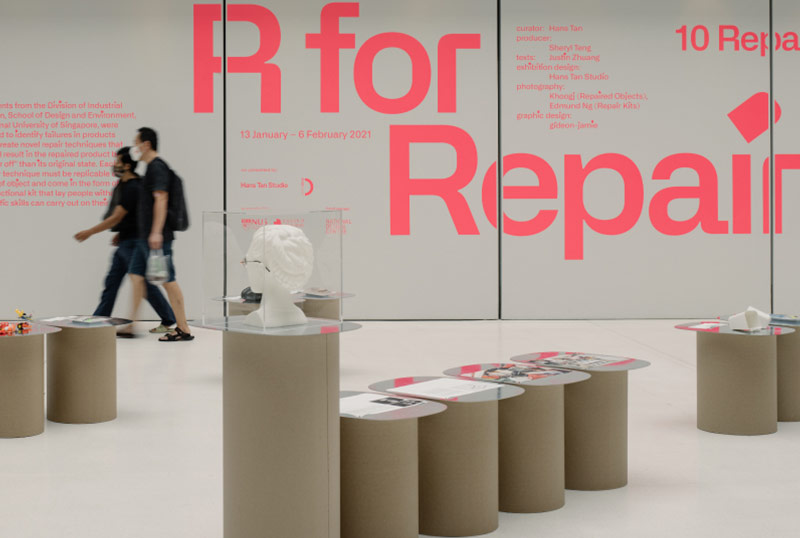
To shift the perception that repair is merely restoration, Hans Tan Studio invited designers to fix broken objects while also demonstrating how repair can enhance the meaning one takes from an object. Design students were asked to develop repair processes that could enhance the objects they were applied to.

The repairs ranged from the practical to the conceptual. Some designers ‘repaired’ perceptions of what ‘broken’ means. For example, Kinetic playfully encouraged the owner of a broken pair of spectacles to adapt her face to the deformed frame. Other repairs restored the function of the objects but added new features.
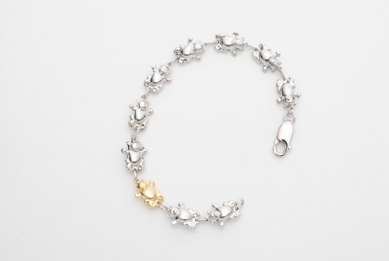
The range of items submitted for repair through an open call to the public included utilitarian objects as well as those with deep sentiments attached, such as a piece of jewellery from childhood (repaired by State Property). Participants were also asked to share stories about the objects to inspire the designers.

Another aspect of the project was an 11-week workshop where design students developed repair kits that created outcomes “better off” than the original. The result was nine repair kits, which facilitated repairs such as ironing graphic patches onto damaged items of children’s clothing, and the transformation of broken and unwanted plastic toy parts into new toy forms.
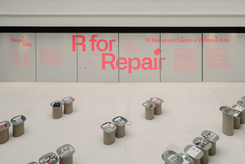
The repair kits were put to the test in a series of public workshops. Kits were mailed to participants who attended virtual sessions guided by the students. The students’ kits and the repairs by designers were showcased at the National Design Centre from 13 January to 6 February 2021.
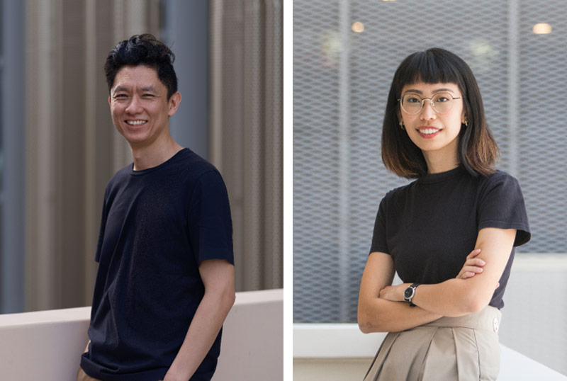
(L-R) Hans Tan and Sheryl Teng.
Designer
WOHA Architects Pte Ltd
DISCIPLINE
Architecture
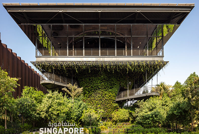
The pavilion and ground garden occupied a 1,550-square-metre site. The large roof canopy, made of 517 solar panels, provided shade while generating power to run the pavilion. Over the six months of operations, the pavilion generated enough energy to power 70 standard households in Singapore for six months.
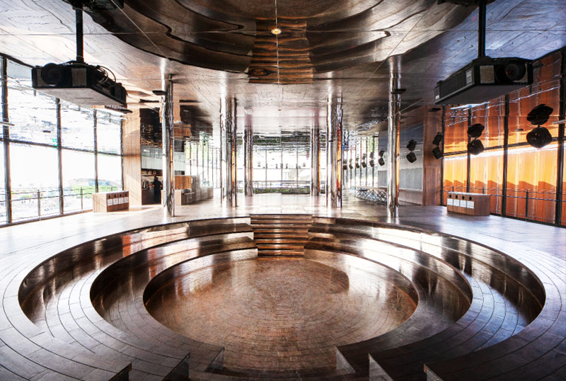
After visitors travelled through the pavilion’s green landscapes, they arrived at a Sky Market where various nodes offered different experiences of Singapore culture. One was a sunken amphitheatre that hosted talks in the day and played Singapore films at night. The elevated deck also allowed visitors to look out to other pavilions and enjoy a light show in the evenings.
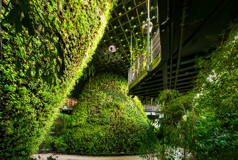
More than 170 varieties of plants were applied not just on the ground and walls but also in a Hanging Garden on the ceiling. They offered visitors an experience of walking through a garden of lush greenery”. The vegetation also removed microscopic PM10 particles from the air, performing at the same level as 2,385 sqm of Dubai’s natural forest would.
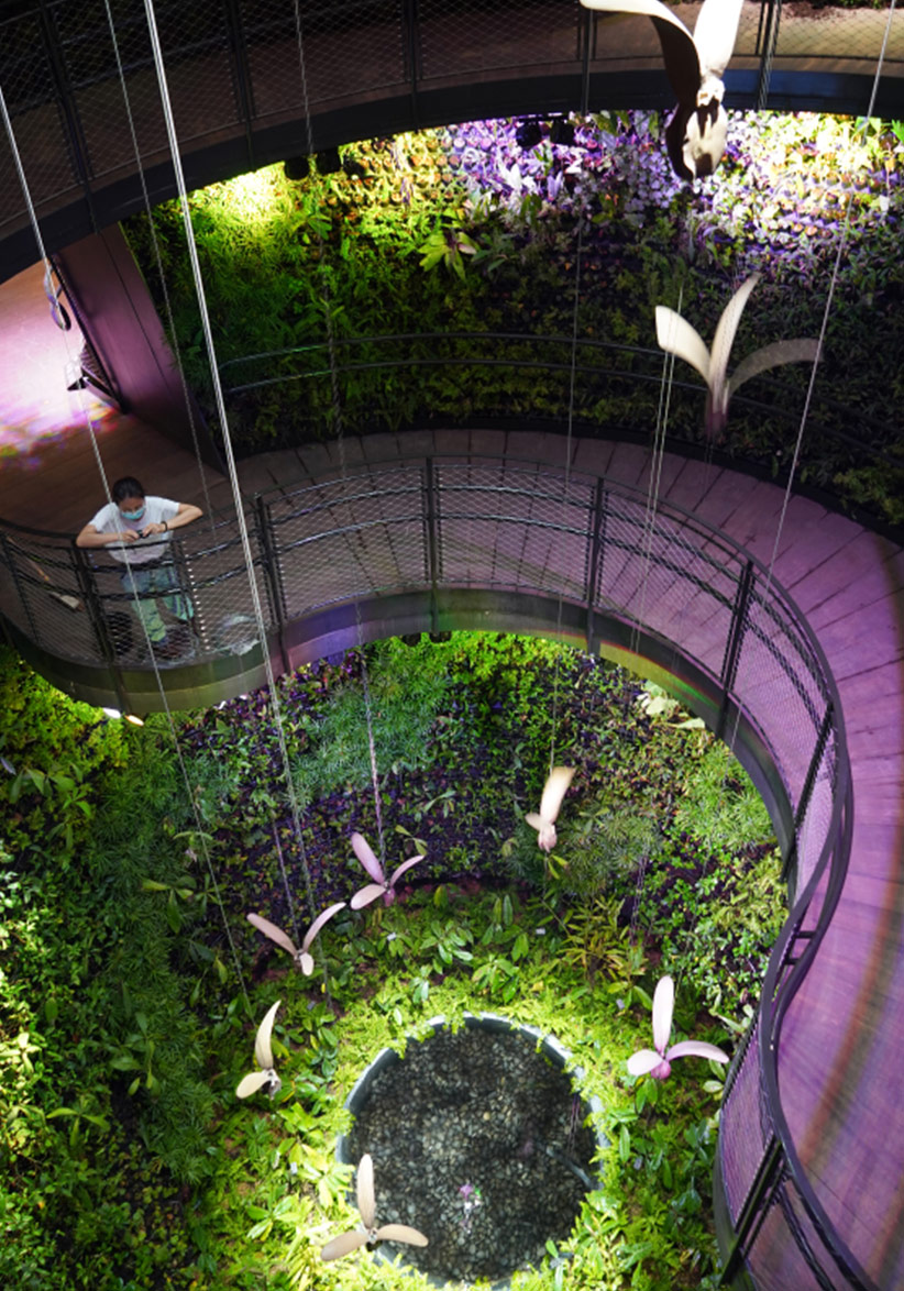
The Rainforest Cone housed various hanging kinetic sculptures inspired by winged seeds from the Dipterocarp, some of the tallest trees in Southeast Asia. The Flower Cone showcased over 50 native orchid varieties. The City Cone showcased a multimedia experience of Singapore’s urban solutions.
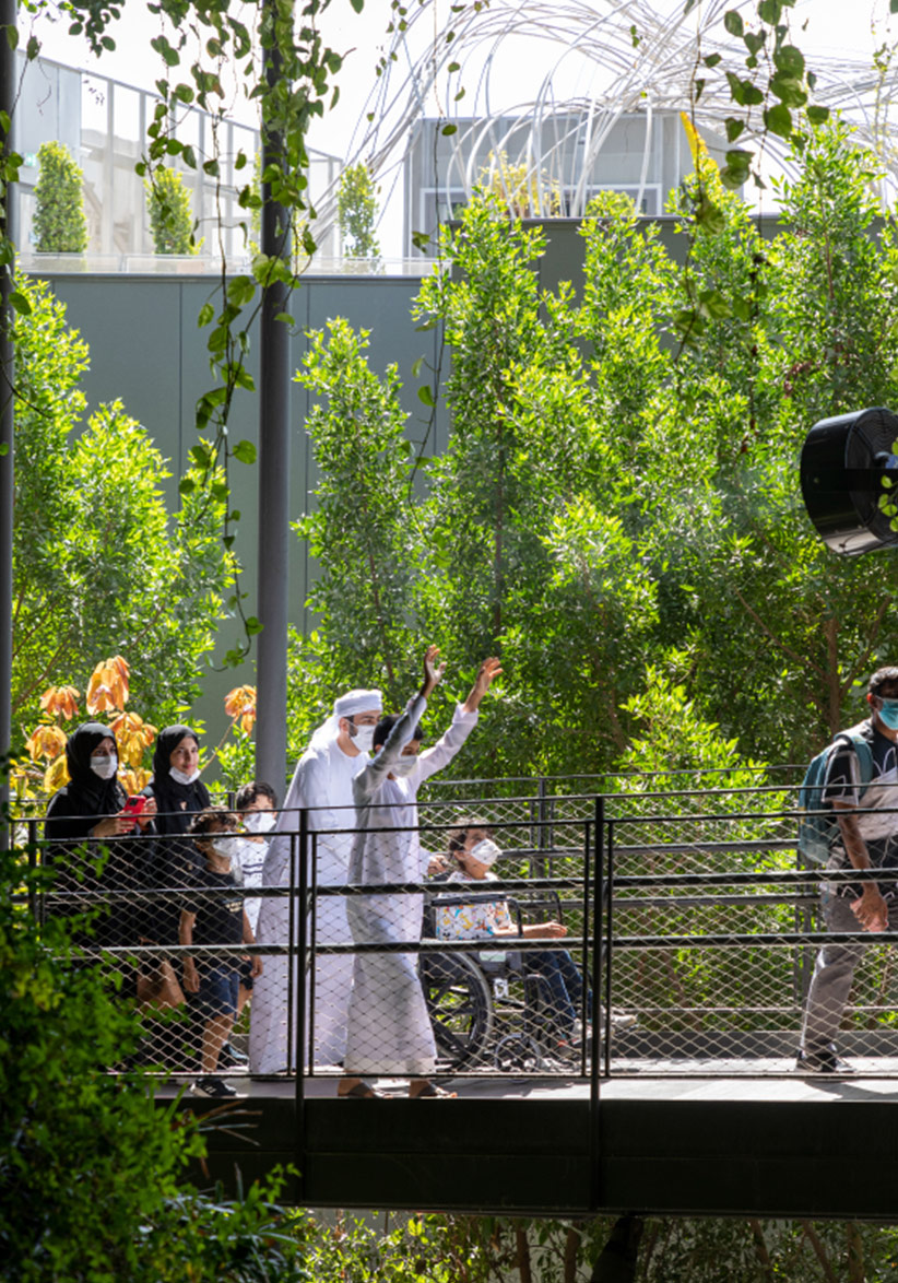
The pavilion adopted a universal design approach and had various inclusive features including a ramp. One of the proudest achievements for the architects was seeing people with and without limited mobility enjoying the pavilion, including some on wheelchairs.
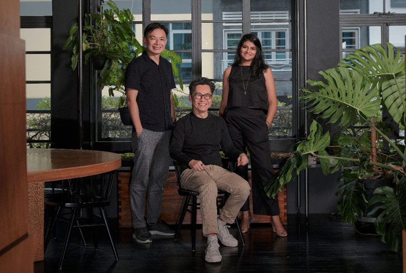
(L-R) Ar. Phua Hong Wei, Ar. Wong Mun Summ, and Shefali Lal.
Designer
Serie + Multiply Consultants Pte Ltd
In collaboration with CPG Consultants Pte Ltd
DISCIPLINE
Architecture
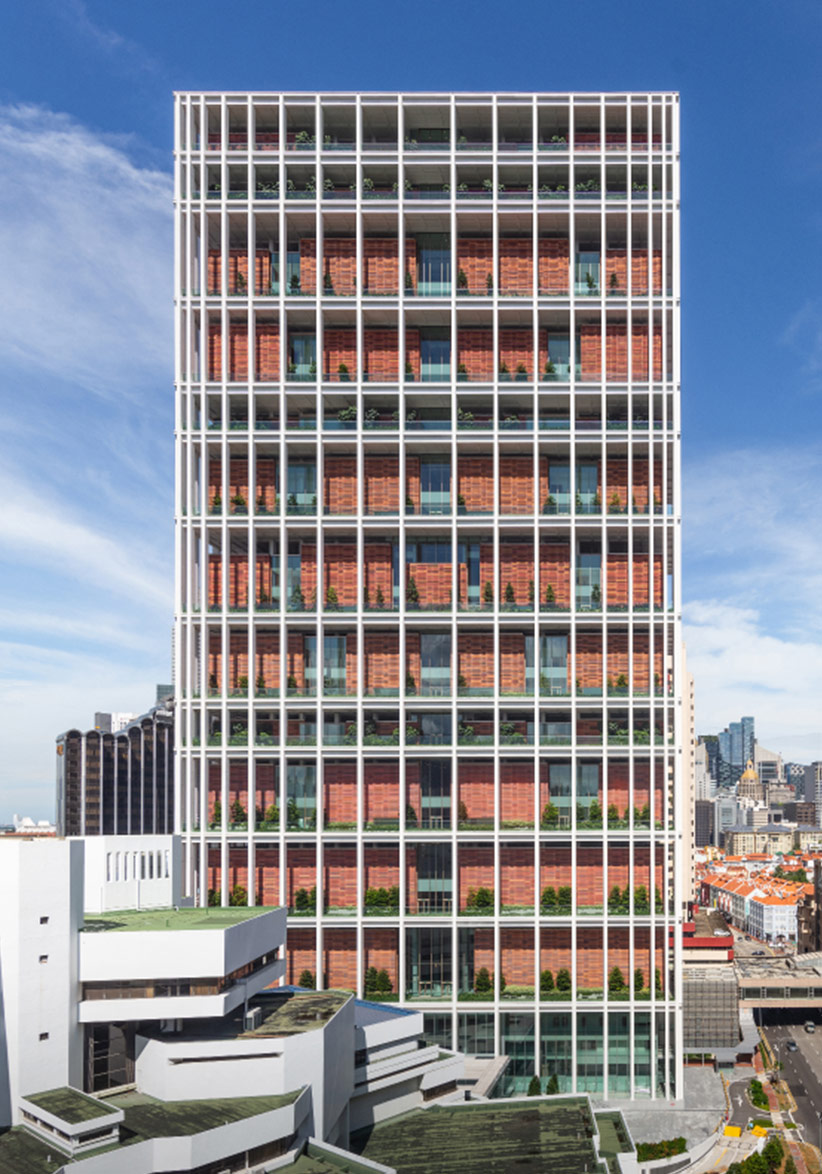
The State Courts Towers adds a much needed 113,000 sqm of additional courtrooms, offices, and ancillary spaces to Singapore’s judicial system. Sitting on the original site of an open-air car park between its former “Octagon” building and the present Family Justice Courts, the trio form an integrated entity that optimises resources for the court services.
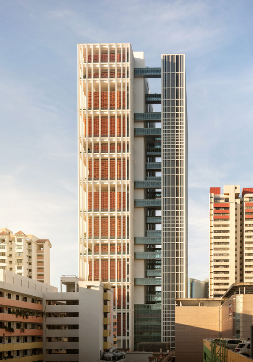
The design was conceived as two towers with clear and separate functions. The publicly accessible courthouses sit on the larger tower, and the other houses the judicial officers. Some 39 link bridges connect the two, providing connections and stability for the structure.
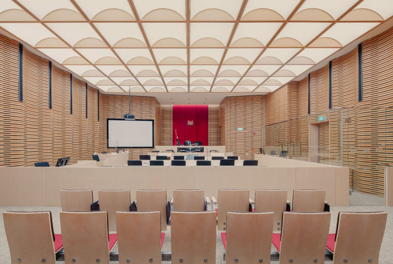
Each courtroom was designed to offer a pleasant experience for all. Acoustic features such as a pitched roof and perforated panels ensure proceedings can be clearly heard. There are easy plug-in points for devices and videoconferencing facilities. Designated accessible counter designs and hearing enhancement systems also ensure the courtroom is inclusive by design.
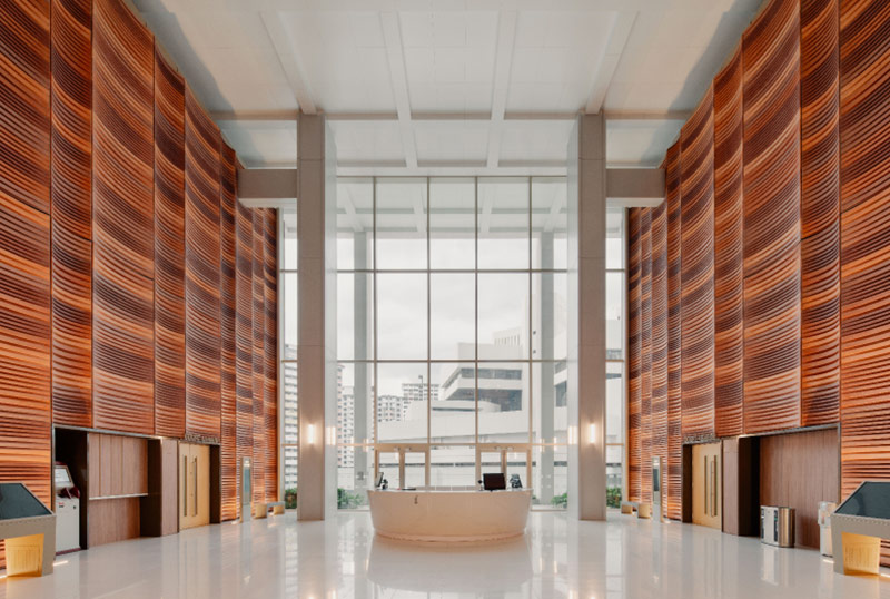
Unlike typical towers, this one has no external glazed facade. Each level houses the courthouses as singular boxes clad with the same wall finishes. Daylight permeates the inner spaces of the building and court users are always conscious of the exterior environment. Together with the lush landscaping on the terraces, this offers a respite from stressful legal proceedings.
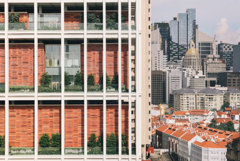
The 178-metre-tall towers relate to their Chinatown site with facades inspired by the ubiquitous terracotta roofs of the surrounding shophouses. This is translated into precast pigmented and stained concrete panels that undulate in size and shade to give the towers a distinct yet familiar look.
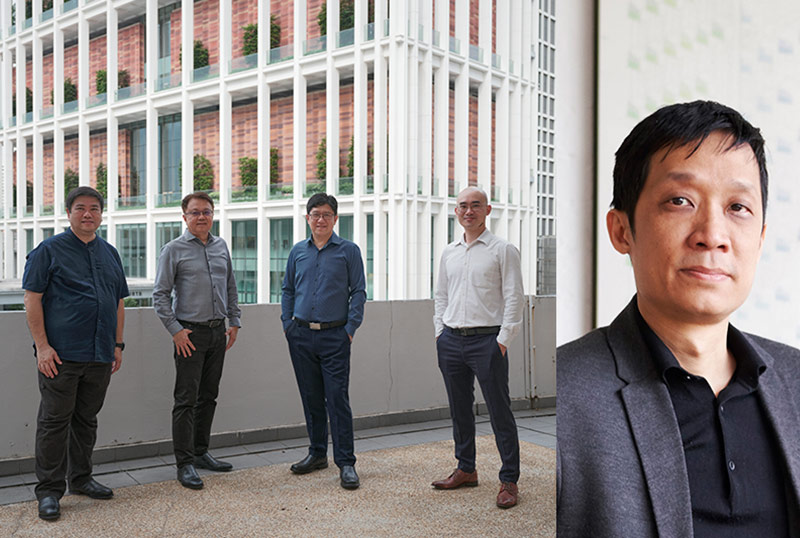
(L-R) Ar. Tan Hooi Ong, Ar. Colin Wu, Ar. Tan Shao Yen, and Ar. Ng Say Chyuan (CPG Consultants); Christopher Lee (Serie + Multiply Consultants).
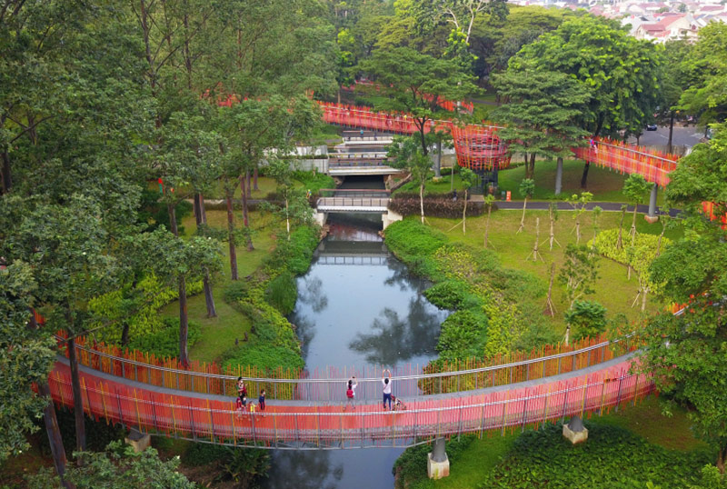
The revitalisation of this ageing park in Tebet went beyond a cosmetic makeover. It was redesigned to be more adaptable to the challenges of climate change and meet the needs of its surrounding community.
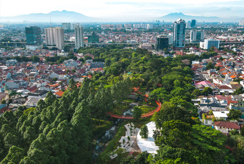
The park is surrounded by a residential area and a commercial street, and was already popular with people. This convinced SIURA Studio of the impact it could make by transforming it into an ecological asset for the city.
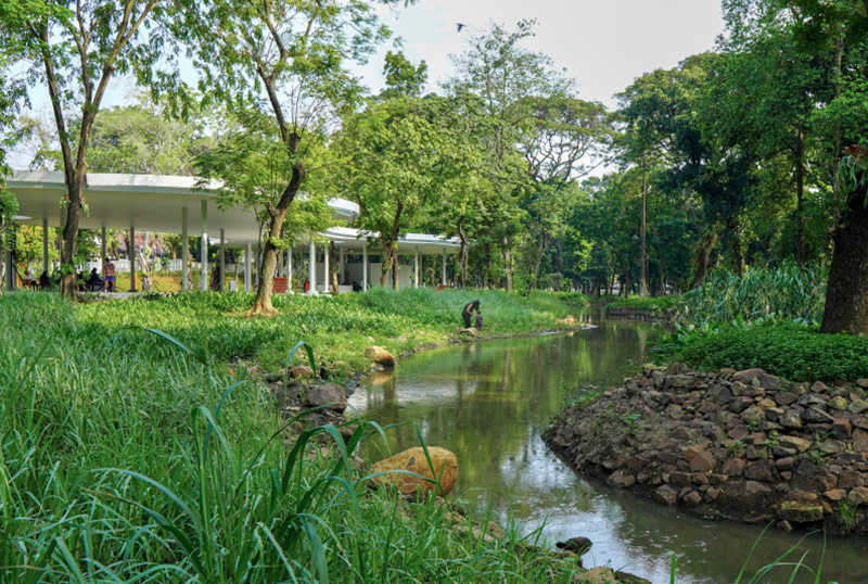
A key project feature was transforming a 714-metre-long concrete canal into a meandering river. This increased its storage capacity and enhanced the park’s ability to better manage runoffs during heavy rains. A more biodiverse ecosystem created along the river also cleans the water and turns it into a welcoming space for visitors and wildlife.
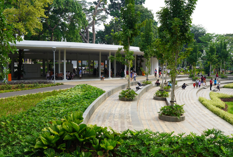
The park was designed with various zones that offer visitors different ways to enjoy nature. Features include an arrival pavilion that houses food stalls; a community lawn for gatherings and events; a wetland boardwalk to get up close with the river; and a playground with equipment inspired by the animals that live in swampy habitats.
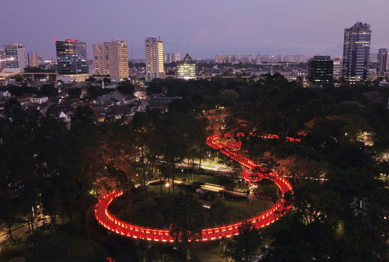
The success of Tebet Eco Park’s ecological design approach offers a shining example of how cities can create new natural assets even as they urbanise.
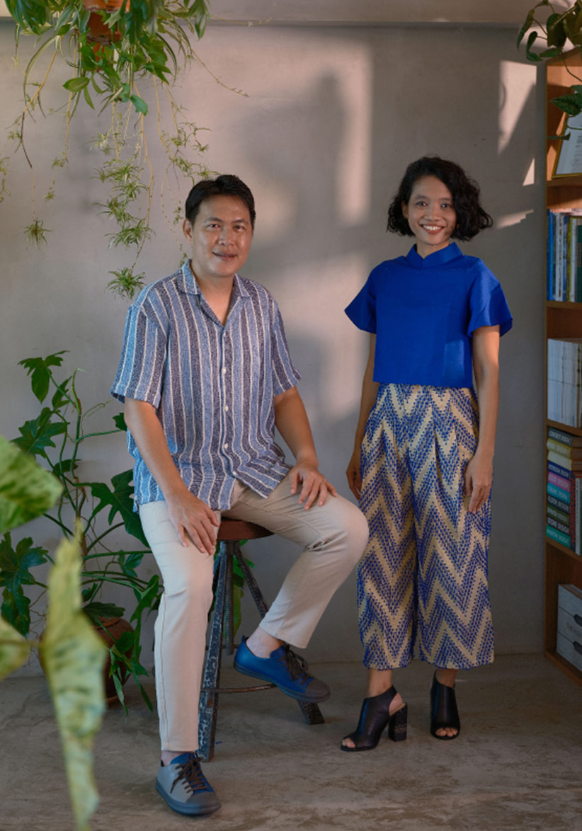
(L-R) Anton Siura and Febrianty Madyansari.
