DESIGN OF THE YEAR 2015
RUBBISH FAMzine Series
Kinetic Singapore
CONTACT
[email protected]
In the two short years since Holycrap launched the first issue of RUBBISH, the magazine has achieved a cult status as much for the quirkiness of the content, as for its extraordinary production values.
Each issue has a print run of just 300, but limited supply is not the reason for the popularity of the FAMzine (yes, the creativity extends even to the product category). The idea itself is an unusual one that appeals across age groups.
“We wanted to put all our unique family memories into print and use the whole creative process as a way to educate our kids about art, design, life and family bonding,” says Pann. “Our brief to ourselves was to document and bring across the idea that expression is a form of art and that it can manifest in many ways.”
Of course, the most obvious manifestation is the magazine’s name. “We called it RUBBISH because it is a common word we use frequently at home. It is a multi-purpose word as we can use it to tease, to scold or praise for example. It’s perfect for us as it is whimsical and nonsensical, very much like our family.”
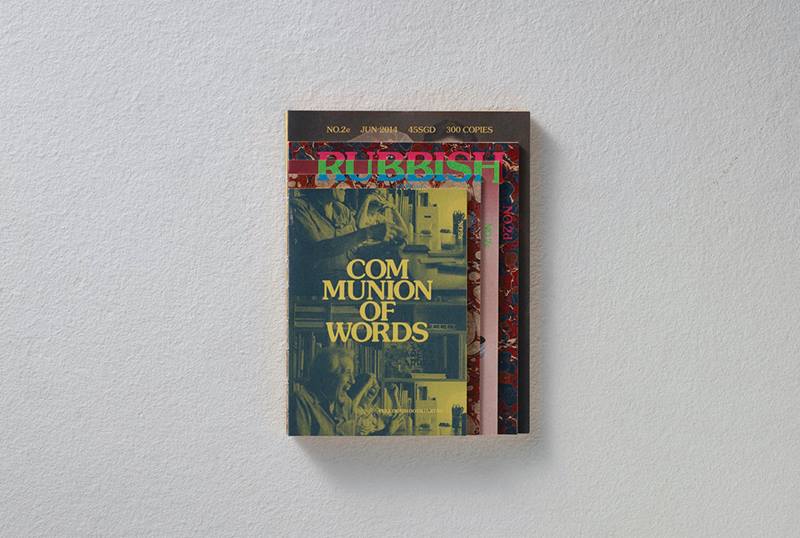
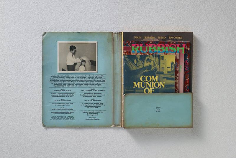
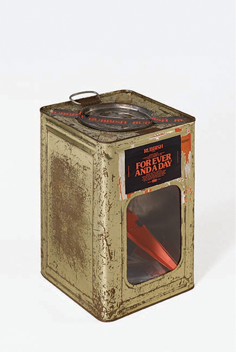
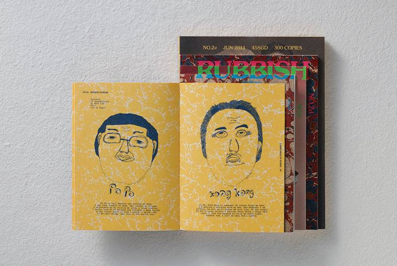
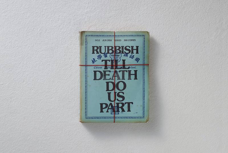
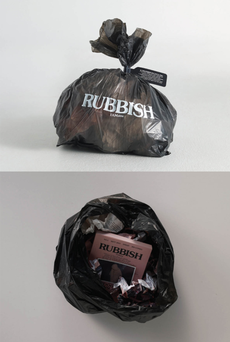
Each bi-annual issue has the same 15 by 20cm format, but the packaging varies wildly. The first issue was sent out in, literally, a rubbish bag; the second in a vintage school folder; and the third in a tarnished, battered biscuit tin.
The labour involved is daunting. Each issue takes between five and seven months to complete, from brainstorming, writing and layout to design, production and printing. Everything is handmade in the sense that photos are individually inserted by hand, containers individually sourced, and folders individually hand-weathered.
Each issue has its own challenges because, as Pann points out, “we make it a point to make every issue different, but, at the same time, without losing the essence and DNA of the FAMzine. We treasure the concept and ideas that go into every issue. This makes it difficult at times because what is beautiful might not be strong in idea and vice versa. So the art of curating what goes in becomes critical.”
But more than that, RUBBISH is a unique distillation of experience seen through the lens of what Pann calls our ‘rojak’ multi-cultural DNA. In other words, the magazine is very much a product of its place. “Living in Singapore has influenced us greatly in our stories for the ’zine,” Pann says. “We are proud Singaporeans living in Singapore and we want to bring up our kids loving Singapore the way we do.”
About the Designer
If there is any lasting observation to be made about the Lim family, it is this: the family that designs together, stays together.
Pann Lim, his wife Claire, and their children Renn, 12, and Aira, 9, are the creative minds powering the family art collective, Holycrap – itself set up to share the family’s stories, document their explorations and experiences in a way that goes beyond the quotidian family scrap-book.
Holycrap’s headlining product, RUBBISH FAMzine, ticks all the boxes and more – a chaotic, lively, visually engaging bi-annual magazine filled with an equal mix of wit, nostalgia and high production values that has touched a chord with readers.
“We want the FAMzine to document and explore subjects, experiments, travels or other strange exploits that interest us as a family,” says Pann. “It should not come across as too contrived or clichéd.”
There is no danger of that happening. The creative values are too obvious. It certainly doesn’t hurt that the collective – a labour-intensive, family project run out of the Lims’ home – is led by Pann whose day job is creative director of Kinetic Singapore and who was also a laureate of the President’s Design Award 2013 for Designer of the Year.
What’s more, the family collective is exactly that. Everyone is involved. “Renn and Aira are full-time pupils,” says Claire, “so, the time schedule is always worked around their time-table. And Pann’s working hours are also very long, so we can only talk about our projects when we go out during the weekends, or when we are sending the kids to school. Even small pockets of free time in between our schedules are not left unused. We make use of any available time to make the project happen.”
“We are very fortunate that the four of us are in this together,” Pann adds. The whole family brainstorms, shares ideas and thoughts. Twice a year, our home becomes a factory line. It’s messy, but we wouldn’t have it any other way.”
DESIGNER
Kinetic Singapore
Pann Lim
IN COLLABORATION WITH
Holycrap.sg
Claire Lim
Renn Lim
Aira Lim
Pann Lim
DESIGNER
Kinetic Singapore
Pann Lim
IN COLLABORATION WITH
Holycrap.sg
Claire Lim
Renn Lim
Aira Lim
Pann Lim
1RUBBISH FAMZINE SERIES
Folder and publication of Issue #2
Till Death Do Us Part
2RUBBISH FAMZINE SERIES
Folder and publication of Issue #2
Till Death Do Us Part
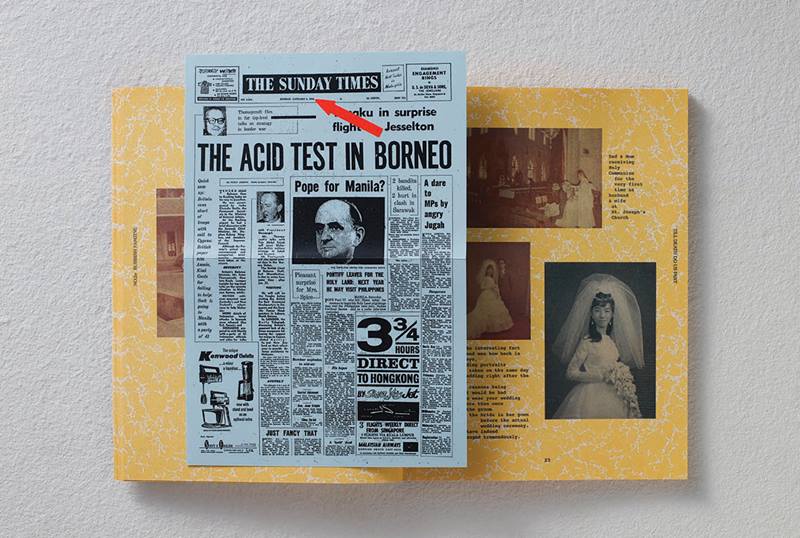
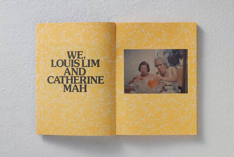
4RUBBISH FAMZINE SERIES
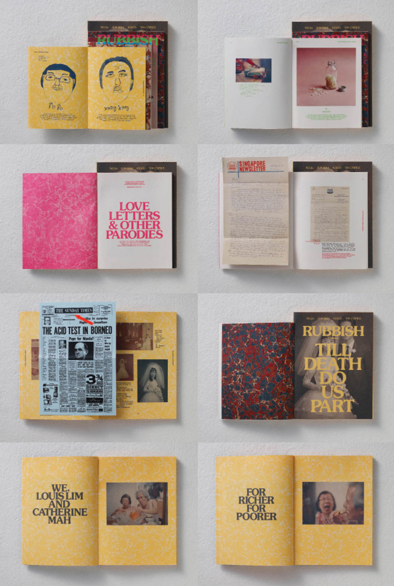
Spreads for Issue #2
Till Death Do Us Part
5RUBBISH FAMZINE SERIES
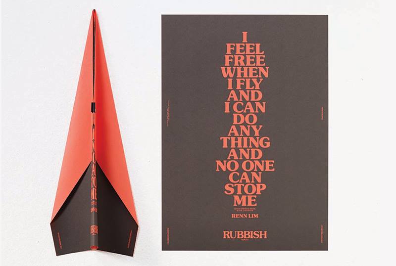
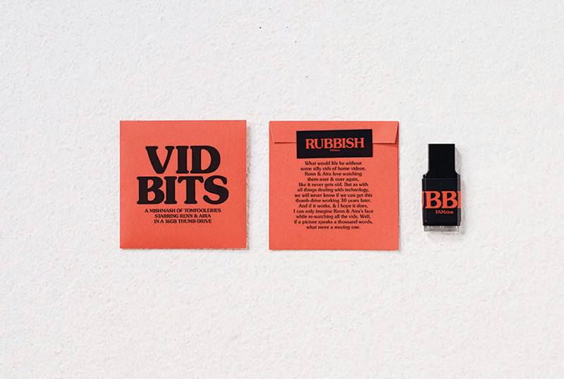
Packaging and memorabilia for Issue #3
Forever and A Day
7RUBBISH FAMZINE SERIES
Packaging for Issue #2
Till Death Do Us Part
16RUBBISH FAMZINE SERIES
Memorabilia for Issue #3
Forever and A Day
22RUBBISH FAMZINE SERIES
Memorabilia for Issue #3
Forever and A Day
23RUBBISH FAMZINE SERIES
Biscuit tin packaging for Issue #3
Forever and A Day
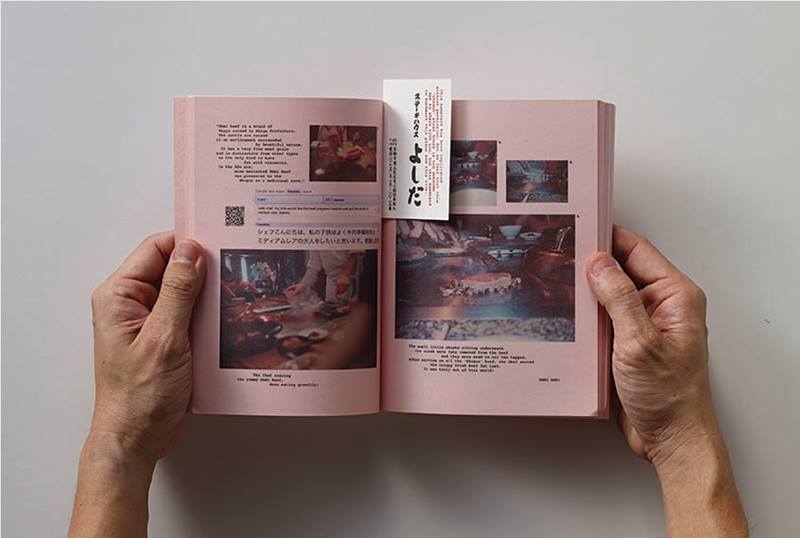
25RUBBISH FAMZINE SERIES
Spreads from Issue #1
Google Translating Tokyoto
26RUBBISH FAMZINE SERIES
Spreads from Issue #1
Google Translating Tokyoto
27RUBBISH FAMZINE SERIES
Variations of cover for Issue #1
Google Translating Tokyoto
28RUBBISH FAMZINE SERIES
Packaging for Issue #1
Google Translating Tokyoto
Insights from the Recipient
Pann Lim: I believe one of our duties is to ensure that every project we put out is of an international standard. Only in this way do we raise the collective benchmark of design. Every single issue of Rubbish has won major international awards, and we want to continue to contribute to Singapore’s design scene by pushing creative boundaries. And to be able to do this as a family is truly a blessing. We hope we can encourage and even inspire other families to working together on anything that they love.
Citation
Jury Citation
Nominator Citation
KENNY LECK
BOOKSELLER
BOOKSACTUALLY
RUBBISH FAMzine, a mash-up of ʻfamilyʼ and ʻmagazineʼ, is both a creative project and a passionate pursuit for the Lim family: a father and a mother – both designers – and their young son and daughter. It is original in concept, daring in design and detailed in execution. Three issues have been produced so far. Each takes a different form: a travelogue of a family holiday in Tokyo; a file folder containing reproductions of vintage photos and love letters; and a traditional biscuit tin that’s used as a time capsule of sorts to hold a family’s memorabilia.
The final expressions are as remarkable as they are surprising. RUBBISH FAMzine is, however, much more than a design project. It is an endeavour of two parents and their children to showcase a contemporary Singaporean family that is living life meaningfully, purposefully and creatively. It demonstrates and encourages familial bonding and values, tradition and heritage. Because the Lim family wears its heart on its sleeve in sharing with the reader (or viewer) its family life experiences, the narrative is first-hand and textured. Expressing the content through design enriches the stories.
For its exceptional, inspiring and holistic design concept, the Jury is unanimous in awarding Design of the Year to the RUBBISH FAMzine series.
I nominate RUBBISH FAMzine Series for the President’s Design Award. There are, to date, three issues of the magazine: issue #1 Google Translating Tokyoto; issue #2 Till Death Do Us Part; and issue #3 Forever and A Day. With every issue, the underlying thread that binds them together is the essence of family and kinship. The main focus is on the Lim family, Pann (42), Claire (41), Renn (12) and Aira (9). This is also why the publication is called a famzine, rather than a magazine.
As a reader, one comes away with the important message that ties really do bind, whether in life-threatening situations or in mundane, everyday living. The message is carried through to the design concept of each issue. Issue #3 is contained in a vintage biscuit tin that doubles up as a time capsule. Issue #2 was designed to resemble a file folder that serves as a documentation of memories, and a reference to family roots. Issue #1 takes the form of a travelogue that chronicles the family’s trip to Tokyo. It is a record of their daily adventures, using Google to translate the Japanese language into English and help them navigate across the city, including mishaps, fun times and endless surprises that only a family travelling together can experience.
What resonates with the reader most strongly is not just the design concept, but also the message and the way it is delivered by the narrative. Through the medium of design, the reader’s senses are ʻmassagedʼ to reveal the message in its clearest terms. This is the essence of the magazine’s design. It captures the attention of the human senses and, with it, the message is understood. In the process, new insights are made.

