* DESIGN OF
THE YEAR 2011
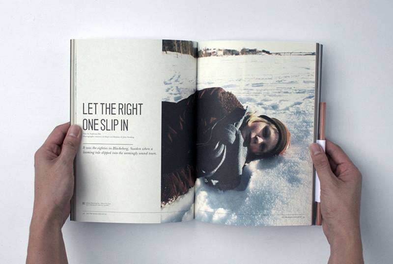
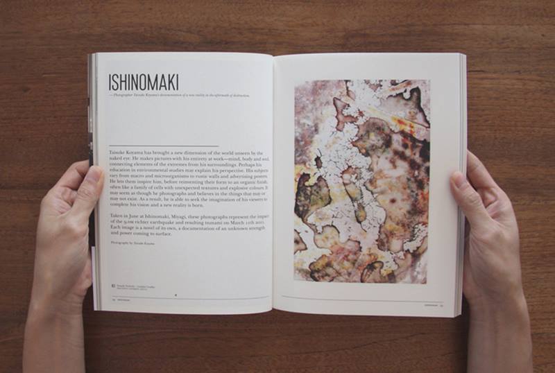
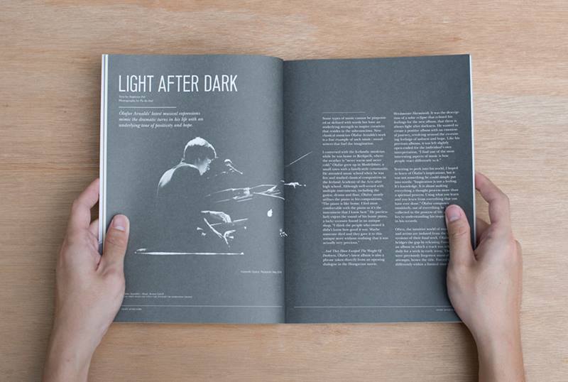
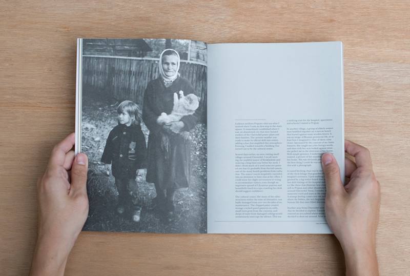
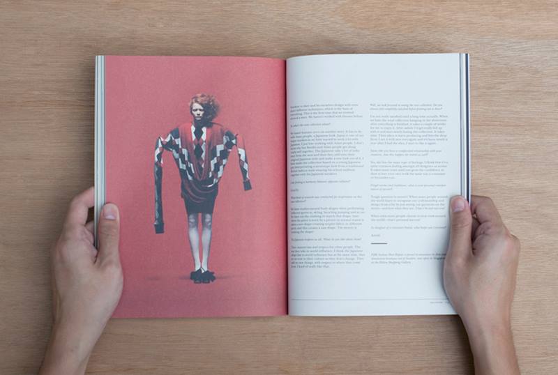
This magazine, as its name suggests, seeks to underline important values that are neglected in our everyday life. Launched in October 2009, this annual publication was conceptualised and produced entirely by Hjgher. It features a wide range of content about arts, culture, fashion, design, and the creative industries from around the world.
“We love print and we couldn’t find a magazine that resonated with our beliefs,” says Mr Justin Long, Hjgher’s creative director. “So, we did it ourselves.”
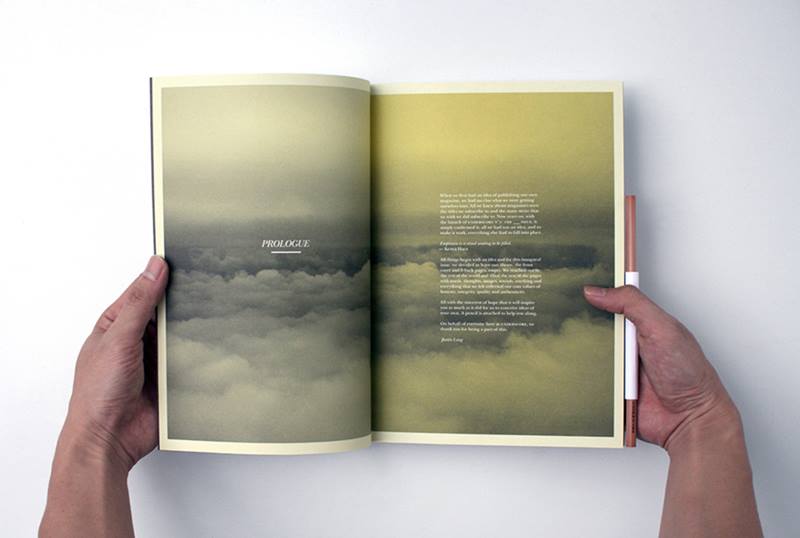
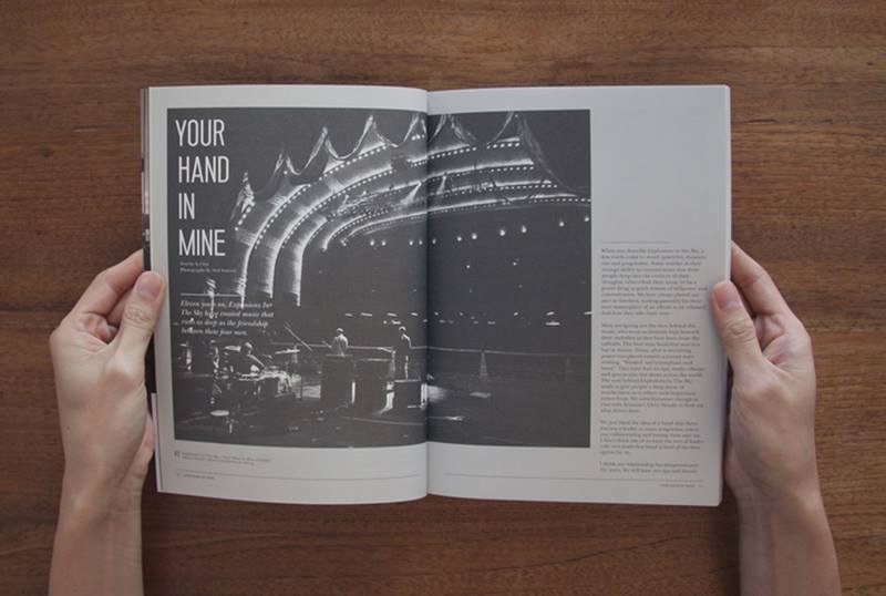
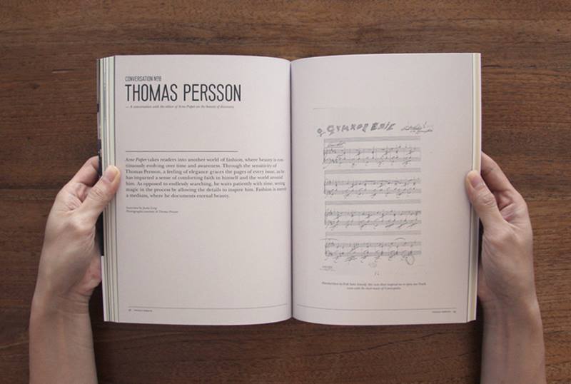
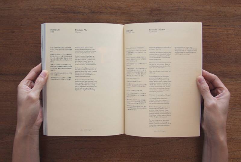
The magazine is designed to be sensitive to the reading experience. It is a convenient size to carry around, and made of an appropriate paper stock that was chosen for its texture, weight and readability. The magazine also has a customised typeface to represent its content. Each issue’s layout is designed to be clean, with minimal advertising to disrupt the flow of reading. As another definition of ‘underscore’ is background music, each issue also comes with a carefully selected soundtrack to complete the reading experience.
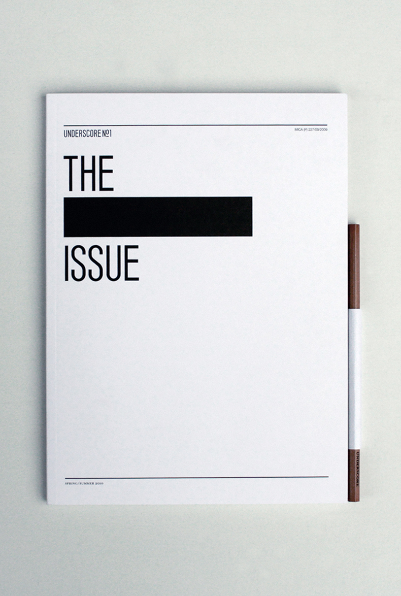
Its inaugural issue, UNDERSCORE N°1: THE ___ ISSUE, explored the theme of “emptiness”. The cover and six back pages were deliberately left empty to communicate this message. The magazine also came with a pencil attached, turning it into a journal where readers, inspired by the content, could pencil in their own ideas.
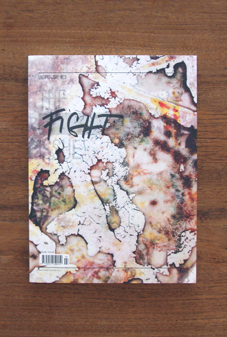
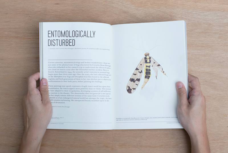
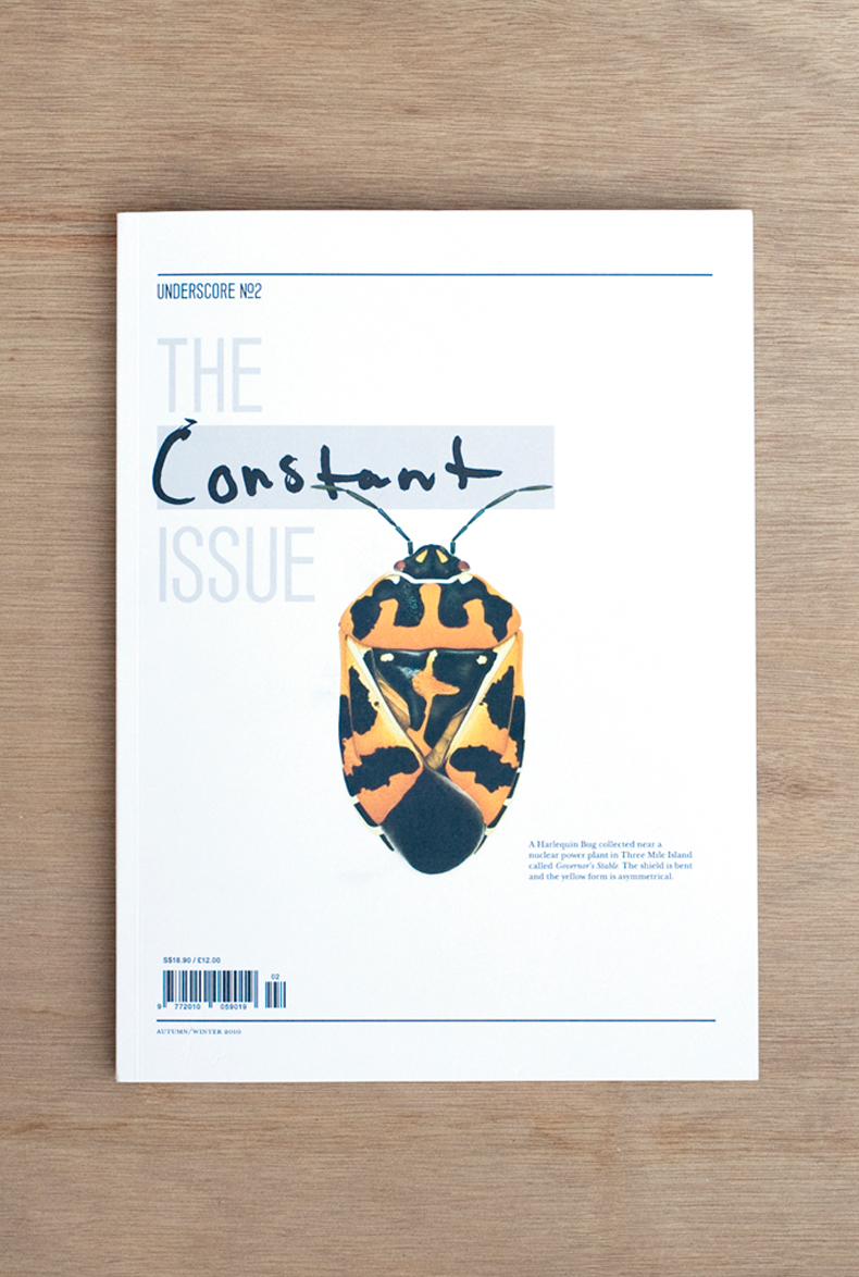
For its second issue, Underscore was inspired by the Japanese’s notion of wabi sabi, and looked at three simple truths: nothing is perfect, nothing lasts, and nothing is finished. On the cover of UNDERSCORE N°2: THE CONSTANT ISSUE was a deformed bug, a victim of the Chernobyl nuclear accident, that symbolised beauty in devastation. As part of this issue, Underscore also collaborated with bespoke bicycle-makers, Vanguard to produce a one-off series of four bicycles inspired by the theme. This was the first of future collaborations with other creatives as part of “THE U STORE”, with all items curated by Underscore.
“At Hjgher, we seek to create new experiences through any medium, be it print, interactive or a physical environment,” says Mr Long. “With Underscore, it was through the medium of print that we sought to break preconceived notions of what a magazine should be.”
While it was challenging to build a community of people involving advertisers, distributors, photographers, artists, and readers who shared Underscore’s beliefs, Mr Long and his team persevered because they wanted to “break old rules and justify new ones” with this magazine.
Since its launch, Underscore has won international design awards and garnered attention from around the world. Through the magazine’s cross-cultural themes, Underscore hopes to build a global community of like-minded individuals and encourage a life worth living.
READ MORE
ABOUT THE DESIGNER
Hjgher was set up in 2006 by Justin Long and Jerry Goh, who have backgrounds in behavioural studies and design. It practises “Design Psychology”, the science of how design form and function affect human behaviour, cognition and emotions.
The studio seeks to create new experiences in any medium, and although it counts a list of multinational companies as clients, it enjoys working with startups like fashion label Lauren Jasmine, cafe cum menswear retail store Maison Ikkoku, and Kith Café.
READ MORE
DESIGNER
Hjgher
Justin Long, Creative Director
Jerry Goh, Art Director
Stephanie Peh, Designer
Jovian Lim, Photographer
Insights from the Recipient
Citation
Jury Citation
Underscore is a magazine you want to read. It is emotional, it has depth, it has a heart. You want to feel it, open it, and devour it — voraciously. Not only is the magazine well-balanced, with good design and thought-provoking articles, the contents are outstanding. It is not your runof- the-mill magazine; it is a labour of love.
Sign us up! We want to read every issue.
VIEW JURORSNominator Citation
BENJY CHOO
CREATIVE DIRECTOR
KILO STUDIO PTE LTD
A magazine presented to the public in its purest form, with uncoated paper and minimal front covers, Underscore is an extension of the reader who decides to pick it up. This is a rare quality in a world dominated by glossy and large format editions. It is a magazine of its own kind that encourages the values of honesty, quality, authenticity and integrity.
With easy access to content, given the rising capabilities of digital media, people are being overloaded with unnecessary information. As a result, many values are lost in today’s society. Underscore goes beyond the surface of every story, critically selecting content to present readers with a substantial compilation. The valuable lessons injected in the content of Underscore are reminders of what is important. It is a conscious publication that questions its readers on their quality of life, posing optimistic alternatives.
While its design serves as a backup for its content, Underscore‘s minimalistic design approach stands out against the overly designed brands, posters and publications today. This is a reminder of the purpose of design, as solutions to problems, and holistic considerations are required when questioning what is necessary for a piece of work. Underscore is a good example for aspiring students to learn about a wideranging approach in editorial design.
While there are thousands of independent titles across the world, it is heartening to see a homegrown publication mentioned on internationally-acclaimed blogs, and seated amongst world-class magazines, and inside bookstores and exhibitions. This is a well-deserved and impressive achievement within just two years of its release.
It is a right step for a local design agency, a bold step to engage beyond the local boundaries. Underscoer marries content, art, design, and makes it relevant not just locally, but on the global stage as well.
