DESIGN OF THE YEAR 2011
1000 Singapore A Model of The Compact City
CONTACT
[email protected]
This exhibition represented Singapore at the 12th International Architecture Exhibition (La Biennale di Venezia) held between 29 August to 21 November 2010 in Venice, Italy. It was conceptualised and created by a multidisciplinary team for the DesignSingapore Council and the Singapore Institute of Architects (SIA).
In response to exhibition curator Kazuyo Sejima’s theme, People meet in architecture, the team decided to showcase Singapore as a model of a compact city, postulating that “1000 Singapores can house the entire world’s population using only 0.5 per cent of the Earth’s land area”.
“We wanted the exhibition to be a thought model: to imagine and think through novel ideas of densities, inhabitation, architecture, planning, ecology and environment, and how settlement patterns impact the world we live in,” says the design team.
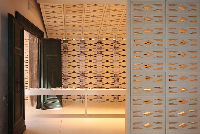
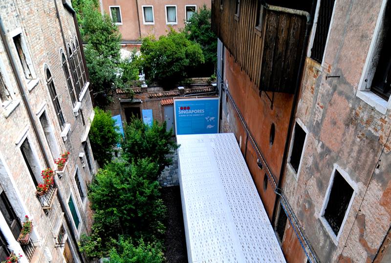
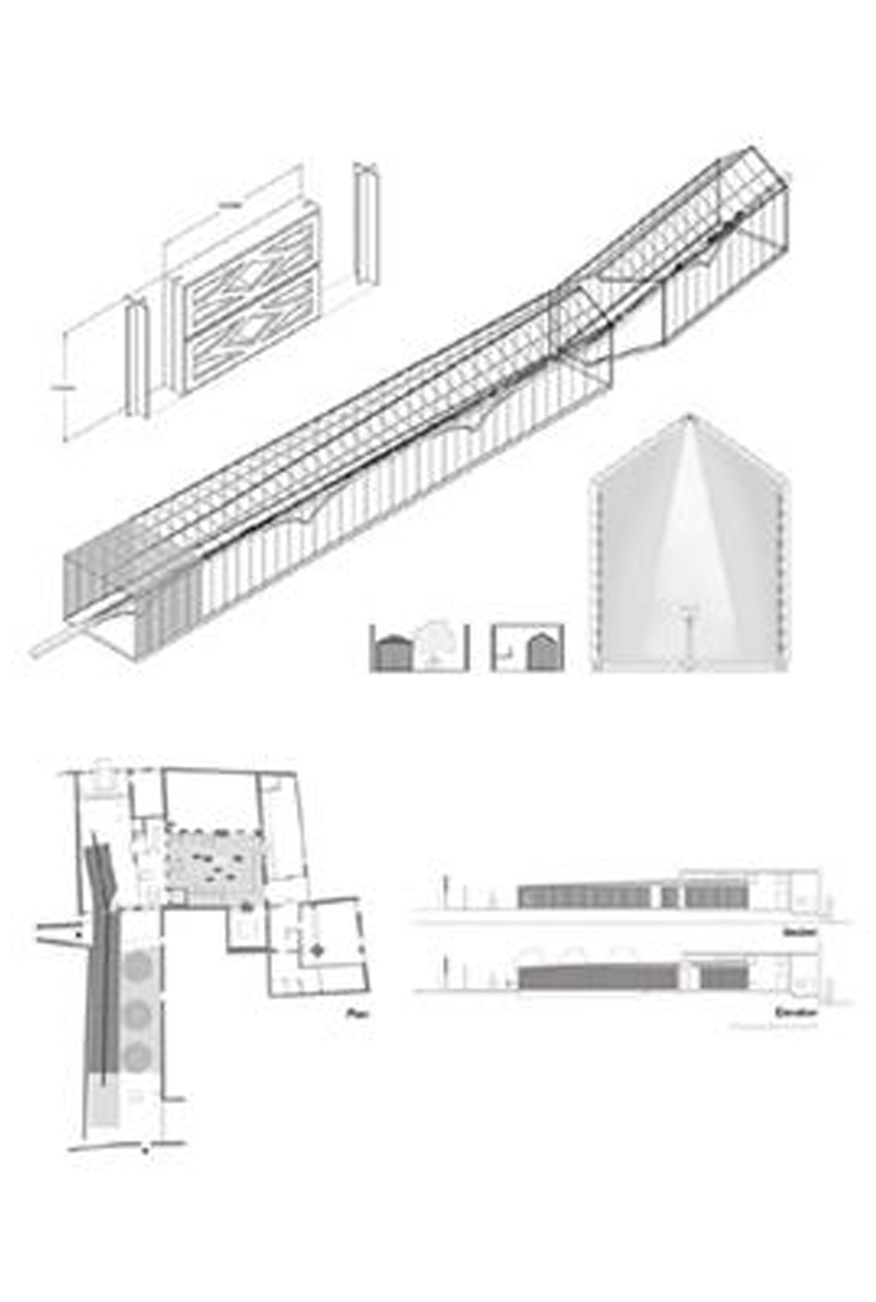
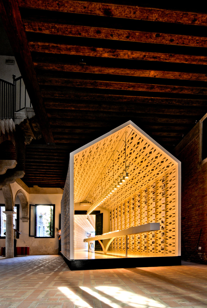
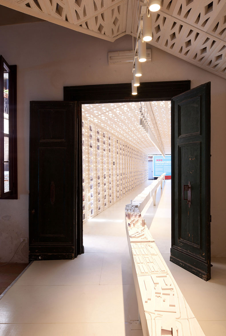
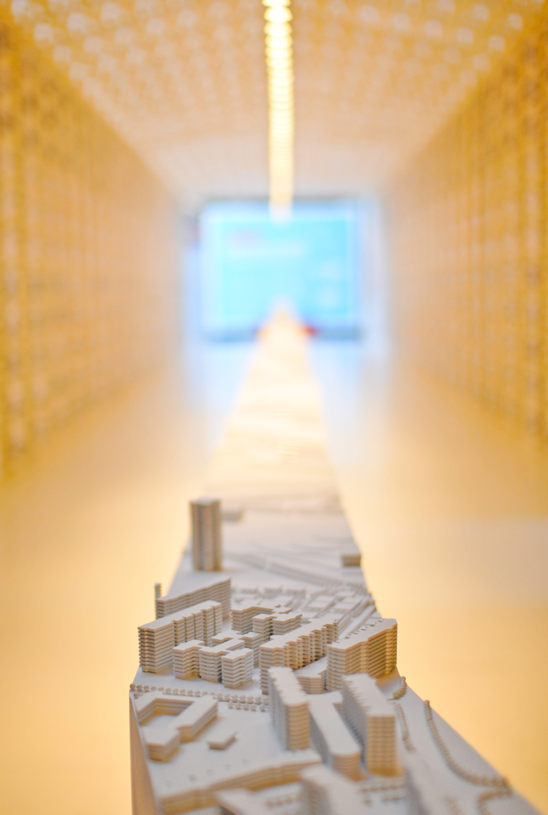
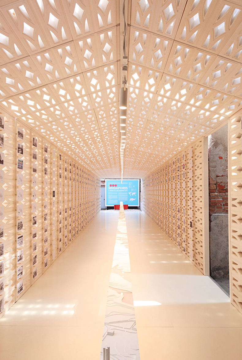
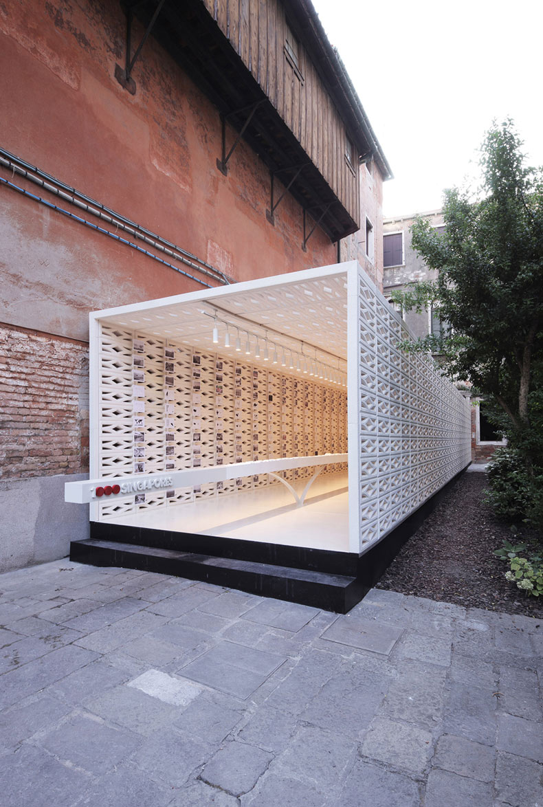
1000 Singapores put together a thousand architectural diagrams and images around a 35-metre long scaled model of a section through the length of Singapore from west to east. This showcased the citystate’s people and its varied urbanscape, including industrial estates, public housing, financial district and nature reserves. The images and the model were housed in a tube made up of a thousand components inspired by the vernacular ventilation blocks found in traditional shophouses. The tube began as a rectangle and changed into a profile of a house with a pitched roof, corresponding to Singapore’s public to private housing ratio of 83 per cent to 17 per cent. A book and an interactive website were also created to complement the exhibition.
The overall design aimed to showcase Singapore in a calm, academic manner, yet highly accessible to a larger audience. The presentation mode was also deliberately kept analogue, instead of making use of extensive digital technology. The design team explains: “This choice of presentation style is by design, in counterpoint to the often loud, technologically exuberant exhibitions that seemingly obscure the complexities of the topics at hand.”
Its biggest challenge in designing this exhibition was the short time-frame. It was fortunate that its members were “passionate, diligent and committed” to see this project come to fruition in just a matter of weeks. To aid the process, the team made use of existing research done by the staff of the National University of Singapore (NUS) and also enlisted the help of its students. “In some ways, time forced us to be extremely focused, direct, and clear,” says the team. “Without which, the exhibition would have never made it to Europe.”
Another challenge was figuring out how to ship the exhibition to a relatively restricted site — a renaissance palazzo in Venice. The team used the limitations in dimensions and weight as references for its design. For example, using the floor-toceiling height of a typical public housing interior helped create a modular dimension that would fit into a shipping container. The custom ventilation block was also crafted out of a lightweight recyclable material so it could be easily moved around, and allowing the exhibition to return to Singapore to be recycled.
The project would not have been successful without the collaborative spirit of its clients and their constant feedback. “As an experiment of thoughts, 1000 Singapores was direct, bold, and might even be controversial,” they say. “However, with the support of, and the in-depth discussions and feedback from DesignSingapore Council, SIA, NUS, Housing & Development Board and the Urban Redevelopment Authority, we were able to test and refine the exhibition direction and make it accessible to an international audience.”
The team would also like to add that 1000 Singapores was inspired by the city-state’s many layers and faces, an attribute unique to it. “Singapore is full of places, things and ideas, many of which are hidden, requiring exploration, curiosity, and thinking,” they say. “This sense of discovery and uncovering is a wonderful value Singapore possesses; it is where ‘people really meet in architecture’.”
About the Designer
The curatorial and design team was led by a cosmopolitan mix of professionals in Singapore. Malaysian-born architect Khoo Peng Beng, and Singapore architect Belinda Huang run arc studio architecture + urbanism. They were the recipient of the 2010 President Design Award – Design of the Year for its public housing project, The Pinnacle@Duxton.
From NUS’s Department of Architecture are Assistant Professor Erik G. L’Heureux and Assistant Professor, Florian Schaetz. Assistant Professor L’Heureux, an American architect, researches hydrology, density, and urban form in Asia while coordinating the second year architecture design curriculum. Assistant Professor Schaetz, a German architect, examines materiality, technology, and develops new solutions for eco-resorts and the aviation industry while running the first year architecture design course.
CURATORIAL AND DESIGN TEAM
Khoo Peng Beng, Head Curator
Belinda Huang Wan Jing Agnes, Curator
Assistant Prof Erik G. L’Heureux, Curator and Designer
Assistant Prof Florian Schaetz, Curator and Designer
GRAPHIC DESIGN
H55
Hanson Ho, Creative Director
ADDITIONAL DIAGRAMS AND PHOTOS
Owen Lam
Prime Tambayong
Wong Rouwan
COLOUR PHOTOGRAPHS
Jing Quek
CONTRACTOR
Kingsmen Exhibits Pte Ltd
DIAGRAMS AND CONCEPT
‘Exuberant Singapore’
Thesis Studio 2009/2010
Assistant Prof Erik G. L’Heureux
Diong Fuhan
Kenneth Koh Qibao
Loo Bo Yan
Ma Xiao
Yang Han
WEBSITE DESIGN
Plate Interactive Pte Ltd
Sean Lam, Creative Director
Jason Chan, Designer/Developer
WITH ASSISTANCE FROM
Lee Huilian
Chen Kian Wee
Chen Yanyi
Kao Shu Lian Konnie
Quek Li-En
Wu Huei Siang
Tan Yong Shen
Duc Duy Ngyuyen Hoang
COMMISSIONED BY
DesignSingapore Council
Singapore Institute of Architects
Insights from the Recipient
Khoo Peng Beng: Design has the power to transform lives. Our responsibility as designers therefore must be to know life and to create without prejudice.
Belinda Huang: We must learn to see from as many different vantage points as possible – to have vast concepts and then to have the thoughtfulness to translate our ideas into reality in great detail.
Erik G L’Heureux: The designer works to envision, project, and sometimes challenge the community to move us into a new future.
Florian Schaetz: We need to inform, communicate and return to the community a different perspective of home, and the complexity of our society.
Citation
Jury Citation
Nominator Citation
LAURENCE LIEW
CHAIRMAN
SIA AWARDS COMMITTEE
1000 Singapores – A Model of the Compact City’ addressed the theme of the 2010 International Architecture Exhibition (La Biennale di Venezia) which was People meet in architecture, and the Jury feels it was executed in a very Singaporean way.
The design team understood from past experience that successful pavilions at Biennales were those which worked with a very singular idea. Following this observation, they developed a range of detailed concepts to showcase how Singapore’s urban life operates at many levels, from simple to complex.
They worked from using the traditional Singapore breeze block as a building material to create a pavilion that presented a range of ideas about living in Singapore and the country’s housing model as a paradigm for the world.
The choice of a linear model, which is a slice through Singapore, was a very original one which demonstrated the good balance between development density and open spaces as a model for the city. It also incorporated the notion of community housing and sustainability. It explained that 83 per cent of the public housing was built by the government, but owned by the people so that they felt a strong sense of ownership and took pride in their way of life.
Additionally, the introduction of 1000 postcards in the exhibition celebrated the ordinary life in this city. They were not tourist postcards, but were diverse, humorous, and full of humanity, capturing the essence of Singapore.
These elements all came together as a very complete, elegant and fluent piece of exhibition design that was highly regarded by its many visitors.
“1000 Singapores can house the world’s population using only 0.5 per cent of the Earth’s land area.”
1000 Singapores is a powerful example of how design can touch the heart and provoke the mind while communicating a very important message. This exhibition was Singapore’s contribution to the 12th International Architecture Exhibition (La Biennale di Venezia), People meet in architecture, directed by Kazuyo Sejima. Focusing on Singapore’s urban planning, with an emphasis on the scalability of the new towns and its high-rise, high-density housing, the project positions the country as a model of the compact city. The city is planned for 6.5 million people; multiplied a 1000 times, one could in theory house the world’s population of 6.5 billion people in a space equivalent to 0.5 per cent of the world’s land area. This was the provocative idea the curatorial team put forward through their beautifully designed pavilion, book and website. Monocle magazine noted the project was “…one of the Biennale’s highlights, expertly curated…”.
The curatorial team captured the visitor’s attention and imagination with a clear and simple exhibition design that looks at Singapore’s multifaceted planning and organisation. The many complex ideas surrounding the planning of Singapore were taken together to create an experience that was informative and focused. The calm setting also allowed the visitors to focus on the many ideas presented. Though the presentation was broad, it was extremely specific in its design. A stimulating visual journey that allowed the visitor to imagine and form his or her own impression of the Singapore model was created.
Central to the exhibition was a 1:1000 scale model of a section through Singapore. Metaphorically, 1000 Singapores exported a slice of this city to help visitors visualise how 6.5 million people can be housed in just 710 square kilometres. Surrounding the model were beautiful photographs of the urban landscape along this strip of Singapore. One thousand black and white images showcased the form of the architectural and urban variety; sufficiently abstract to draw one’s attention to the quality of the urbanscape. Moments of colour were distributed throughout the exhibition, rendering different groups of people in ‘family’ portraits-like poses that presented the different urban settings in Singapore. Examples are a group of cyclists, a team of grass cutters and a class of students. These were sprinkled as counterpoints to the black and white images. Juxtaposed against the photographs and sectional model were also various architectural diagrams elaborating on the scale and the organisation of Singapore’s landscape. All the information was presented in graphic form instead of text, allowing a clear and direct communication with the visitors.
Placed strategically in the context of a historic building, the pavilion complemented the setting as a beautiful architectural object. A linear tube made up of lightweight blocks transformed gradually, from a rectangle to a shape reminiscent of the archetypal pitched roof house. Symbolically, this alludes to a transformation from the high-rise housing blocks to single unit houses. The components of the tube were an abstraction of the ventilation blocks found in Singapore’s conservation houses, and throughout Southeast Asia.
The exhibition’s graphic design was powerful in its simplicity. The world map was utilised as its design motif, while the red dot referenced Singapore. The light blue background provided a foil to the more abstract architectural presentation of the pavilion, which included geography, maps and cartography.
A highly crafted and exquisite book complemented the exhibition. This compendium of essays, images, photographs, and diagrams, allowed visitors to examine the exhibition up close. The book also provided in-depth explanations, commentaries and critiques, on various facets of Singapore and its proposition to house the entire world’s population in such a small land area.
The website, as an extension of the exhibition, took the cue from the pavilion’s organisation. It provided detailed references that were precisely located where the diagrams and photographs were found in the actual exhibition. This allowed the visitor to travel along and explore the long slice of Singapore virtually. The website thus became the 1000 Singapores’ digital gallery, accessible anytime, anywhere. By sliding along the axonometric drawing of the slice of Singapore, one could get a more detailed visual experience of the photographs and diagrams pertaining to that area.
The exhibition’s three components — the pavilion, book and website — presented the subject matter in different forms. Each exploited its unique capability to communicate at varying degrees of detail. This created multiple levels of interpretation and ways to experience 1000 Singapores. The visitors were then prompted to give their feedback and thoughts at the pavilion and through its Facebook page. The entire exhibition thus acquired a sense that the model is not static, but a dynamic one, being a work in progress.
The team that designed and curated 1000 Singapores is an example of how great collaborations in design can produce well thought out works that are highly sophisticated and refined. The design of the pavilion, graphics, book and website coalesced wonderfully into a single presentation that was at once simple and profound. While the exhibit set a high level of intellectual depth, the presentation gave a sense of quietude and humility. At first glance, 1000 Singapores might seem audacious, but on closer inspection, it is a compelling idea that points to sustainability, settlement patterns, and the practices of human occupation. It is a discussion about all manners of footprints — not only the size of our cities, but also carbon footprints, chemical footprints, ecological footprints, economic footprints, etc.
The power of the design is in its simplicity and clarity. To distil from an explosion of information into one statement. To take that statement from the smallest scale to the largest scale, and back. From the local to the global. From the abstract to the literal. And finally, to invite one to reflect, share and discuss.

