* DESIGN OF
THE YEAR 2007
Philips Singapore Learning Centre
Philips Design
DISCIPLINE
Interior Design
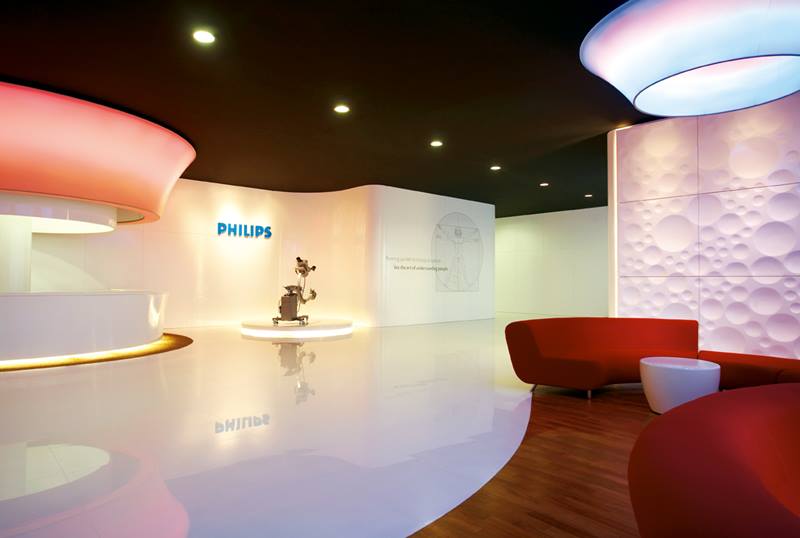
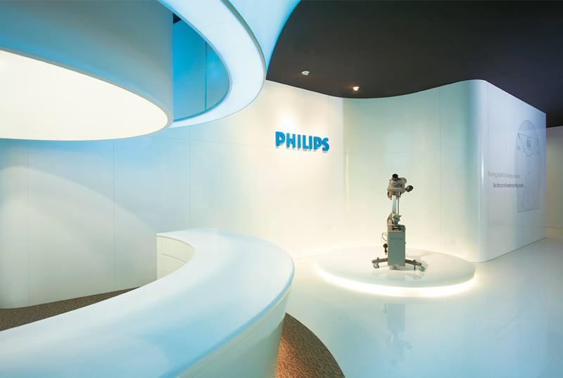
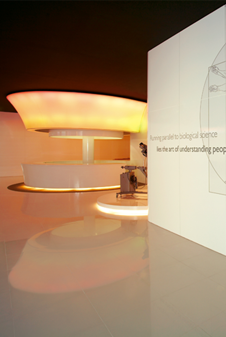
Philips Design was commissioned to create a conducive environment for users who are being trained in highly technical and medically complex content. To lighten the demanding training experience, an area was created with an open layout of flowing spaces and dynamic ambient lighting, articulated with the use of light materials and inviting forms. To complete the structural concept, a message was created on the walls of the learning centre that speaks of Philips’ commitment to ‘improving people’s lives’. This ideal was put into the context of a man’s constant pursuit to learn more about themselves and the world they inhabit – especially with clear references to the medical field.
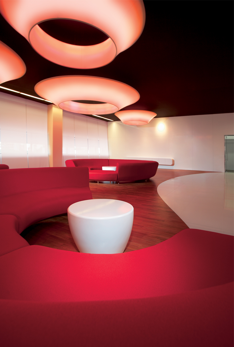
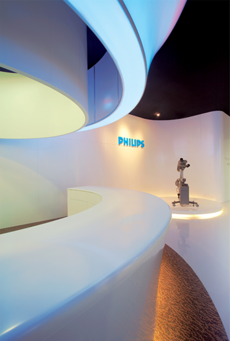
In keeping with the company’s vision, mission and values, three key areas were identified for the new environment – a Reception area, Chill-out area and an Amphitorium. The centre’s clean curved lines reflect both its technical function and soften the harsh clinical shapes often associated with laboratory and learning environments. Elements from the Chill-out and Reception areas, such as the furniture and lighting, echo the centre’s medical focus with semantics, shapes and materials that mimic cells, clusters and microscopic bone structures.
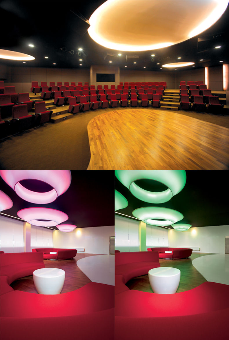
Throughout the centre, clusters of lighting cells hang from the ceiling and are used to create a ‘halo-ambient’ effect, particularly at the Reception & Chill-out areas where visitors are kept emotionally engaged through a dynamic behavior of lighting cells that achieve a range of changing colour cycles, giving the illusion of time passing.
To construct the round lighting cells, an advanced material called Barisol was used. This synthetic substance, which can be draped like cloth, was used to cover round frames and then heated to shrink into its final shape. This process of shaping itself was very challenging since the behavior of the material is never fully predictable. Barisol was chosen as ideal for the unusually shaped lighting cells because of its malleability, translucence and lightweight characteristics.
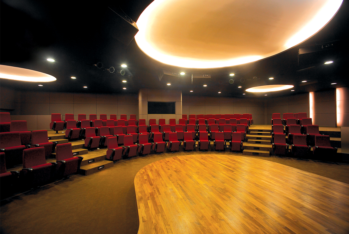
Faced with the challenge of maximising seating capacity in a limited space, the design team experimented with ideas and layouts for the lecture auditorium called the Amphitorium, a hybrid of a lecture auditorium and amphitheater. The 100-person space has a semicircular seating arrangement and a protruding stage that allows the speaker to walk out into the audience. Both of these changes work to create a more intimate and interactive learning experience, encouraging users to interact in a much more open and dynamic way than traditional parallel-line rectangular lecture set-ups.
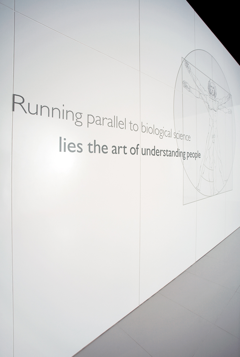
Three murals were designed to convey three principles for learning: Leonardo’s man paired with the phrase – ‘Running parallel to biological science lies the art of understanding people’. This Western icon from the Renaissance, conveys their long heritage of learning and firmly puts in place the idea that they must never forget the human aspects of science.
Le Corbusier’s man, paired with the phrase – ‘Understanding our relationship to the environment enables us to create our world’ is a more contemporary icon that conveys the need for man to coexist with the world around them. An Acupuncture man paired with the phrase – ‘Our learning should also encompass that which is not always understood’, is an Eastern icon that speaks of the unknown, the things that they need to accept and understand without the benefit of rational explanation. Together these images were used to represent the need to fuse both Western and Eastern ideas in their drive to learn. They represent their long heritage of learning with humanity set firmly at its centre.
By combining functionality with aesthetics and using advanced material technologies that enhance the visual experience, The Singapore Learning Centre’s design clearly demonstrates Philips’ promise of advanced, user-centric design. All elements interact to create a concept for a contemporary, dynamic space which is the canvas for a relaxed, yet productive learning experience.
The Singapore Learning Centre was awarded the Asia Pacific Interior Design Award 2006 with an Honourable Mention, as well as the iF Design Award 2006, which is a prestigious event organised by the International Forum Design Hanover. Philips Design is a global design agency of Dutch Philips Electronics from the Netherlands offering multi-disciplinary design services in product design, packaging design, identity design, environment design, interface and interaction design, etc. Since establishing the Hong Kong centre, Philips has set up four more design centres in the region – in Singapore, Taipei, Bangalore and Pune, India, which currently account for more than 30 percent of the design output at Philips.
READ MORE
ABOUT THE DESIGNER
READ MORECOMPANY
Philips Design
DESIGNERS
Low Cheaw Hwei, Senior Account / Creative
Daphne Flynn, Design, Account Director
Audrey Tan, Account, Project Manager
Nic Ng, Art Director
Rahul Pradhan, Senior Design Account Manager
Alok Marathe, Senior Designer
NAME OF CLIENT
Philips Medical Systems / Philips Electronics Singapore
Insights from the Recipient
Citation
Jury Citation
There is an amazing interior design project created at the Learning Centre in Asia, where people can interact amidst a uniquely designed environment and learn how to use Philips’ extensive range of medical devices.
The clever design execution reflects the company’s philosophy, which is to capture the very essence of modern, contemporary design. Through its minimalistic approach, design is distilled into its simplest and purest form by shaving off elements such as the entrance counter, waiting hall and auditorium. By eliminating the conventional use of space, it has opened up an entirely new spatial realm and experience -facilitating smoother interaction between the user and their immediate environment. The warm glow and luminosity of the specially designed lamps are exceptionally beautiful and evoke a magical feel.
VIEW JURORS
Nominator Citation
DAPHNE FLYNN
DESIGNER
PHILIPS DESIGN
On 2 June 2006, the Philips Singapore Learning Centre opened its doors as the concept flagship training facility for Philips Asia-Pacific. Philips Design was charged with making the centre a more inviting and productive learning environment possible. The result is a simple, open layout with flowing spaces and soft forms that mimic bio-nature, characterising Philips’ brand promise of ‘sense and simplicity’ in its user and function-led design.
By combining functionality with aesthetics and using advanced material technologies that enhance the visual experience, the Singapore Learning Centre’s design clearly demonstrates Philips’ promise of advanced user-centric design. All elements interact to create a concept for a contemporary, dynamic space, which will be the canvas for a relaxed, yet productive learning experience.
