Redesigning Traditions for Tomorrow Even as traditional food businesses keep up with the times, they must keep their “soul” while showing empathy towards their customers, says Larry Peh.
When Tong Heng approached him to rebrand their over eight-decades-old business, Larry Peh knew it would be a fine balancing act. The Cantonese pastry shop in Chinatown is well-known amongst older Singaporeans for its diamond-shaped egg tarts. But its new generation owner, Ana Fong, also wanted to attract a younger audience so the business would continue thriving.
“The question for these brands is: ‘How do we change ourselves without alienating the older fans?’,” says Larry. “Yet, we also want younger audiences to look at them and say, ‘Sounds interesting. I want to try it out.’.”
This challenge of updating traditional businesses is a familiar one for Larry who was named the Designer of the Year in the President’s Design Award 2014. Since founding &Larry in 2005, he and his team have worked for high-end luxury brands, such as Sincere Fine Watches and Restaurant André and also familiar local enterprises. They previously refreshed the logo of the almost century-old Killiney Kopitiam and branded Tuan Yuan Pork Ribs Soup, an eatery opened by the descendant of a decades-old business. One of their most prominent projects was helping Singapore’s oldest bookbinder create Bynd Artisan, a retail brand that has leveraged on its long history of craft to reach new audiences. This even clinched a Design of the Year at the President’s Design Award 2016.
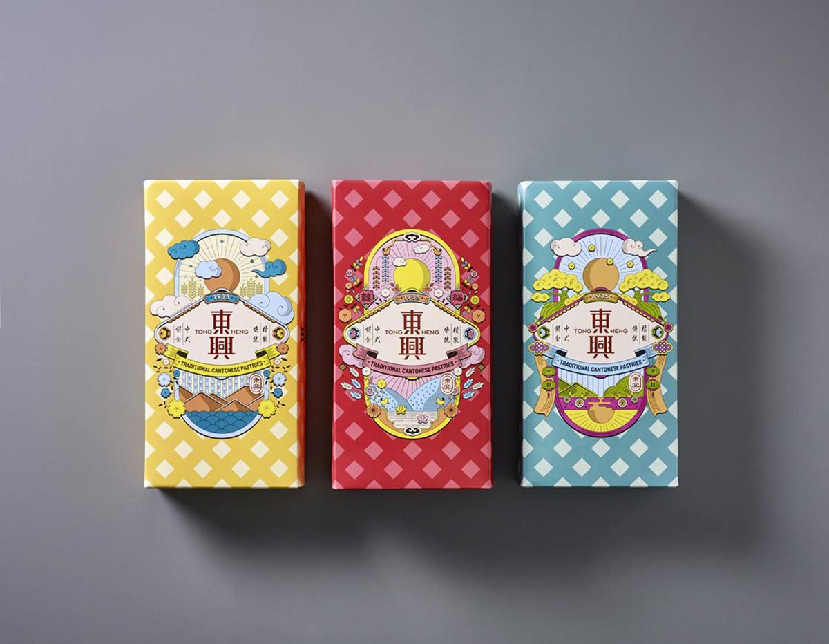
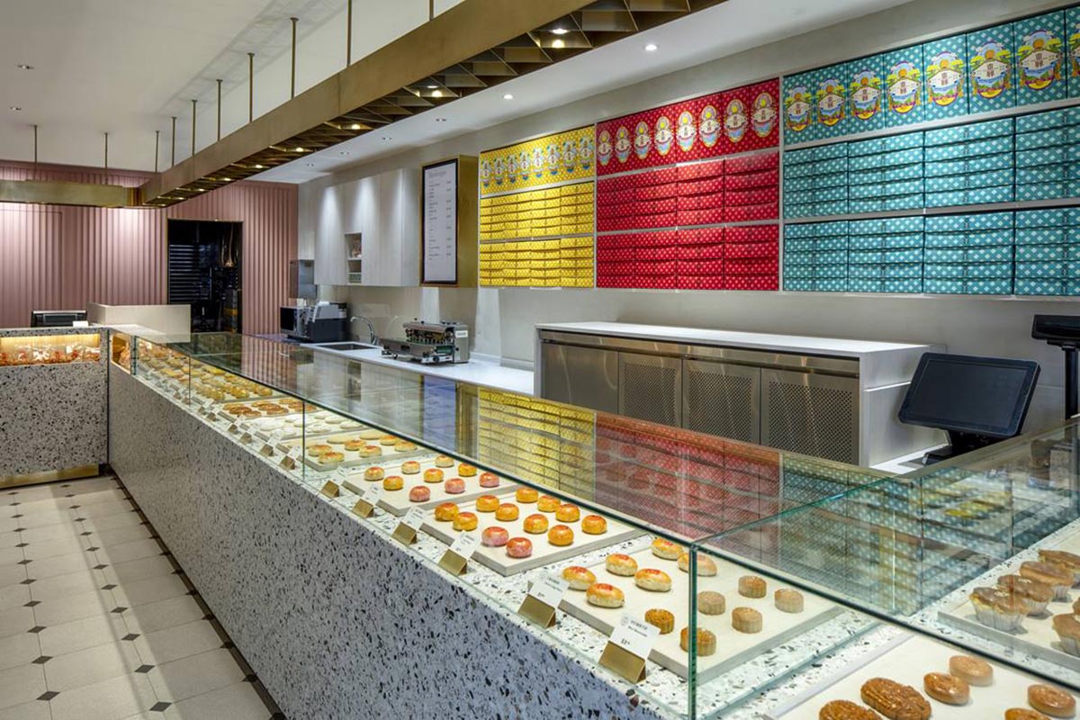
With Tong Heng, Larry wanted to avoid transforming it into yet another “hipster brand”. While rebrands of heritage businesses typically meant going upscale, the designer wanted to showcase Tong Heng’s heritage in a “colloquial way” that was familiar with its fans and would appeal to a younger crowd. This is most evident in the series of three boxes used to pack the pastries which its customers typically takeaway. Decked out in the festive colours of yellow, red and turquoise, each features an illustration that depicts Tong Heng’s roots in Chinese culture and the occasions they are consumed in. While the yellow box pays tribute to the brands popular egg tart with its diamond-shaped mountains and yolk-like sun, the red box designed for gifting pastries at Chinese weddings is decked out in auspicious motifs. The turquoise box has lanterns and Chinese knots to compliment the mooncakes it is meant to contain during the Mid-Autumn Festival.
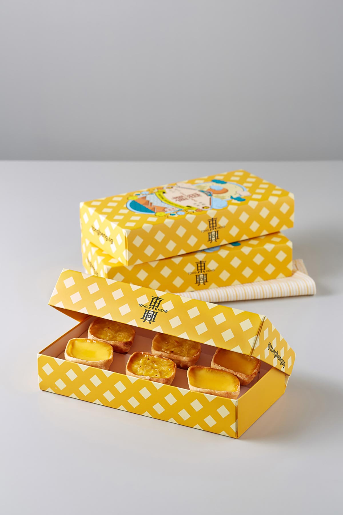
These boxes resemble nothing like Tong Heng’s previous dull boxes, but on closer look, one discovers the familiar calligraphy of Tong Heng’s values that used to plaster its packaging and store. There is also its old logo, which resembles the traditional hat of a Chinese court official. Both these elements were created by Ana’s aunt, one of two who still help out in the business today.
“There are a lot of the things about the new design that are humble and still old school,” explains Larry. While customers may not immediately notice these details, he notes that they have proved useful for Tong Heng’s staff to educate students and tourists on the origins of the shop. “The simple humble box becomes a platform, a stepping stone to understand heritage, history and a brand story. That’s how we put these things to work.”
FROM BOX TO SHOP
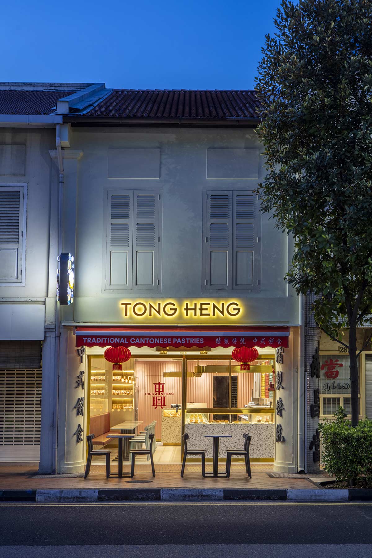
The revamp also involved freshening up the three-decades-old interior of Tong Heng’s only shop at 285 South Bridge Road. Out went the no-frills cake counters, kopitiam-style tables and stools as well as the array of calligraphy signages that used to crowd the shophouse’s façade. In their place, Larry introduced a terrazzo countertop that is encased in glass and lit from above to better showcase Tong Heng’s pastries. Across the display is a mirror decorated with Chinese motifs and upholstered booth seating to comfortably accommodate more customers.
Beyond the snazzy new look, Larry reveals that much of the redesign was about improving business operations too. For instance, the new packaging is bigger and even comes with inner trays so the pastries stay in shape even when brought home. The new in-store display also gives prominence to Tong Heng’s over 30 types of pastries and allows customers to easily snap photos of them to share on social media. This tweak has raised the sales of the other pastries, says Larry, though the egg tart remains by far Tong Heng’s bestseller.
It is still early days to judge the impact of the rebrand — the shop reopened only in April 2018 — but customers have returned and its more common to see younger customers in the shop. It helps too that the prices of the pastries still start from $1.30, the same as just before the revamp. This issue of affordability was on Larry’s mind as he and his team went about the rebranding. While design can help traditional food businesses keep up with the times, he says it should be done with care.
“The danger was we turned it into a hipster brand without understanding the audience,” he says.
THE FUTURE OF HAWKER CULTURE
Such empathy is what he hopes to impress on more amidst the on-going debate on how best to sustain Singapore’s hawker trade and support a new generation of hawkers. There is also an effort to inscribe Singapore’s hawker culture on the UNESCO intangible cultural heritage. “Designers need to be very sensitive about how our hawker culture started,” says Larry. “It was born out of intuition and exchanges in culture, and this is what make it unique.”
When asked to propose a design for the future of Singapore’s hawker culture, Larry sketches out a hawker centre of tomorrow. Resembling the iconic Supertrees at the Gardens by the Bay, these centres located across Singapore will go higher or deeper underground to better connect with a city that is growing denser and with the many buildings offering communal spaces above ground level. Not surprisingly, the centre will have automation — but only to take over the laborious work so that hawkers can focus on perfecting their dishes.
Beyond these seemingly futuristic transformations, consumers will recognise a familiar hawker experience that has been updated for the times. The hawker centre will have facilities for drive-in orders and pick-ups, riding on the rising demand for food delivery. It will also take a leaf out of co-working spaces, offering more than just a space to eat-and-go but a comfortable environment designed for hanging out, like uncles in a kopitiam today.

Similar to his approach in the redesign of Tong Heng, Larry says any future changes to Singapore’s hawker culture should not be “over-designed” and must retain its soul — one that is rooted in the streets and open to people of all cultures, classes and also the environment.
“If it’s not broken, I don’t want to fix it,” he says. “And don’t ask a hawker to practise design thinking to come up with the next Singapore dish!”
+++
Article written by Ng Hui Hsien.

