* DESIGN OF
THE YEAR 2018

The Warehouse Hotel

Designer
Asylum Creative Pte Ltd

DISCIPLINE
Interior Design
Visual Communication

DESIGN IMPACT
Advancing Singapore Brand, Culture and Community
Enabling Economic Transformation
Making Ground-breaking Achievements in Design
Raising Quality of Life

CONTACT

michelle@theasylum.com.sg

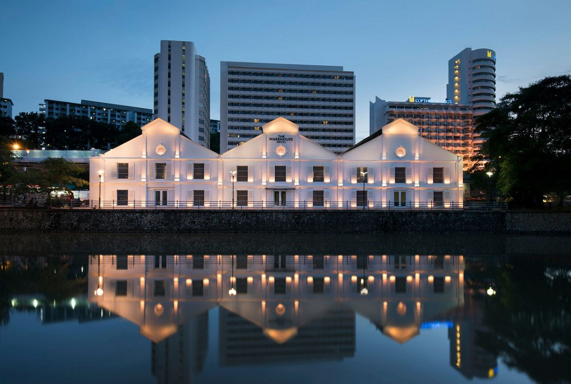
Having stood vacant for decades, three godowns along the Singapore River have been revived as The Warehouse Hotel. This restoration has brought to life the 120-year-old building with a contemporary interior design and branding that reference the past to offer it a future in Singapore today.

While retaining the industrial architecture of this conserved building—double-volume spaces, pitch roofs and trusses— Asylum injected a layer of modern touches that transforms the former storage space for spice and goods into a comfortable lodge for global business travellers. This approach of bringing the past into the present extends to the hotel’s branding and guest experience. Serving up nostalgia-tinged cocktails at its bar and offering a menu of “vices” to its guests are just two examples of how the hotel pays homage to its neighbourhood’s once dark and illicit past. A curated selection of books and products by Singaporean makers also gives the hotel a sense of place.

Beyond catering to guests of its 37 rooms, the hotel welcomes the public and locals with a lobby space that also houses a bar and restaurant. Through such considered design, The Warehouse Hotel showcases how the heritage of Singapore can continue to be relevant to its people and also the world.

READ MORE

ABOUT THE DESIGNER

Asylum is one of Asia’s foremost creative agencies integrating branding and spatial design. Since its inception in 1999, Asylum has focused on cross disciplinary projects that include interactive design, product development, environmental and interior design, packaging, apparel design, branding and graphic design. The studio’s work has won more than 100 international awards and has been featured in numerous publications across the globe.

Best defined as an unconventional maverick in the creative sphere, Asylum’s unique understanding of commerce and art has resulted in exponential success for its clients. The studio is known for its serious work ethics and having a quirky sense of humour.

Asylum is founded by creative director Chris Lee who is the recipient of the President*s Design Award Designer of the Year (2009). He has served as a juror for many top international creative awards such as D&AD, Red Dot Award, The One Show and Tokyo Type Director’s Club. Chris is also a founding member and ex-President of The Design Society, a non-profit organisation that aims to promote visual culture through exhibitions, workshops and education.

READ MORE

ACOUSTIC CONSULTANT
CCW Associates Pte Ltd

CLIENT
I Hotel Pte Ltd

ID CONTRACTOR
DH Deco Pte Ltd

LIGHTING DESIGNER
Switch Lighting Design LLP

MANAGED BY
The Lo & Behold Group

MECHANICAL AND ELECTRICAL ENGINEER
Icon Engineers LLP

STRUCTURAL CONSULTANT
JS Tan Consultant Pte Ltd

ARCHITECT
Zarch Collaboratives Pte Ltd

DESIGNER
Asylum Creative Pte Ltd

LANDSCAPE DESIGNER
John Lim

MAIN CONTRACTOR
Towner Construction Pte Ltd

MECHANICAL AND ELECTRICAL CONTRACTOR
Coolmac Engineering Pte Ltd

QUANTITY SURVEYOR
QS Consultants Pte Ltd

Reviving Singapore’s built heritage

The Warehouse Hotel breathes new life to three 19th century godowns, the Asian term for warehouses, along the banks of the Singapore River. Once used to store spices and goods, and more recently, house a disco, this conserved building has been restored by Zarch Collaboratives and redesigned by Asylum into a modern 37-room boutique hotel.

An industrial design for today

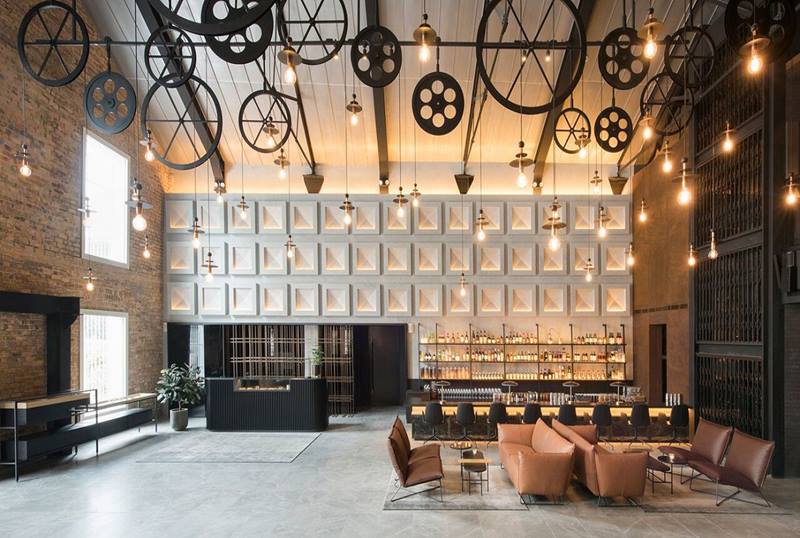
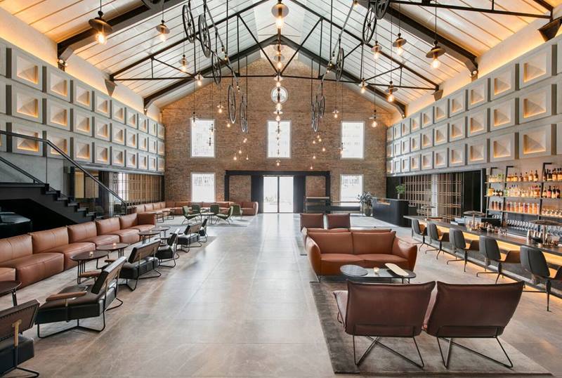
Aware of how the industrial look has become blatantly appropriated around the world regardless of context, the interior of the Warehouse Hotel subtly references its past but brings it to the present. The hotel retains its industrial architecture but is layered with modern fittings and touches that inject comfort and warmth to the space.

Telling histories through design

The hotel’s branding is inspired by its past lives. For instance, the use of traditional Chinese characters as a secondary brand references the old name of the warehouse on its façade that has been retained. This is just one example of how the Warehouse Hotel uses design to subtly tell stories about its past as well as that of the neighbourhood it sits in.

A welcoming buzz

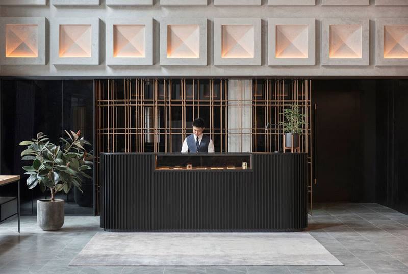
Visitors and guests to the hotel are greeted not by the reception, which has been pushed to the side, but a large social space containing a public bar and a restaurant, Pó. Bringing such amenities upfront ensures guests always return to a lively lobby and this also supports the financial operations of this hotel that only has 37 rooms. The open lobby also invites the public, especially locals, to come in and enjoy a slice of Singapore’s industrial past.

Perfectly pitched rooms

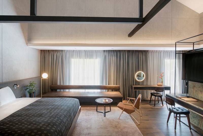
To preserve the warehouses’ original pitch roofs while creating a comfortable living environment, the hotel rooms had to be each individually designed to carve out pockets of windows or roofs that could bring in natural daylight. As a result, almost no two rooms are the same, which turned out to be a unique selling point for the hotel.

‘‘With the warehouse’s history and narrative, I don’t think the design needed to further accentuate Singaporean-ess. In fact, what is Singaporean design? We are international before we are national.’’

Insights from the Recipient

We hear you are quite a party-goer. Did you visit The Warehouse Hotel in its past life as a disco? How did this aspect of its heritage shape your approach to this project?

Chris Lee (CL): I was a party-goer! I’ve been there when it was a disco. I was actually looking for Zouk and we went into the wrong place. The impression wasn’t much—just another big club. Over the years, there were a couple of events that happened in the space as well. In the back of my mind, it was a jewel waiting to be polished. When the client contacted me, it felt great that somebody finally decided to do it.

When we first walked into the dilapidated building with the client, we immediately felt that we wanted to keep the volume in the lobby to give it the character of a warehouse. If you were to seal that up to add a few more rooms or block that out, then from the outside it looks like a warehouse but it could be anywhere in the world when you walk in. From day one, we knew we had to preserve this distinct feel of going into a warehouse. Then it’s about finding a way to give something with so much history a future. One of the initial ideas was inspired by movie sets such as Blade Runner and Metropolis. I felt the cold industrial architecture would work well within the warehouse context.


Transforming former industrial spaces for alternative uses has become commonplace around the world. How did Asylum go about giving a “fresh perspective” and why was this important for the hotel?

CL: All around the world, cafés that don’t have any industrial context also want to be industrial. It’s a good look; young people resonate with this old feel that is not squeaky clean. Given that this warehouse has all the right in the world to be industrial, we wanted to deliberately layer it with a more mature and modern take. It’s also about who our audience is. It’s not meant for bed and breakfast travellers or budget travellers, but for people who want a unique and different experience from other boutique hotels in Singapore. Many of these boutique hotels tend to have kitsch design or scream “design”. We wanted to move away from that and contextualise the warehouse.

We didn’t want any of the “industrial”: carts, heavy metal beams and used wood. The bare bones of this architecture, particularly its pitch roofs, would already tell you this is a warehouse. We did not have to scream “industrial” anymore. Instead, our design adds a whole layer of modern, luxurious touches that is subtle. We have a lot of warm leather and tropical plants to balance the cold industrial space. Unlike typical hotel rooms, we also dispense with cabinets and just have open hangers that make the rooms feel airy and more modern. We also kept the original brick wall and trusses. The only throwback to the era that we added were the pulley lights. Given that it was once a spice warehouse, we designed a system similar to what the coolies used then.

The warehouse’s original function was not for hospitality and its key features such as its pitch roofs were a challenge to designing the hotel rooms. How did Asylum go about overcoming this and turning it into a selling point?

CL: When we were designing for hospitality, one of the things that had to work was obviously the bedroom including amenities and a bath. Typically, a newly built 400-room hotel has five different rooms and then you clone them throughout the building. There’s more work at the Warehouse Hotel because of the pitch roofs. We had to move rooms around and alter the design accordingly to take in as much natural light as we could. We managed to achieve that in 33 or 34 rooms, either from the roof or windows. That was a big challenge and the architect, Zarch Collaboratives, did a great job working with us. Even at the corridors you have sunlight coming in to accentuate them. That is my favourite part of the hotel.

Another key design feature is the double-volume lobby that defies conventional hotels. The reception is tucked to the side and visitors are welcomed with generous seating. Why start with such a social entrance?

CL: Given that there were only 37 rooms, we were very mindful that each time you checked in, it would be quite quiet. We wanted the lobby space to have energy. We wanted to bring the local community into the space. Anything with activity has to be in the lobby space. Not just hotel events, but a public bar and restaurant. Besides, how much reception space do you need for 37 rooms? So, we integrated everything into one space and that has worked very well. We wanted to open the back lane as a café to serve passers-by at the river side but the authorities did not allow us.

I’ve been there in the evenings and it is a nice, lively space if you want to meet your friends, or bring somebody from out of town. Financially, it has also worked very well from the client. With only 37 rooms it’s hard to make it viable so the bar and restaurant adds to the revenue. To the credit of the client, he did not try to squeeze many rooms in this hotel but chose to make it comfortable and charge higher fees instead. If you are practical, you look at how much money you can make and what are the returns. We were lucky to have a client who gave us a good canvas to project our vision on to it.

Besides its interiors, Asylum also worked on its branding found across the hotel’s collaterals and guest experience. We hear there is even a “vice” menu to reflect the neighbourhood’s histories. What is the role of design in telling stories?

CL: We wanted the identity to tell the story of the godown and that era. We found the company’s name painted on the warehouse itself in Chinese so we incorporated it into the secondary graphics for the brand.

As we were doing research we found all these stories about the warehouse being part of a street where there were illegal distilleries too. We highlighted these illicit histories through the type of drinks offered at the bar. The hotel also extended this theme of “vices” by offering guests items such as handcuffs and blindfolds in the rooms. That added to the story-telling.

As we got to do both the interior and the branding, we could synergise and decide where the story-telling should be played up or down. This made the project more complete.

Citation

Jury Citation

The Warehouse Hotel has set the benchmark for a Singaporean boutique hotel. Housed in a restored godown (the local term for “warehouse”), the hotel marries the celebration of heritage with modern design finishes that makes it relevant today and brings it into the future.

The Jury is absolutely amazed by the standard of design execution—all touchpoints have been exquisitely considered, from the respectful treatment of the hotel’s existing architectural fabric, to the wonderfully inventive use of space, colour, light and tectonics in its interiors. Having 37 rooms in the building, each with its unique character, is a design feat. The hotel’s meticulously crafted design language also permeates the furniture, accessories, communications collaterals and brand identity.

The care and attention paid to the restoration of the hotel has resulted in wide-ranging economic, social and emotional impact. Besides achieving consistently high occupation rates and repeat visitation rates, the design intervention has revived a place of social significance that had fallen into a dilapidated state for years. The restoration has since enlivened the area, rebuilt memories and made heritage relevant to the younger generation and those who have not encountered the original building.

Ticking all boxes for urban conservation, heritage, design and impact, The Warehouse Hotel has raised the bar for what a boutique hotel could be; the Jury is in agreement that “it has given something back to Singapore.”

VIEW JURORS

Nominator Citation

Tarun Kalra
General Manager
The Lo & Behold Group

Asylum did an outstanding job with the interior design of The Warehouse Hotel. In recent years, the industrial interior trend calls to mind spaces that are sometimes over-designed or done out of context. With the hotel’s origins as a warehouse, the epitome of “industrial”, their challenge was to evolve this design language in a way that was not trendy, but trend-setting. They did this by preserving the architectural structure of the building, contrasting its steely frame with soft leather interiors, brass finishing, green foliage and warm lighting.

The building has been around for many generations and has become somewhat of an architectural icon in Singapore. People are extremely grateful to see the building being given a new lease of life while guests truly appreciate the way the building’s illicit past still permeates every aspect of the hotel, including the finer details like our key cards, retail installation and minibar.

The Warehouse Hotel has received both local and international acclaim, including world-renowned design and travel publications such as Monocle, Wallpaper*, Sleeper Magazine and Condé Nast Traveler. It was a meticulous project that breathed new life into a space while still preserving as much of its heritage as possible.
 

OTHER RECIPIENTS