DESIGN OF THE YEAR 2018
Mediacorp Campus
Architect
Maki and Associates
DP Architects Pte Ltd
CONTACT
[email protected]
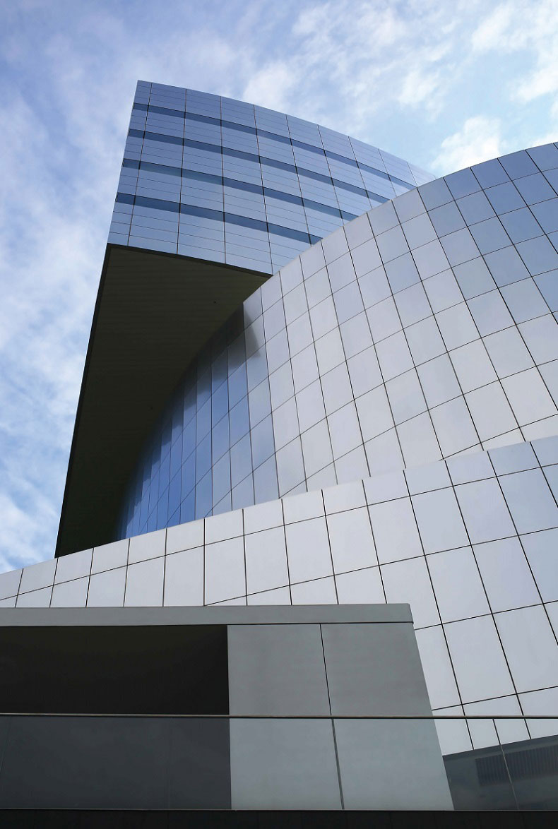
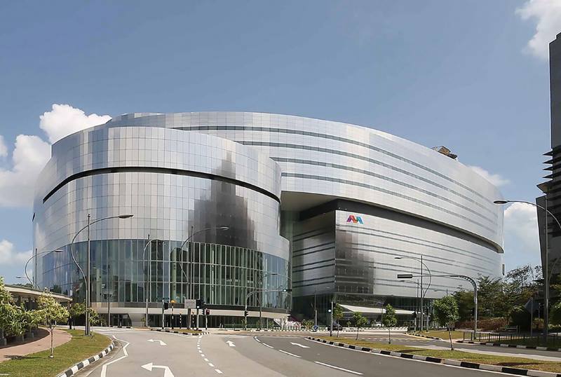
Glowing orange as the sun rises each day or shining silver under a clear blue sky—the stainless steel façade of Mediacorp Campus changes to reflect its surroundings just like the media which constantly evolves as it is shaped by the world. This new home for Singapore’s national broadcaster is not only a striking landmark, but a highly functional and sustainable facility that brings its workforce and audiences closer in new ways.
Underneath its stainless-steel façade, the 12-storey building integrates Mediacorp’s variety of operations into three distinct parts. Standing on the oblong site is a Broadcast Theatre for live performances and a Broadcast Centre that houses two studios and a newsroom. Seemingly hovering above them is a Corporate Office designed for staff to collaborate more easily with breakout spaces and a hot-desking environment.
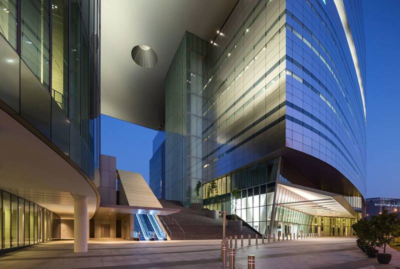
The campus also opens Mediacorp up to the public. Through skilful planning, a tour route was carved out to offer visitors a peek into the traditionally closed broadcasting and production facilities while still ensuring secure operations. The architects also embraced a raised public park next to the campus by connecting them both with a grand stairway at the entrance. Ascending to the top, one enters a green space with vistas of the upcoming digital media hub, Mediapolis. As a pioneering building in this development, Mediacorp Campus offers a gleaming gateway into this future.
About the Designer
Maki and Associates is an internationally recognised architecture and urban design firm based in Tokyo, Japan, and involved in projects worldwide. The firm was founded in 1965 by Principal, Fumihiko Maki, a modernist who has fused the best of both eastern and western cultures. The firm’s work is intelligent and artistic in concept and expression; meticulously achieved where detailing gives the work its rhythm and scale. Regardless of building type, size or locale, the firm approaches the creation of architecture as discovery not invention, and as a cultural act in response to the common imagination of the time. Its projects offer spaces where human activities are both physically and mentally enhanced and where a sense of public character develops. Today, Maki and Associates is led by its founder and Directors of whom Gary Kamemoto oversees the firm’s international projects. Its recent works include the award winning 4 World Trade Center in New York, Aga Khan Museum in Toronto and recipient of the 2009 President*s Design Award, Republic Polytechnic Campus.
Founded in 1967, DP Architects (DPA) was founded on a deep concern for the environment to enrich the human spirit and experience. Evolving in tandem with Singapore’s nation building, DPA has been instrumental in shaping the country’s remarkable built environment. Now, a multidisciplinary design practice with 17 global offices, eight specialist subsidiaries, and a reach of 77 countries, DPA is devoted to placemaking and the shaping of a sustainable public domain and civic society. DPA aims to improve the quality of life of communities through buildings and spaces; among its works are Esplanade Theatres on the Bay, The Dubai Mall, Singapore Sports Hub and Sengkang General & Community Hospitals.
ACOUSTIC AND THEATRE CONSULTANT
Arup Singapore
ASSOCIATE LIGHTING DESIGNER
Lighting Planners Associates
CLIENT
Mediacorp
FACADE ENGINEER
HCCH Consulting
LANDSCAPE CONSULTANT
DP Green
MECHANICAL AND ELECTRICAL CONSULTANT
WSP / Parsons Brinckerhoff
QUANTITY SURVEYOR
Rider Levitt Bucknall LLP
ARCHITECT
Maki and Associates
DP Architects Pte Ltd
CIVIL AND STRUCTURAL CONSULTANT
Web Structures
ENVIRONMENTAL SUSTAINABILITY CONSULTANT
DP Sustainable Design
AECOM
FIRE ENGINEER
Arup Singapore
MAIN CONTRACTOR
Kajima Overseas Asia (Singapore)
PROJECT MANAGER
Jurong Consultant
SECURITY CONSULTANT
Certis Cisco Consulting Services
1Reflecting media in form and function
Mediacorp Campus was designed to express the spirit of media today and in the future. The architecture integrates a variety of functions—a theatre, production studios, news room, radio suites and offices—into a single 12-storey building that is highly accessible to the public. A distinctive façade reflects the ever-changing surroundings, just as media does.
(Photo by: Future Stage Creations)2A welcoming landmark
The campus’ Broadcast Theatre with a plaza as a forecourt greets visitors coming up via One-North station to the west corner along Ayer Rajah and Stars Avenue. As one of the first buildings to be built in Singapore’s upcoming digital media hub, Mediapolis, the campus is also a landmark that invites future developments to be part of this ecosystem.
(Photo by: Future Stage Creations)3A gateway into the future
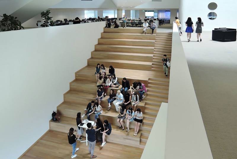
Between the campus’ Broadcast Theatre and Broadcast Centre, a majestic 50-step staircase— a homage to Singapore’s 50th anniversary in 2015—leads to a park offering a grand vista overlooking the future Mediapolis. This connection was created as the site was next to this public park.
(Photo by: Marc Tey)4A star theatre
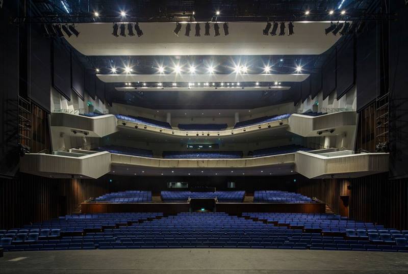
The state-of-the-art Broadcast Theatre, which can accommodate 1,549 seats on three levels, was designed to host a wide variety of performances, including musicals, dramas, concerts, variety shows and festivals. It is now the permanent venue for the Prime Minister’s annual National Day Rally speech.
(Photo by: Bai JiWen, DP Architects Pte Ltd)5A public attraction
The campus is open to the public while ensuring that operations could go on securely. Today, visitors can pay to go on the Mediacorp Experience, a 60-minute guided tour that takes visitors through 15 curated exhibits and into the Broadcast Centre where they can look down into the newsroom and radio conty to watch live production and broadcast of media.
(Photo by: Future Stage Creations)6Room for endless
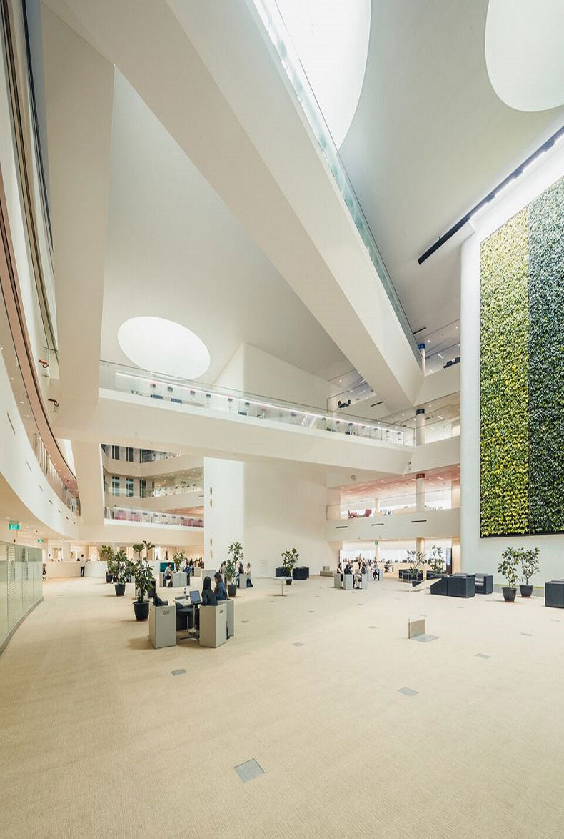
The corporate offices take full advantage of the 225-metre long site with floor plates that span the entire length. Like rings, these workspaces encircle a central atrium with a green wall—a feature that is imagined as Mediacorp’s living room. This design gives the company the flexibility to reconfigure operations as the media environment changes.
(Photo by: Bai JiWen, DP Architects Pte Ltd)7Working together as one
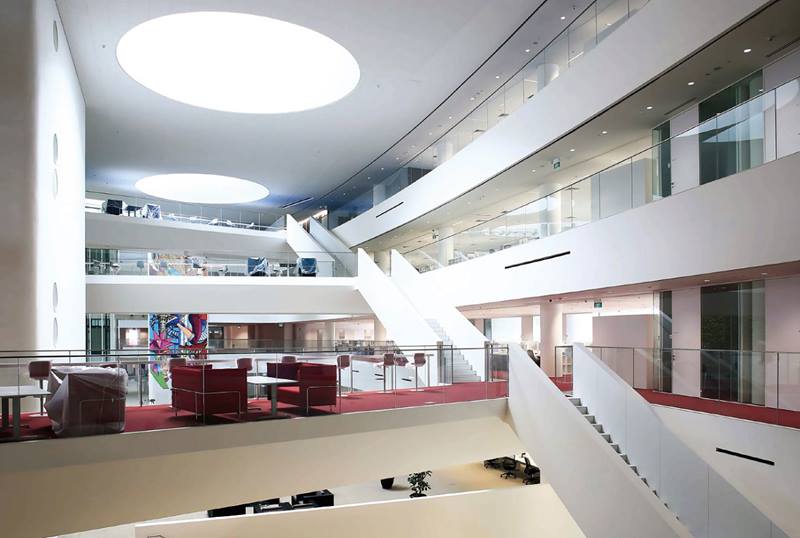
The four levels of the corporate offices are naturally lit by five large conical skylights that are nine metres in diameter. Themed in red, green and blue—reflecting the RGB colour model that enables television to output colours—the offices are designed for staff to collaborate. Stairs and bridges connect the different levels, while the breakout spaces are supported by a hot-desking concept.
(Photo by: Future Stage Creations)8Working together as one
The four levels of the corporate offices are naturally lit by five large conical skylights that are nine metres in diameter. Themed in red, green and blue—reflecting the RGB colour model that enables television to output colours—the offices are designed for staff to collaborate. Stairs and bridges connect the different levels, while the breakout spaces are supported by a hot-desking concept.
(Photo by: Gary Kamemoto, Maki and Associates)Insights from the Recipient
Gary Kamemoto (GK): The old Mediacorp campus had seen a series of patchworks and additions over a period of 50 years. The staff of 3,000 people were housed in a sprawling compound of a dozen low-rise buildings, making it almost operationally impossible to proceed. Therefore, Mediacorp decided to move into Mediapolis at One-North. The small site required us to vertically stack the facilities. What was once a horizontal campus of 12 buildings ended up one on top of the other in a very clear organisational structure. The other challenge was that the building sits on an oblong site derived from Zaha Hadid’s bent grid master plan for One-North. We had to fit 1,000-square metre and 700-square metre studios, which are square in geometry, into a triangular site.
Angelene Chan (AC): I remember when we first went to the old campus, we would be escorted to the rooms and the various meeting places every time because you would definitely get lost. When they moved to this 1.5-hectare site, one of the primary goals was to make sure that circulation is absolutely easy. If you visited broadcast centres in the other parts of the world, you would see that they never have a theatre and broadcast, radio and news studios all housed in one building. One of our challenges was to incorporate everything while keeping them separate, and still inter-connected.
GK: It is important to highlight that this project came out of an international competition and not a commission. Seven firms were invited to participate and four were international firms. It was very clear on the outset that Mediacorp desired a new idea for a broadcast centre. This was particularly apt because our first project in Singapore, which we also collaborated with Angelene and DP Architects, was Republic Polytechnic. The building received the Design of the Year at the 2009 President*s Design Award, and it was recognised for its social value and introducing a new type of learning experience.
Although Mediacorp Campus is a different kind of building, the client had a social agenda which resonates with our design philosophy. When they awarded us the project, we noted that their jury selected us on two counts: ours was the only scheme that met their operational needs and we were the only ones that provided seamless public engagement. The merit of our scheme is not based upon just what meets the eye.Although Mediacorp Campus is a different kind of building, the client had a social agenda which resonates with our design philosophy. When they awarded us the project, we noted that their jury selected us on two counts: ours was the only scheme that met their operational needs and we were the only ones that provided seamless public engagement. The merit of our scheme is not based upon just what meets the eye.
The biggest component of the public engagement is this unique tour route that goes inside of the centre of Mediacorp’s operations. Typically, a broadcast centre does not allow the public to enter its premises. But we saw a potential for broadcast activities to be an attraction. Mediacorp’s product is entertainment, education and information, but how that is being created is fascinating for the public to see too. While some broadcasters open up to a limited amount, Mediacorp has embraced this throughout the entire facility.
GK: Often times, broadcast centres are an industrial building type which are very closed off to the public. The location of Mediacorp is next to a 2.2-hectare park, the biggest in the master plan of Mediapolis. This was a tremendous opportunity to conceive the broadcast centre and the park as one. We immediately discussed with the National Parks Board to see if they would embrace this. What made it challenging to design the building with the park is that it is raised 7.5 metres above ground level. Underneath the park are the support and carpark facilities for the entire district.
Ideally, one would want to have direct access at ground level to the broadcast centre because it has a lot of heavy duty services and also a theatre that will have many props coming in and out for live shows. Due to the constraints of the site, we created a service spine that goes all the way through from north to south. Because the park is raised, all the services, which are hugging the edge of the park, will not be visible at all. That’s a tremendous advantage of integrating with this particular park.
AC: We are very privileged to be located adjacent to this wonderful park. The park enabled us to sprawl some activities to this green area. Events that are held in the building could spread over to the park. Although it is not our land, it was a wonderful opportunity to design for a larger piece of land. In thinking of the park as a public space, there is a radio broadcast booth facing the park on the fourth floor so that deejays can play songs and people can watch them from below. All that public engagement has been designed into the building.
GK: Mediacorp has 48 different productions, through broadcast, radio, press, and digital media. If you can imagine 48 teams spread out in 12 different buildings, it was quite a balkanised environment in Caldecott Hill. In this day and age, collaboration is a buzzword, but it really works. Coming into contact with your co-workers as much as possible to share information and come up with good ideas—it is where the world is going right now. This is exactly what Mediacorp set out to do in its new campus.
Obviously, to get 3,000 people in one big space was very difficult physically. For the Corporate Office, we maxmised the site area over four floors. But if you create separate floors, you don’t create this “oneness” which Mediacorp was very passionate about. To achieve a collaborative work environment in a singular space, we created a very large atrium in the centre of each floor such that the office is like a doughnut or a circle—it doesn’t have a start and end. Mediacorp then came up with the hot desking concept so that no one owns a particular area. Such a space means the staff are always mingling and departments are always changing. This resonates with the premise of this building which is designed for an organisation that is simultaneously changing too.
GK: Like a small city, a broadcast centre has lots of different components. First of all, the spaces are very large and therefore the mechanical systems tend to be very robust. There are very strict acoustic and vibration requirements. It becomes an engineering exercise to harmoniously balance some of these structural and mechanical requirements. Above all, there is broadcast infrastructure that also comes into play. If you look at broadcast centres around the world, many of them tend to be industrial type buildings, and not places where people come to visit. However, Mediacorp had a tremendous aspiration that the facility would attract the general public. This is very rare. Balancing the heavy infrastructure while making this a very open and public building was the major challenge which we solved in the project.
Citation
Jury Citation
Nominator Citation
Professor Heng Chye Kiang
Lum Chang Chair Professor
National University of Singapore
Mediacorp Campus is a simple expression of a complex spatial programme. Situated on a long triangular site in the One-North Business Park, the architects have articulated the building as artfully assembled volumes containing the three primary functions of Broadcast Theatre, Broadcast Centre and Corporate Office.
The juxtaposition of volumes creates a public connection at ground level that serves as a gateway to Mediapolis and its adjoining park. The semi-reflective façade is a metaphor for a vessel of media and information that echoes its surroundings and changes subtly throughout the day. Conceived as a collaborative campus, the work spaces are designed to create opportunities for informal gatherings, unified by a four-storey central atrium envisioned as a communal living room.
The skilful organisation of spaces into a coherent vertical media city impressed the Jury and it is a remarkable feat given the campus’ enormous size and tight security requirements. The flexible spatial arrangement and well-planned interfaces between the different levels foster interaction and communication—mirroring the ethos of a progressive and transparent media company.
Mediacorp Campus is a remarkable building that exudes an extraordinary presence. Judicious design bestows a strong corporate identity on the building and its corporate spaces—a difficult feat given its enormous size and length. Its clever planning also entices passers-by to traverse the building, glimpse at the activities within, use its F&B amenities and enjoy the public space integrated with the greenery beyond.
Situated on a long triangular site between the built-up section of One-North business park and a raised linear park, it is designed as a gateway to Mediapolis beyond the park. The two long elevations are differently and masterfully treated: the former embraces an articulated volume to address the busy business park while the latter is presented as an elegant backdrop to the expansive green. A large portal links and facilitates public access from the “town” to the park.
The complex programme is translated into three primary components— Broadcast Theatre, Broadcast Centre (studios) and Corporate Offices—and expressed architecturally as three distinctive blocks artfully assembled. The office volume hovers above the other two constituents, creating a highly memorable structure. Seen from Ayer Rajah Expressway (AYE), the sculpted form resembles, metaphorically, a refined vessel of media and information, faintly shimmering in its bead-blasted steel cladding that reflects its surroundings and the changing sky ever so subtly.
New work practices are encouraged through the design of the corporate offices that are organised around an enormous four-storey atrium. This is beautifully lit by skylights and criss-crossed by link bridges and dynamic staircases. An intimate tiered gathering space stretches the floor of the atrium to link diagonally to the floor below and, visually, beyond to the park. Spatially and visually, the corporate atrium space, like the all-reaching media, is extended from the park and parvis to the sky.

