* DESIGN OF
THE YEAR 2015
Deck People Place Photography
When Gwen Lee and Jay Lau, co-founders of 2902 Gallery commissioned LAUD Architects to design a space for the 2014 Singapore International Photography Festival, they did not expect the result LAUD delivered.
For starters, the site for DECK itself – a vacant block of state land in the vicinity of the Nanyang Academy of Fine Arts and LASALLE College of the Arts – was physically unpromising. For another, the limited budget and construction period were daunting. Finally, as the lease was for only two years, the structure had to be temporary.
“The most difficult part of the design process,” says Ho Tzu Yin, LAUD’s lead architect on the project, “was the struggle to gain an insight that DECK could or should be more than a photographic gallery. Paradoxically, for us, it would have been infinitely more difficult to design something that just fulfilled the design brief.”
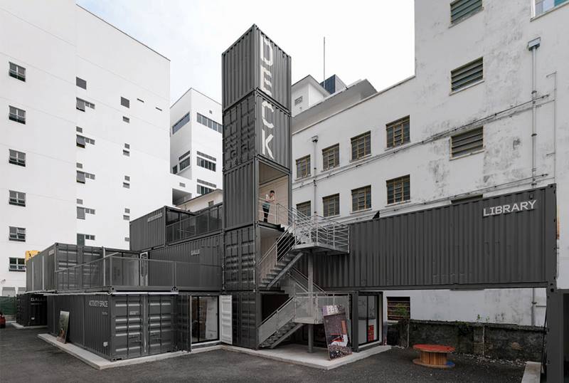
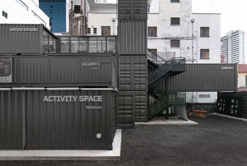
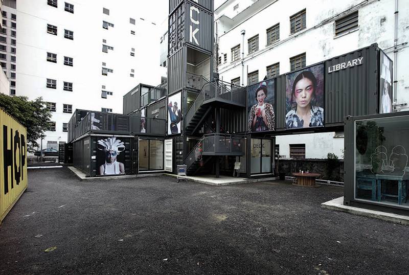
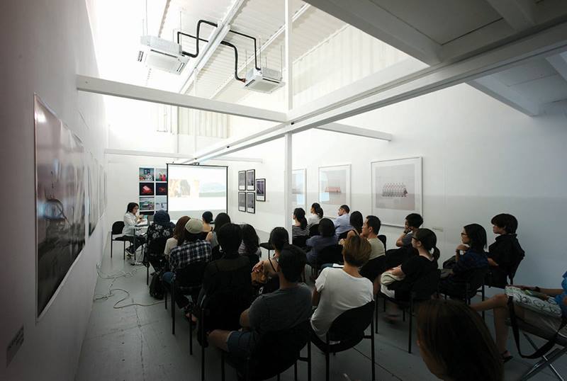
The solution was to stack 19 twenty-foot and forty-foot shipping containers in a visually intriguing Escher-like geometry of cascading terraces. The architects’ insistence on a low carbon footprint and minimal on-site construction (and deconstruction) time has resulted in a rawness that perfectly fits DECK’s remit of a non-commercial, independent arts venue – specifically, a venue for staging photographic exhibitions, lectures and workshops.
“The shipping containers provide the advantages of lightweight volumes, structural integrity, mobility and modularity,” Tzu Yin explains. Both internal and external spaces remain exposed with no extraneous or decorative elements. Their DNA is clearly visible.
Very early on, LAUD realised the potential to design DECK as a social and cultural events space; as well as the need to consider its place in the urban context, and how it can contribute to the surrounding streetscape.
“We felt strongly that DECK should not be a hermetic white box gallery,” says Tzu Yin, “but that it should present itself as a welcoming platform to support intimate, cultural and social events.”
For this reason, a blank party wall has been integrated into DECK’s spatial boundary as an al fresco projection screen. The spaces between the containers become sheltered gathering spots and plaza for break-out discussions and performances.
For Tzu Yin, DECK is a timely Singaporean case study on attuning the collective sensitivity towards cost effective construction in a city of high-density living and high building costs. “The starting blocks for our design were based on challenging ourselves with the question: How to build this cheap?”
Part of the answer, at least, can be found in DECK.
READ MORE
ABOUT THE DESIGNER
For Ho Tzu Yin, deputy managing director of LAUD Architects and lead designer on the DECK project, architecture is a lens through which one understands the wider world.
“Singapore, today, is truly at the crossroads of cultures, both east and west,” he says. “The mix of local cultures, living in a high density Asian city, the tropical climate, and having a Western architectural education allow us to create architecture that is truly unique to Singapore.”
This approach is especially evident in LAUD’s portfolio of churches, hotels, industrial buildings, condominiums, retail and office buildings that are located across the world from Hangzhou to Qatar. Light is always a consideration but its heat and glare are invariably filtered through strategically placed roofs, brises soleil, careful site orientation, and landscaping. Geometric and modular forms are favourite expressions, as are expansive volumes particularly in the firm’s designs for churches.
Good architecture, says Tzu Yin, must incorporate three aspects. First, it must appeal to the intellect by communicating to the visitor through a conscious understanding and interpretation of composite forms and volume. Secondly, it should fulfil its role as a social institution that supports the daily interactions of the occupants of the space. And lastly, it must offer a heightened sense of experience whereby a memorably designed space transcends the mundane quality of daily life.
When incorporated into a design, the cumulative effect of this philosophy is a sense of inclusion, of wanting to linger in a space to explore or, perhaps, to contemplate. Case in point is DECK which, since it opened, has energised the quiet stretch of Prinsep Street by attracting both visitors for events and curious neighbours.
A sense of community is important to Tzu Yin. It is a refrain that he is eager to project on to a larger stage, specifically Singapore’s design scene. “To push ourselves to the next level, we need more robust public discussion and critique on design. That, and a stronger sense of a design community that supports and gives feedback to one another.”
Of course, achieving this state is no easy task. There is a push and pull, between a predisposition to imitate other design traditions and a sense of place that grows with each graduating class of architects and designers.
Tzu Yin is, as always, charmingly optimistic. He believes the fundamentals are in place. “My generation of designers are equally comfortable assimilating what we need from the global modernist vocabulary while, at the same time, realising the importance of responding to the sense of the local.”
READ MORE
DESIGNER
LAUD Architects Pte Ltd
Ho Tzu Yin
Joseph Lau
Melvin Tan
Toh Minghui
Benjamin Yeo
Pichan Vatanotai
Cherie Zabala Carino
MAIN CONTRACTOR
Tong Hai Yang Construction Pte Ltd
Lim Wei Ping
ENGINEER
Auston Consulting Engineers
Tang Ing Hua
CONTAINER SPECIALIST
TA Asia
Albert Koh
Insights from the Recipient
Citation
Jury Citation
This project uses de-commissioned shipping containers. These are not an unusual resource in the Jury’s view, but they have been developed with a skill rarely seen in temporary structures. The site is an ʻurban gapʼ, essentially a no-man’s-land.
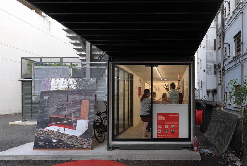
DECK is an architectural intervention with a lively vibe that actively links two neighbouring art schools. The interiors deliver dynamic spaces comprising galleries, a photography studio, and a resource library. The exterior is configured into multiple zones that further animate the overall structure. Overall, the project exudes a quality of space that few other temporary structures have achieved. Its very existence demonstrates innovation and resourcefulness in surmounting the problems of land scarcity and high leasing cost in Singapore.
For its exceptional execution and clarity of vision, the Jury is unanimous in awarding Design of the Year to DECK.
VIEW JURORSNominator Citation
LIU YIMEI
PSYCHOLOGIST
It is difficult to miss the photography gallery, DECK, which sits opposite the Prinsep Street Presbyterian Church. Within the short span of a month, the vacant land was transformed into an active space that is now enjoyed by the public and students from the neighbouring arts schools. As quickly as it sprung up, DECK established itself almost immediately as a local landmark.
Its three-storey structure, assembled from recycled containers, stands out amidst the concrete structures on Prinsep Street. Shipping containers, synonymous with construction sites, have been transformed into a gallery space. The rejuvenated space has brought a breath of fresh air into the neighbourhood and naturally draws people into the compound. A five-container-high tower, which serves as a staircase and a signage for the project, further pronounces its presence. Internally, the gallery spaces, especially the double-volumed gallery, reveal their corrugated skin, a design feature that showcases the inherent DNA of the containers even though the effect is a subtle one. The stark interiors of the containers are painted white so as not to distract from the original intent of displaying photo artworks. The versatility of the space was demonstrated when Singaporean artist Ang Song Nian integrated his installation, ʻA Tree With Too Many Branchesʼ, into the building. In one deft stroke, the entire building was transformed into an art installation.
The design for DECK has won media kudos with coverage in the Thai edition of Wallpaper*, and the Singapore edition of Home & Décor. The hope is that this nomination will attract a larger audience to the bold, interesting building, and view the photography exhibitions it hosts.
