DESIGN OF THE YEAR 2015
Architects Office at Kim Yam Road
Park + Associates Pte Ltd
CONTACT
[email protected]
When it came to designing its new office on Kim Yam Road for a staff of 60, it seemed only appropriate that Park + Associates should present itself the job. The self-vote of confidence has paid handsome dividends. The office design has secured many accolades, including the SIA Architectural Design Awards 2014, the International Design Award 2014, and the Architizer A + Awards 2015.
Part of the challenge for the project is that the 8,000 sq ft office space was originally the staff office and library of a 1960s school. This meant having to re-configure awkward spaces including a large, long corridor.
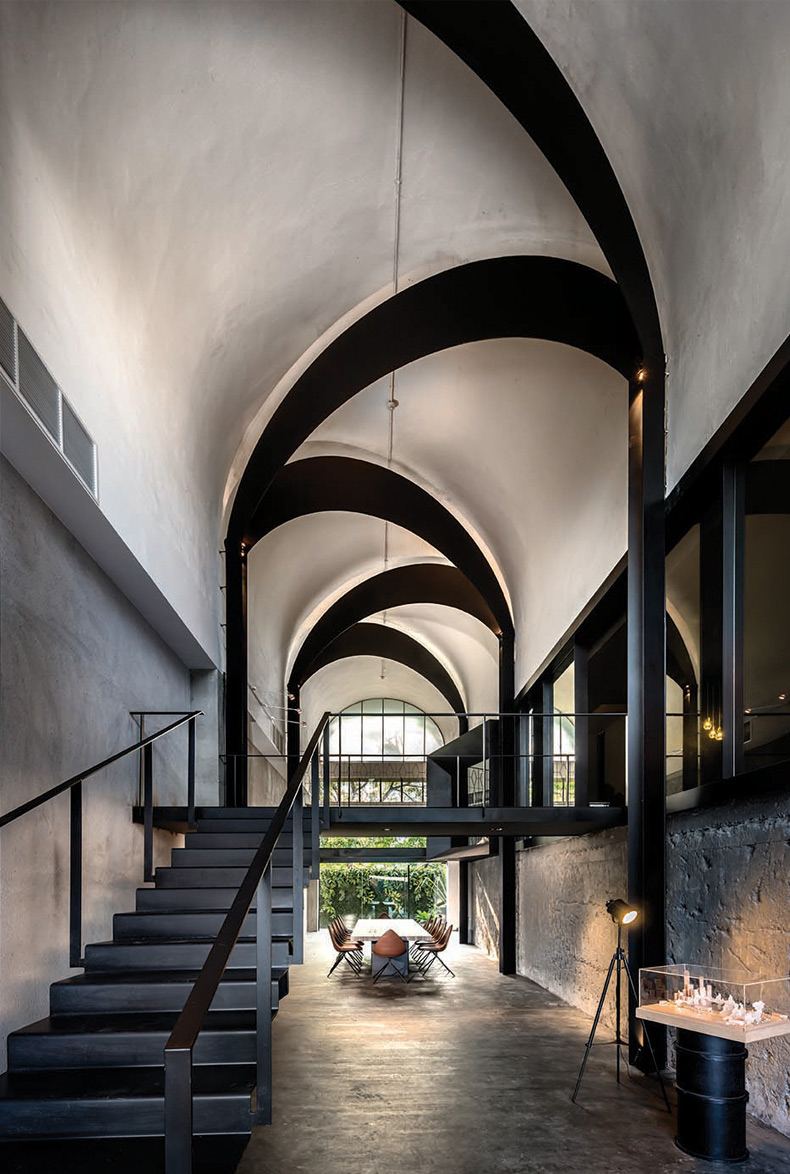
Luckily, the bones of the building were sturdy, beautifully proportioned and imbued with nostalgic architectural niceties, not least a sprawling column-free space crowned by barrel vaults.
Lim Koon Park, the lead architect on the project, says his team’s approach was predicated on a “reaction against the rigidity of the typical office”. This meant discarding conventional notions of an office, in favour of an experiential space that not only embodied Park + Associates’ approach to design, but also served to inspire the staff and visitors.
In that sense, Koon Park says the most challenging aspect of the design was figuring out “how to introduce distinct character and interest into a series of traditional office spaces without making them contrived or gimmicky”.
How does one create spaces that transcend visual interest and function? How should ‘space’ be transformed into a ‘place’ that holds meaning, and creates memory for the user? These questions persisted throughout the design process.
About the Designer
Lim Koon Park says that while we have good designs in all aspects of our lives in Singapore, there are still many more opportunities to push the envelope.
Since the NUS- and Bartlett-trained architect set up Park + Associates in 1999, he has cleaved closely to that mind-set, unveiling one after another, designs that are immaculate, considered, understated. Whether a hotel in Malaysia, a school in Singapore, or a mixed-use development in Cambodia, there are, inevitably, lush layers of textures and visual cues that surprise the visitor.
Much of Park + Associates’ success can be attributed to an abiding respect for the site, in understanding and harnessing not just its inherent strength and character as part of the final design, but also the palimpsest of the site’s genetic origins. In a city that is as aggressively progressive as Singapore, this last element adds an unexpected dimension to the projects.
“The rapid urbanisation of Singapore, which creates a modern but sanitised environment, exaggerates our need to remember the past,” Koon Park says, in explaining the rationale for the sensitivity with which he and his team transformed, but without losing the nostalgic charm, a mid-century school building into his firm’s modern office.
That said, whilst Koon Park is keen to create spaces that define a sense of place, he is also mindful that the design must also be rational.
Here lies the key to understanding Koon Park’s modus operandi. What makes him tick is this: Intrigued as he is by the romantic possibility of each site, every project, first and foremost, serves its uses.
Koon Park is also mindful that understanding the practicalities of good design should extend beyond the closed circle of architects and designers.
“I think that public education on design awareness is important,” he says. “A supportive and appreciative public audience is a big factor in encouraging the growth of local design talent.”
That is why the influence of the President’s Design Award is so important. “It furthers the push for design awareness. Having the endorsement of the highest office lends weight because it’s newsworthy and, hence, reaches a wider audience.”
1ARCHITECT'S OFFICE AT KIM YAM ROAD
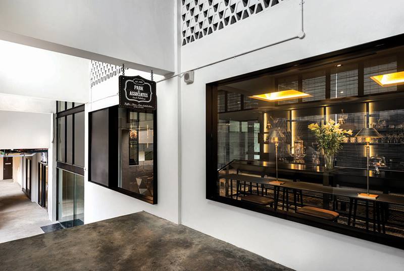
The multi-purpose pantry
(Photo by: Edward Hendricks)2ARCHITECT'S OFFICE AT KIM YAM ROAD
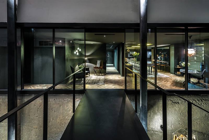
A bridge connects the entrance foyer to the office
(Photo by: Edward Hendricks)3ARCHITECT'S OFFICE AT KIM YAM ROAD
The ‘garden shed’ marks the end of the series of barrel vaults
(Photo by: Edward Hendricks)4ARCHITECT'S OFFICE AT KIM YAM ROAD
The principal work space
(Photo by: Edward Hendricks)5 ARCHITECT'S OFFICE AT KIM YAM ROAD
The principal’s office
(Photo by: Edward Hendricks)6ARCHITECT'S OFFICE AT KIM YAM ROAD
Large windows peek into the office and the common corridor
7ARCHITECT'S OFFICE AT KIM YAM ROAD
The vaulted ceiling in the gallery
(Photo by: Edward Hendricks)Insights from the Recipient
Lim Koon Park: There were two fundamental challenges. The first was working out how to introduce distinct character and interest into a series of traditional office spaces without being contrived and gimmicky. We treated each space as a mini-commission and created a series of experiential journeys, each of which demonstrated our design philosophy. The second challenge involved the introduction of modern necessities of an office into an old structure, while preserving its inherent charm. Our solution organized the exposed mechanical services in a rational and visually neutral way.
Citation
Jury Citation
Nominator Citation
TAN PENG GEOK
DIRECTOR
PARK + ASSOCIATES PTE LTD
The vaulted ceiling, part of an existing structure in a former school built in the 1960s, is emphasised and punctuated with black steel forms. This makes for a remarkable office for architecture firm, Park + Associates. The design also establishes the firm’s signature design expression: specific, refined, elegant.
The visitor is surprised by the unconventional sequence of spaces. One first enters into a chamber where the staff gathers or meets to share a meal – the intent emphasises the focus on community and the Singaporean love of food. In the studio beyond, the barrel-vaulted ceilings with up-lighting deliver a softly lit effect into the heart of the workspace to create a calm and serene setting.
This is an ʻanti-officeʼ where strategic visual cues are placed longitudinally to reveal the full depth of the entrance while criss-crossing black steel arcs accentuate the building’s existing concrete vaulted ceiling. These two gestures emphasise the length and height of the space, and mark one’s arrival with a subtle sense of occasion.
A flight of black razor thin steel staircase leads from the impressive foyer to the social heart of the office on the fifth floor. Here, instead of hiding the conventional pantry area as a ʻback-of-houseʼ space, it is celebrated as a hip café. A series of gold textured ceiling coves floods the space in a golden hue, creating a warm, embracing space. The ceiling is deliberately lowered to create a compressed space. This play of volume punctuates the spatial progression with a pause and helps to focus one’s experience of the barrel vaulted ceiling.
The ensuing space releases into a wide column-free studio framed by several bays of barrel vaulted ceiling. Light flows through both sides of the ceiling’s high glass fenestrations.
The principal work area coincides at this point to take advantage of the light and space. The rational and orderly insertion of furniture and office equipment takes on a neutral but complementary stance so as not to distract from one’s reading of the space. In one corner in this open platform, the director’s office stands quietly. Inspired by the image of a green house, the office is playfully designed as an objet d’art that is clad with plants that frame the fenestrations into the ʻhouseʼ. This green surface provides a visually pleasing backdrop to the adjacent informal discussion space.


