* DESIGN OF
THE YEAR 2010
The design of the Stadium MRT Station was born out of an architectural design competition organised in 2000 by the Singapore Land Transport Authority (LTA) in association with the Singapore Institute of Architects. The competition aimed at design excellence for the Stadium and Bras Basah MRT Stations by focusing on good design and innovation.
Led by Wong Mun Summ and Richard Hassell, architecture firm WOHA emerged the winner of the competition with its proposed designs for both stations. The team acknowledges the LTA’s role both in seeking innovation and in achieving the station’s grand design. “LTA was highly committed to a good design outcome, since they had organised the anonymous design competition. The design competition focused purely on good design and innovation, and did not require a proven track record or that a firm be of a certain size. They took a leap of faith in awarding the contract to us, and provided the technical backup to help us understand the issues with underground stations.”
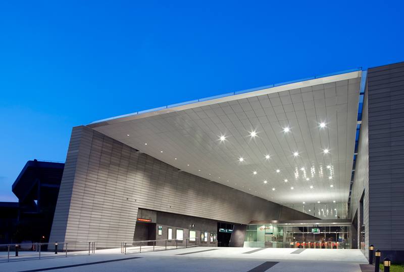
Stadium MRT Station’s design was inspired by European train stations of the nineteenth century, when train stations were grand, inspiring spaces that gave commuters an exciting architectural experience as part of their journey. Says the WOHA team, “These classic train stations are also important urban landmarks. We wanted Stadium MRT Station to achieve this aim, in addition to providing efficient commuter facilities.”
The winning design for the Stadium MRT Station had a “dramatic rebirth”. The design team had originally proposed lifting the existing road, Stadium Boulevard, and making it a bridge, thereby creating a public space that flowed under the road and connected all the surrounding buildings. As WOHA explains, “Once we started work, LTA did a traffic study on our bridge and came back with the conclusion that the road could be removed! This bridge was the central element of our design, and it was gone.”
Forced to return to the drawing board, WOHA started again using the same principles – a public plaza, a very clear diagram, and simple large elements. “We turned the design on its side – instead of the bridge arcing over the ground, we made a curved plane, previously the bridge, and played it off against a straight vertical plane, previously the ground.” While the team had won the competition with a design that was quite different in form, they felt that “the new design was simpler and stronger than the original competition-winning scheme”.
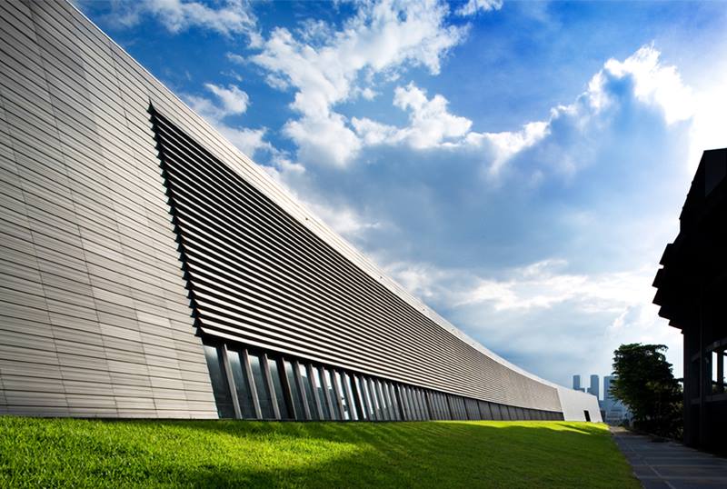
As the station’s location is adjacent to the existing National Stadium, the design team had to address the scale of the large buildings in its vicinity and the need to accommodate surge crowds spilling out from events at the Singapore Indoor Stadium and the National Stadium. To cater to large ground-level crowds, the station was designed with a ground-level open-air concourse and plaza, with plenty of space for crowds to mill around. The resulting form of the station was shaped by both the flow of crowds down into the station, and inflected by the sweeping curves of the stadium. Contrasting a linear element against a curved one, the station was designed as a dramatic silver canyon that is breathtaking in scale.
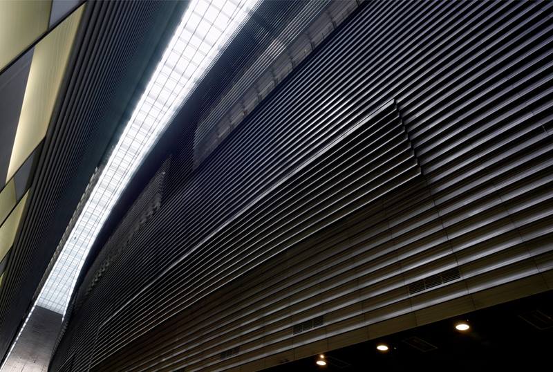
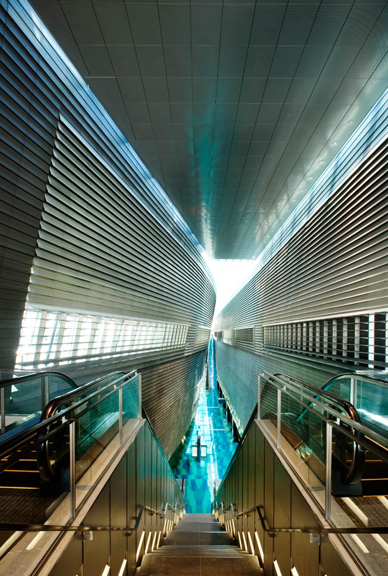
Inside, the architecture is about the tension between the straight side and the curved side, and the way they nearly touch in the centre. A central skylight creates an attractive, day-lit platform. Openings in the aboveground forms allow views down to the platform from the ground-level plaza. The curve of the station, and the grey banding of the cladding are both visual references to the National Stadium, and will serve as a reminder when it is torn down and redeveloped into the upcoming Sports Hub.
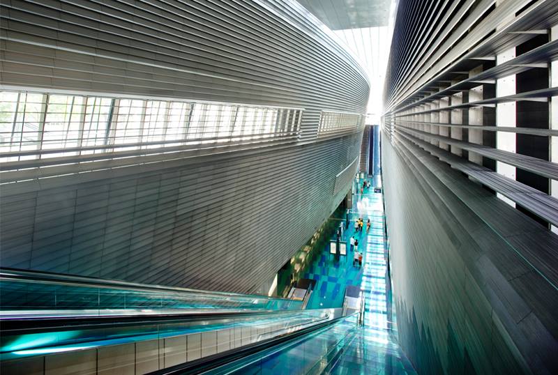
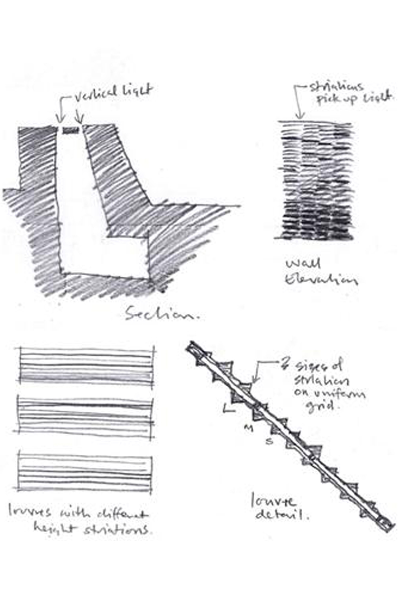
At the platform level, the interior of the station is derived from abstract geological forms, creating a glassy grotto below the opaque striated elements above. Pedestrian movement dramatises perception of the space, as the escalators slide below the curve above, transporting commuters from the concourse at grade to the platform at Basement 2.
Keeping the space at the Stadium MRT Station free of structural elements was challenging as “it was not easy to make it look so clean, light and airy”. To solve this, the ribbed aluminium cladding system was custom designed to create an ambiguous material – sometimes soft like fabric, sometimes hard like stone, sometimes metallic – that changes with the quality of light and the time of day.
Over the course of the project, the design team recalls three turning points: “We had three breakthrough moments: in the original design, where we lifted up the road and suddenly had a great solution to the problem of holding the surge crowds; a second in the revised design, where we realised we could have such a simple clear diagram; and then a third one, where LTA agreed that the impact of the design required a central volume free of any bracing structure, although it would have been simpler from a structural point of view to have beams crossing the space.”
The WOHA team notes that the Stadium MRT Station has garnered very positive feedback, underscoring its own views on the need for good design in public spaces. Says the team, “Stadium MRT Station is a strong architectural space that many people pass through every day. We believe that all public buildings should be of the highest quality, as they are the setting for our daily lives, and so have immense impact on all of us and our quality of life. It is possible to achieve excellence through the right procurement process and by clients understanding the value of design; we wish this were done more often. We hope the very good outcome and positive feedback that the stations have generated will encourage more government projects to be procured with this focus on design.”
READ MOREABOUT THE DESIGNER
WOHA Architects prides itself on not having a signature style; instead, it says,
“We try and find out the driving forces behind the project, and look at how we can satisfy these while at the same time making multiple connections to the context of the project, always with the idea that our intervention should create a greater good for the end-users and larger community.”
Working with these criteria, the team then conceptualises ideas for the kind of architectural strategies that would be appropriate. “We try and refine this into a project language that is abstract and flexible enough to survive the harsh realities of construction, yet which still has the consistency that we recognise as architecture. We develop each project through a set of objectives and strategies that emerge from within the project. What unites our work is the quest to make spaces that delight the end-user and enhance the environment.”
While every project has its challenges, says the team, “Our personal strength is commitment to the final built result – we always aim to be the “last man standing” on any project. No matter what happens. If the result is going to compromise the outcome, we don’t abandon the project or give up, but instead seek a creative solution to transform the unforeseen event into something positive.”
READ MOREDESIGNER
WOHA Architects Pte Ltd Richard Hassell, Founding Director Wong Mun Summ, Founding Director Pearl Chee, Associate Dharmaraj Subramaniam, Ex-Associate
CONTRACTOR
Nishimatsu Construction / Lum Chang Joint Venture
CLIENT
Land Transport Authority
ENGINEER
Meinhardt (Singapore) Pte Ltd
Insights from the Recipient
Advice to Emerging Designers
Innovative design needs three things – well-honed creative skills, intensive knowledge for the area of focus, as well as broad general knowledge to contribute fresh ways of seeing. These all take time to acquire – most studies suggest ten years is the minimum period to become an expert in any domain.
Young designers should consciously work on creative techniques, do intensive research for any design challenge, and read widely on any topic whatsoever that catches their interest. With this toolkit, they will be ready to innovate.
Citation
Jury Citation
The dramatic volume the architects have delivered makes this a landmark station appropriate to the importance of the new stadium facility that it will serve.
This volume is derived from a large curved wall that compresses the deep space through which visitors ascend or descend via escalators that enhance the experience of entering the earth or rising toward the sky.
Cost control has been used as a creative mainspring rather than a tiresome constraint and the limited range of materials has strengthened the integrity of the design.
The key design decision to manage crowds aboveground rather than at lower levels has produced a less costly project that will be far better for passengers, who will get the benefit of what should be a seamless journey from exterior to train.
The artworks incorporated into the project are a welcome announcement of the sporting buildings beyond.
VIEW JURORS
Nominator Citation
MR PATRICK BINGHAM-HALL
PUBLISHER
PESARO PUBLISHING PTE LTD
St Pancras Goes Underground
Under the joint auspices of the Singapore Institute of Architects and the Land Transport Authority, an architectural competition was held in 2000 to select a design for two of the stations on the new Marina Line (now called Circle Line) for Singapore’s MRT network. The other stations for the MRT line were to be procured, so the design processes would be led by “design and build” contractors rather than architects, and the two selected stations were effectively the only two in which architectural ambition would be prioritised. The competition – effectively two competitions, one for each station – was open to local and international practices, and it is worth noting that some very prominent names entered. A young and relatively unknown Singapore partnership was announced as the winner for both stations, which was a most noteworthy achievement.
Ten years later, after various delays incurred during the construction programme, the MRT stations (now known as Bras Basah and Stadium) are finally open to the public, and the relatively unknown architectural practice is now established as the very well known WOHA Architects. Wong Mun Summ and Richard Hassell (the founding partners of WOHA) had entered the MRT competition as they had wanted to move on from commissions for houses, which had comprised their work to date: they had grander plans. The MRT stations were the perfect opportunity for such plans, as the ambition of Wong and Hassell was to emulate the “grand stations” of Europe (a reasonable checklist would include the Gare du Nord and the Gare St Lazare in Paris, Paddington and St Pancras in London, and the main termini in Rome, Milan, Amsterdam, Zurich and St Petersburg). As Wong recalls, “We wanted that kind of quality, the awesome feeling that you experience in such a place.”
The experience of waiting for a train at Stadium MRT Station is unexpectedly “awesome” for contemporary mass transit, especially in an urban context, where grandiose architecture has long been supplanted by the requirement for modular efficiency. As the airport has taken over the railway station’s role as a gateway to a city, Stadium MRT Station – whose architecture could be described as uplifting and sublime, rather than grandiose – represents a new paradigm for public design placed within the functional network of a city. The manipulation of colour, space and light is reminiscent of religious architecture, where the intention (achieved by the use of stained glass and gothic arches) was to raise the spirits and to look to the heavens. Stadium MRT Station is no less surreal, with the architects taking advantage of the sunken location of the platform: passengers look to the heavens from a crystalline space bathed in an azure light. A glass roof, a crescent-shaped slit – through which a sliver of sunlight illuminates the platform level below – runs the length of the station, and the sliver expands and contracts in peristaltic fashion as the sun moves overhead, creating shimmering patterns of light and shade on the massive canted walls above the platform. The station’s plan takes the form of a straight line opposed to a convex line (determined by the adjacency of the National Stadium), and trumpet-like entry vestibules flare out at either end of the sleek yet robust aboveground volume. The northern convex line creates a massive bulge above the platform level as the wall flares outward and downward from the narrow roof, so that the view looking up from the platform is akin to the glimpse of the sky from the base of a canyon. The walls are clad with finely ribbed aluminium panels, and the floor is tiled with greens and blues that engender an overwhelming aquatic ambience, a refreshing release from the tropical heat outside.
The design for this station was extraordinarily ambitious and, as built, it is “bravura” architecture, conceived by highly confident young architects who could see no reason to design anything less than spectacular. The Stadium MRT Station is a brilliantly intuitive piece of architecture – one that sets out to raise the spirits, and one that will defy imitation.
