DESIGN OF THE YEAR 2010
Pinnacle at Duxton
arc studio architecture
CONTACT
[email protected]
arc studio architecture + urbanism is led by Khoo Peng Beng and Belinda Huang. Their design philosophy is founded on the belief that “no matter how complex a problem might be, we will always be able to find another good solution. And we always believe that our designs will improve the world we live in.”
They believe, “it is love that drives our design. Above enthusiasm and imagination, design is love. We are always looking for designs we love. And we design as if it is for our loved ones.”
In their approach to any new design, they always begin by asking questions. “We throw out as many issues to generate as many design parameters as possible. A good design will be an elegant solution that addresses all these issues while shifting the way we look at the problem.”
The team describes the design journey as
“less about the breakthrough moment and more the result of a string of related decisions. It is the willingness to keep looking for the next best step according to a set process for arriving at a solution. It is a process of ongoing research: to learn and to observe the environment we live in.”
RSP Architects Planners and Engineers, Recipient of the President’s Design Award in 2009 for Henderson Waves, is a well-established firm. Its approach to the complex architectural and constructional challenges of The Pinnacle@Duxton was to harness its strength and commitment to achieving excellence in design and delivery, with a client-centred and collaborative approach with the rest of the design and consultant team.
With its experience in implementing large developments and its quality-certified framework of design and implementation processes and procedures, RSP was able to achieve buildability and functionality while adhering to the implementation of the overall building design intent within the time and cost parameters. Says the team, “We are proud to have been part of the team responsible for developing and implementing this unique and outstanding design that bears testimony to the heights of achievement attained by both public housing and architecture in Singapore.”
About the Designer
In 2002, arc studio architecture + urbanism in collaboration with RSP Architects Planners and Engineers, won the international Duxton Plain Public Housing Design Competition, drawing attention from architects around the world. As the jury members selected the winning design purely on its own merits, without knowing the firm involved, the dynamic team of arc studio architecture + urbanism and RSP Architects Planners and Engineers were able to clinch the commission for the prestigious The Pinnacle@Duxton project.
The design brief for The Pinnacle@Duxton was extremely complex. While it was clear that the building would be massive, the architects wanted it to “feel open and to be visually elegant”, with a design that was “efficient and pragmatic while rising above pure pragmatism into the realm of aesthetics. The process of constructing the building should produce a new aesthetic.” They also imagined what it might be like to live at this unprecedented height and density, and felt that the design had to provide new communal spaces for residents. In short, “even though the units were compact, the entire development had to feel spacious.”
The design team started with analysis and research. Said the team, “We observed and looked at everything and asked questions about anything. We visited existing estates and sat below the blocks, trying to speculate what it might be like for the blocks to rise to the proposed height and density. We then created as many solutions as we could and tested some of these solutions with models and drawings until we found one that was able to answer all the requirements while delivering a certain formal lightness and porosity. We applied this process at all scales and levels. We then visualised what the design might be and looked at how the details came together.”
The next step was to analyse the mathematical figures and generate “tens of models and hundreds of sketches”. The team subjected each model to intense discussion and scrutiny in its search for the simplest and most elegant model.
The development was constructed using pre-fabricated concrete building components. The façade uses the seemingly undifferentiated pre-fabrication technology to create a highly differentiated design, one that demonstrates individuality and difference yet is co-ordinated to form a beautiful building envelope. The design team sees the façade as “frozen music, inspired by DNA sequencing and the structure within our chaotic world”.
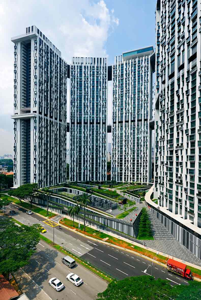
The Pinnacle@Duxton comprises 1,848 apartment units contained within seven extremely efficient tower blocks united by three levels of parks, all spread over 2.5ha of land in the city centre of Singapore.
The building layout creates a large forecourt for the towers while maintaining visual connectivity with the existing Tanjong Pagar Community Club. While optimising views, connection, air and light flow and minimising west-facing exposure to reduce solar heat gain, the layout forms a powerful sculptural skyline that looks different from every direction.
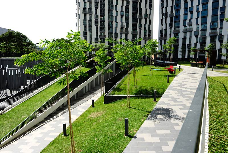
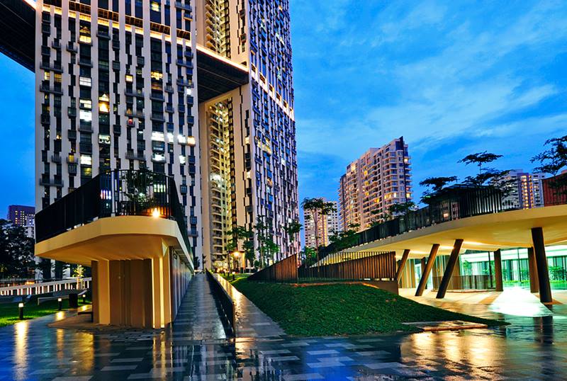
On the ground, a new architectural surface flows over the car park and services, creating a lush environmental deck that connects strategically with the existing urban network while forming a green lung for the city. Multiple pathways, connections and landscape bands were created in the recognition that residents want a fast and convenient way to reach home but might also want the option of a slower, more relaxing path for recreation. This deck becomes an extension of the Duxton Plain Park that is part of an island-wide park connector.
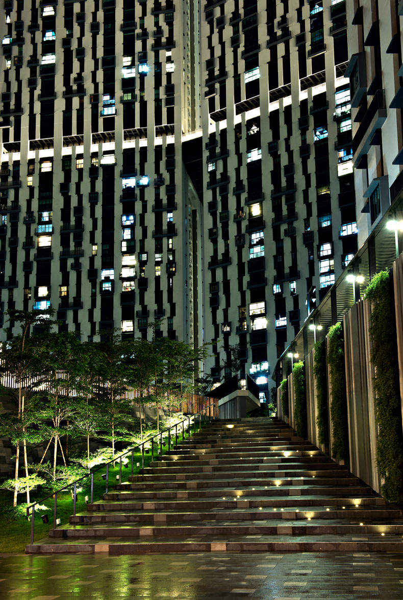
On this new ground, an outdoor gallery poetically uses the concept of a light ruin to capture the historical significance of the site by tracing the outlines of the original two public housing blocks built in the 1960s.
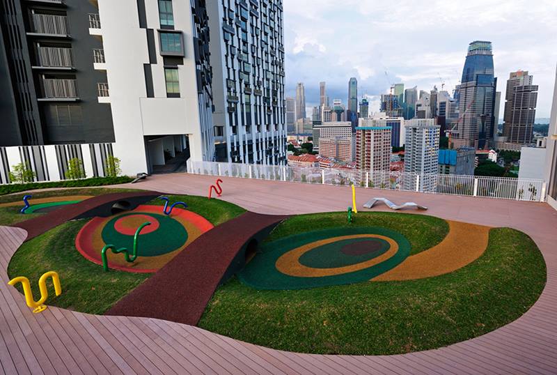
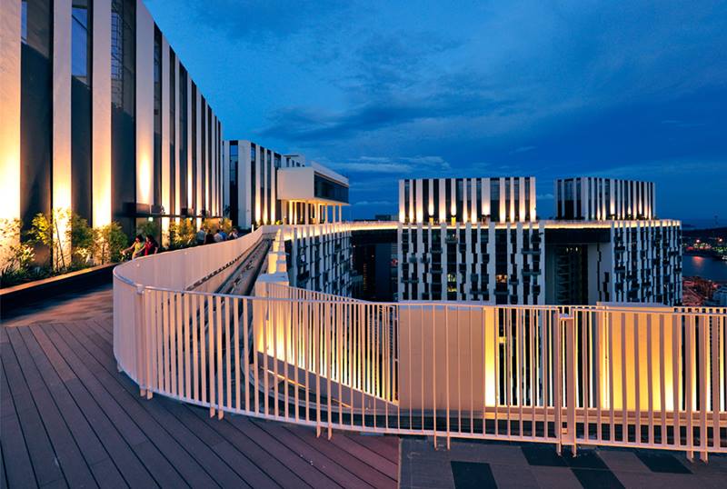
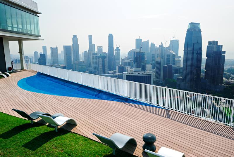
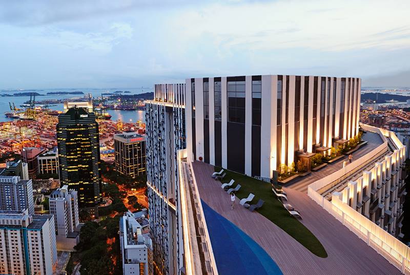
Continuous sky gardens on the 26th and 50th storeys weave through all seven tower blocks, which are placed in an open and porous arrangement to reduce the perception of density. The sky gardens create almost 50% more shared space for residents, providing diverse spaces that become an extension of the living environment for residents. They also function as areas of refuge during fires and allow the sustainable sharing of infrastructure and mechanical services.
The integration of all seven blocks effectively reclaims the ground from car parks and services for the community. By raising it from the road level and seamlessly stitching it to the city, the ground successfully mediates between the private and public realm. Together with the sky gardens, the deck becomes a social dynamo, encouraging interaction and communal activities.
The architects are pleased to note that “the design of The Pinnacle@Duxton stayed pure and was delivered without losing any of the initial design concepts”. While the client “demanded great attention on pragmatism, safety, maintainability and close monitoring of the budget, they were also extremely supportive in the construction and design development, effortlessly collaborating to bring our design from idea to reality.”
As a public housing project, The Pinnacle@Duxton displayed great concern for security, maintainability and cost effectiveness. The project addressed a wide spectrum of social, political, and cultural issues with simplicity and clarity while demonstrating sensitivity to the relationship between high-rise, high-density living and the human scale.
More than this, The Pinnacle@Duxton redefines public housing for Singapore and possibly the world. The project demonstrates that high-rise, high-density housing is liveable and sustainable. It boldly demonstrates a sustainable and liveable environment for urban high-rise, high-density homes, and initiates an innovative typology of public communal spaces that are metaphorically reclaimed from the air.
By addressing both the pragmatic and the metaphysical, the design will be a project many will look at for a long time to come with regards to this typology. The sky gardens successfully create a brand new form of public space. By connecting buildings, The Pinnacle@Duxton paved the way for a new form of urbanism where buildings are no longer isolated monoliths but rather an integrated network working together to form a greater whole.
The Pinnacle@Duxton emphatically shows that high design need not come only with high budgets. Public housing has broken design barriers with this project in terms of attitudes and expectations. It has captured the public’s imagination and is a shining beacon for the new generation of public housing.
DESIGNER
arc studio architecture + urbanism Khoo Peng Beng Belinda Huang Lim Khim Guan Cheng Boon Ping Tan Hooi Ong Debbie Loo
ARCHITECTS
Planners & Engineers Pte Ltd Albert Hong Hin Kay Lee Kut Cheung Nina Loo Iyn Ang Chen Yik Ying Aaron Ong Tan
CLIENT
Housing & Development Board
CIVIL AND STRUCTURAL ENGINEER
Surbana International Consultants Pte Ltd
QUANTITY SURVEYOR
Surbana International Consultants Pte Ltd
LANDSCAPE CONSULTANT
Envirospace Consultants Pte Ltd
PROJECT MANAGER
SIPM Consultants Pte Ltd
MECHANICAL AND ELECTRICAL ENGINEER
Surbana International Consultants Pte Ltd
LIGHTING CONSULTANT
Lighting Planners Associates (S) Pte Ltd
MAIN CONTRACTOR
The key “CIVIL AND STRUCTURAL ENGINEER” is invalid.A key may only contain letters and numbers.
1THE PINNACLE@DUXTON
Singapore, 2009
Lush green landscape.
2THE PINNACLE@DUXTON
Singapore, 2009
Historical Park at night on 3rd storey.
3THE PINNACLE@DUXTON
Singapore, 2009
View of Environmental Deck.
4THE PINNACLE@DUXTON
Singapore, 2009
Seamless connection to ground level.
5THE PINNACLE@DUXTON
Singapore, 2009
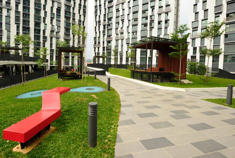
Pavilions and public furniture on 3rd storey.
6THE PINNACLE@DUXTON
Singapore, 2009
Sky Garden at 26th storey – Meadow.
7THE PINNACLE@DUXTON
Singapore, 2009
Sky Garden at 26th storey – Crater.
8THE PINNACLE@DUXTON
Singapore, 2009
Sky Garden at 50th storey.
9THE PINNACLE@DUXTON
Singapore, 2009
Sky Garden at 50th storey – Beach.
10THE PINNACLE@DUXTON
Singapore, 2009
3rd storey ground warps and peels to conceal services and create pockets of community spaces.
11THE PINNACLE@DUXTON
Singapore, 2009
City view from 50th storey.
Insights from the Recipient
Khoo Peng Beng & Belinda Huang: The most challenging aspect of the design was to find a form that is open and porous with a strong urban identity, while addressing the sheer mass of the building. We knew we had to solve all these complex issues with a simple yet elegant solution. The answer was to string together seven relatively simple tower blocks along a curvilinear line and connect them with two levels of bridges. This effectively created a massive building that has a unique silhouette, but which also provides residents with a humanised environment.
Citation
Jury Citation
Nominator Citation
ER YAP TIEM YEW
DIRECTOR
BUILDING AND INFRASTRUCTURE DEPARTMENT
HOUSING AND DEVELOPMENT BOARD
This complex represents an experiment in high-rise, high-density public housing that gives a new dynamic to a familiar residential form. In the process, it provides architecture for a broad public with a new attitude to the use of vertical public space.
The provision of health and well-being amenities on exterior links is combined with an intelligent set of interior plans. These include a sensible division between wet and dry zones, and internal wall arrangements that anticipate potential demolition to provide both flexible and adaptable space.
Façade variations that remove a feeling of institutional conformity are derived from a palette of plan types combined with the economic disposition of low-cost pre-cast elements.
Above all, The Pinnacle@Duxton is a striking addition to the city centre skyline which announces that height, views and amenities can be the province of ordinary families.
This project serves as a reminder of the social value of design.
The Pinnacle@Duxton redefines high-density living. The project is heroic in that it rises from the quagmire of complex issues surrounding this typology to provide an elegant demonstration of new possibilities for this housing typology. The design is both resolutely pragmatic and incredibly beautiful. It is unapologetic about its massiveness and yet is sensitive to its context, even enriching the skyline by its unique silhouette. At the highest order of thinking, The Pinnacle@Duxton challenges one to be creative, to dare to dream and to continue to challenge the improbable.
By observing the unique character of the 2.5ha site, the layout of the seven highly efficient towers housing 1,848 units responds optimally to the context. The layout, in a deceptively simple sweep, addresses intricately entangled issues. From environmental factors like minimising solar exposure and the conservation of existing trees, to urban conditions like preserving the frontage of the existing community centre and connections to the linear park, to aesthetic considerations like the reduction of perceived mass and the maximising of distant views, the layout effortlessly addresses each and every issue. And yet what pushes the design from good to great is that it is not satisfied by the resolution of pragmatic requirements but surges forward into the unknown to imagine a new aesthetic, an aesthetic that is authentic and truthful to the nature of its construction. By cleverly inventing a system of repetition from simple façade panels, the entire building becomes an intricate artwork. The façade demonstrates how modularisation and pre-fabrication can be differentiated, how it can provide diversity and, mostly, how it can be beautiful. During the construction, before the colours were applied and before the entire ensemble could truly be appreciated, the building looked heavy and massive, but upon completion the building was totally transformed into something at once light and mesmerising. It is a testament to the visual power of the façade and the understanding of the aesthetics of massive surfaces. Residents are empowered with the choice of façade elements that suit their desires. They can choose from the basic units to those with bay windows, balconies and planter boxes.
The façade panel itself is an ingenious invention. Designed to be structurally integral for hoisting, it is at once both skin and structure. Columns and beams are integrated with walls, windows, balconies, planters, bay windows and canopies. Even the rainwater downpipe is perfectly concealed in the façade and yet easily accessible. The compact site in the business district means that there is heavy congestion on the ground. By constructing the panels in off-site pre-fabrication plants, high-quality finishes were assured. The site then became a place of assembly. As the panels were assembled, multiple elements were put together at the same time. Almost the entire building, including the household shelter and staircases, were modularised and prefabricated. The structural design is rational, clear and efficient; superbly adapted to prefabrication construction. And by providing a column-free living space within every unit, the units become easily adaptable. The internal lightweight concrete walls may be totally removed for a full open-plan apartment. This allows the unit to adapt over time to the changing needs of each and every homeowner.
The 50-storey tower blocks with the small site coverage might suggest that more ground is available for communal spaces. However with a plot ratio of 9.37, a density that is three times that of the usual public housing projects, the ground becomes a highly contested surface. The car-park becomes the largest programme followed by the electrical sub-stations and refuse centres. These programmes take over the entire site. The design wrestles with this seemingly insoluble situation and the result is an imaginative new architectural ground. The new ground is the environmental deck that wraps over the car-parks and services, creating a new urban hill. The new ground is public and well-connected but raised above the street level. The rise in elevation creates a threshold for a secure and safe space for residents. This ground plane becomes an important mediator of the public and private realm. The design imaginatively used allegorical sand dunes and fluid dynamics to generate paths, planting strips and courtyards. Air and light wells and ventilation gaps are cleverly integrated with the landscape. The landscape becomes the organising surface, providing large and small-scale places for the community. The environmental deck creates beautiful green communal spaces that act as the catalyst for chance encounters that lead to the formation of friendships and community. Children’s playgrounds are intentionally programmed adjacent to the childcare and kindergartens, the food court right next to the Duxton Plain Park, the shops and clinics right next to the bus stop along the pedestrian path. The environmental deck is stitched to the city seamlessly, providing connections and short-cuts and a dynamic ground plane. By transforming the ground into a social dynamo, both receiving and generating social activities for the residents as well as for the city, the design has turned what might have been a congested space of car-parks and services into a meaningful landscape full of potential for social interaction and bonding.
The designers have even traced the imprint of the historic first high-rise public housing built in the 1960s with a series of light reeds. The outdoor gallery called “Traces” is an architectural installation that pays homage to the historical significance of the site. The historical park is complemented by the nutmeg court that houses the trees planted by Minister Mentor Lee Kuan Yew on the original site on two separate occasions. The historical element is relevant as it provides an aesthetic expression of the site that extends the public space beyond not just the physical but also the metaphysical. This will, in the long run, create greater awareness of the impact of history on our development.
While the new ground provides the most significant contribution to the streetscape, the most impressive component of the design is the sky garden. Like all great ideas, it is the unusual combination of two almost incongruent elements – the tower and the bridge. The result here is the creation of almost 2ha of land in the air. Instead of becoming floors for mechanical services, the sky gardens provide a platform for sharing the networking of buildings. Seven sets of water tanks become three, seven sets of façade maintenance units become one. Escape paths multiply. And, best of all, there are brand-new spaces for the community. Like golden threads weaving through the seven blocks, the sky gardens on the 26th and 50th storeys are the highest public spaces anywhere. It is a totally new form of public space. On the more active 26th-storey garden, an 800m jogging and walking path connects a series of pocket gardens. Like Alice in Wonderland, one encounters spaces that are new landscapes. At once play surfaces and lookout points, the ground plane folds and undulates to create interesting new elevations with stunning views of the city. The designers know that the view is the main protagonist here and created every possible device to heighten the drama of height and distance views. An outdoor gym with stationery bicycles and step machines in one pocket, a small climbing net in another, and a climbing rock in yet another. In other sensorial gardens, “craters” are created as unusual displaced landscapes with colourful telephone pipes playfully worming out of the ground. Up on the 50th-storey sky garden, the city fades away along with our stresses and worries – a “beach” beckons, and at last, a short trek to the top of the metaphorical mountain for the most dramatic bridge with pods for star-gazing. The atmosphere up on the sky garden is calm and relaxed. A boulevard, following the shape of the blocks, strings together all the gardens. The vistas and view angles change as one walks along the path. At times one is looking back at the building, at other times at the magnificent city view and towards only open sky. The design is simple yet dramatic. To top it off, the look-out points on either end of the 26th and 50th storey sky gardens marry the breathtaking panoramic views harmoniously with a hint of the indoors by using the finishing touches of pebble-shaped outdoor furniture.
More than just gardens, the simple act of joining the blocks together creates a totally unique and original space for the people. The Pinnacle@Duxton demonstrates that living in the city does not mean congested and crowded spaces. The sky bridges turn the shortcomings of additional service space into a delightful opportunity. In this project, the public spaces are imaginative with the right touch of restraint, always delightful and creative.
The high-rise, high-density building form, as demonstrated by The Pinnacle@Duxton, is inherently the most sustainable building typology due to the intensive sharing of infrastructure. As cities continue to expand at a staggering rate, it will not be land that is the limiting factor. It will be the low performance infrastructure that will make developments unsustainable both in fiscal and environmental terms. The compact urbanism as suggested by this project will point the way towards an environment that is green, connected and complete. With sufficient mass and density to support a local economy and a transit-oriented environment, The Pinnacle@Duxton is opening the door for high-rise, high-density urbanism that is sustainable socially, environmentally and economically.
The design expertly handles the extremely large project by creating spaces that relate to the human scale, always acutely aware that it is at this scale that the project is experienced. With keen attention to detail and a powerful silhouette, The Pinnacle@Duxton is a proud demonstration of the best of public housing. It is well executed and a remarkable addition to the urbanscape. Singapore and the world will look towards The Pinnacle@Duxton> for years to come where liveable high-rise, high-density developments are concerned. The project has paved the way for a sustainable urbanism that is compact, connected and complete. And most of all, it is an astounding display of originality and a solution-based approach to creating a building that is both practical and extremely beautiful.

