DESIGN OF THE YEAR 2008
New Majestic Hotel, Front Lawn
Atelier Dreiseitl Asia Private Ltd
CONTACT
[email protected]
The Front Lawn of the New Majestic Hotel almost did not happen. The hotel management had initially approached the Land Transport Authority (LTA) to carve a thin strip from Bukit Pasoh Road in order to install a landscape that would enhance the frontage of the hotel and benefit the public. It was only after some persuasion that LTA subsequently LTA agreed to the idea.
By hotel standards, the Front Lawn is small. The site had several significant constraints that affected design possibilities. IT was long, narrow and problematic. The agency restrictions were not conducive to horticultural requirements. The National Parks Board specified that provisions should be made for trees within the strip. LTA mandated that there should not be any trees planted in the ground that could interfere with the high-tension electrical cables running beneath the road.
In addition, the design had to take care not to visually impeded vehicular traffic along Bukit Pasoh Road, which meant nothing above eye level. The installation also had to look permanent but had to be easily removable to enable access to below-ground services.
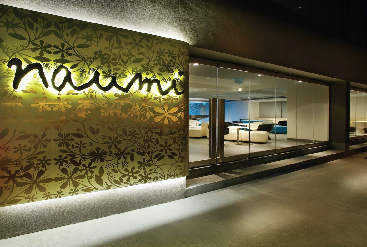
All these restrictions existed for valid reasons but presented a considerable challenge in the search for a creative solution. As Leonard recalls, the most logical and cost-effective answer was to place trees in pots on the site. But how could pots be used without looking like pots? There was also the need to maintain continuity – the interior design of Majestic’s Hotel and Bar is unabashedly contemporary, but its façade remains faithful to the architectural language of the surround period.
The Front Lawn, by virtue of its location, is positioned to mediate between the interior and exterior. The ensuing dialogue that arose from the tension between the contemporary interior and the historical exterior was best expressed through a design that was inclusive and embracing. Leonard therefore deliberately set about crafting a design solution that combined old and new, traditional and contemporary. He eventually found inspiration in the distinctive layering technique found in traditional Chinese landscape art, an idea that had a pleasing resonance given the historical context of the site, which sits in the Chinatown area. The technique was adapted to the site characteristics to address on-site issues.
Leonard began researching various techniques of expression in traditional Chinese landscapes, among these layering, borrowed landscapes, framing and composition. This was followed by quick and simple abstract models to explore the concept. Further 3-D software simulation was constructed to sell the idea to the client. This was followed by a physical model to finalise the landscape composition and sizing. The details were worked out with input from a metal and horticultural specialist.
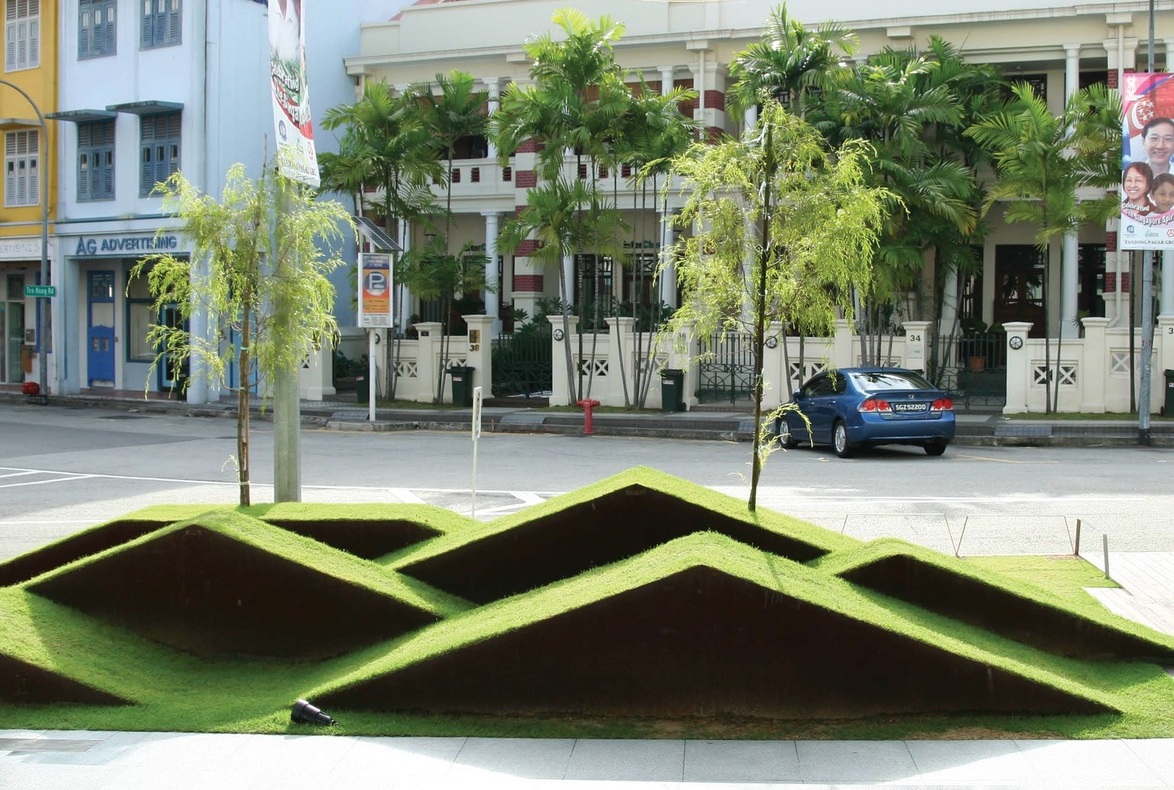
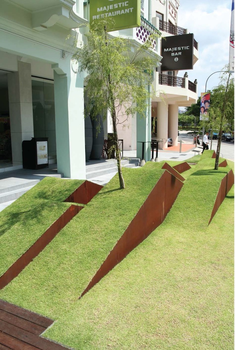
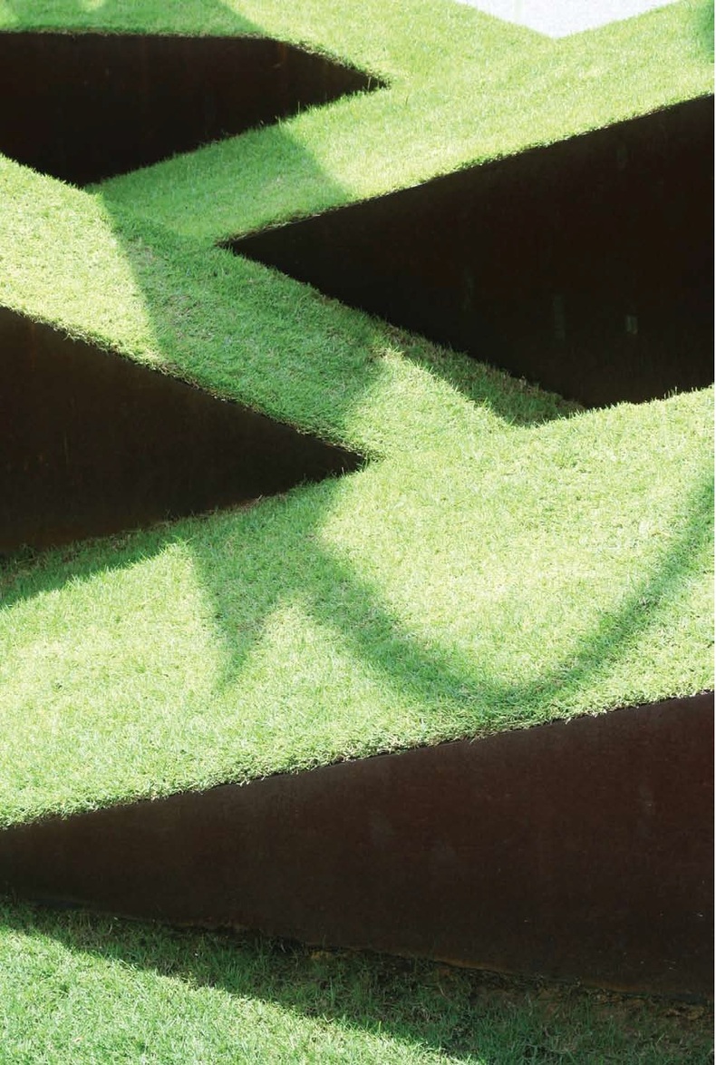
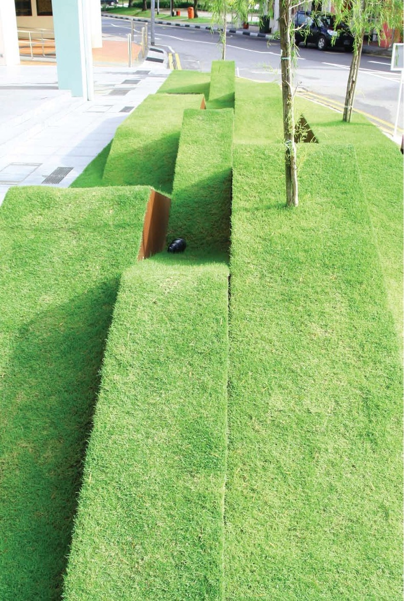
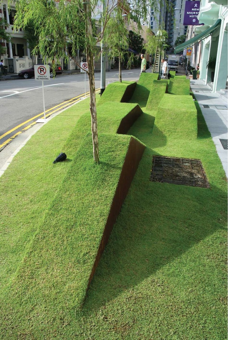
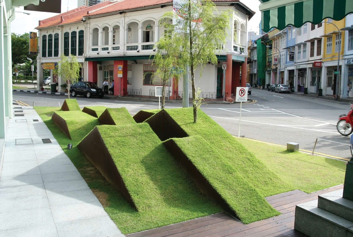
In its final form, the juxtaposition of Corten Steel plates as pots filled with soil and sown with emerald green grass is a contemporary interpretation of the English lawn. These modular pots are then strung together to form grass ribbons. When viewed in profile from within the lobby of the hotel. These ribbons of grass together become an abstraction of the eponymous Chinese layered landscape. These same strips of grass double as landscaped seats in the evening when the neighbouring Majestic Bar opens and the glass partition to the hotel lobby is folded away. The use of Leptospermum brachyandrum (Australian Tea Tree), a miniature look-alike of the Chinese Weeping Willow, completes the illusion that draws the visual focus away from the road.
Leonard’s ability to ‘understand the site and the functional issues, create a design that is unique for the site and express the ideas simply’ led to the creation of a distinctive work that animates and enriches a public space. For his part, Leonard found it ‘a pleasure to work with a client who understands the convergence of art and landscape architecture and who is prepared to explore contemporary design approaches’. Ultimately, however, the most rewarding aspect of the project was ‘seeing users engage with the installation – hotel guests lounging on the grass seats with glass in hand and kids having fun running up and down the grass ribbons’.
About the Designer
DESIGNER
Leonard Ng
Atelier Dreiseitl Asia Pte Ltd
(Now known as Ramboll Studio Dreiseitl)
CONTRACTORS
M S Kong Contracts Service Pte Ltd
Universal Gardens
DESIGNER
Leonard Ng
Atelier Dreiseitl Asia Pte Ltd
(Now known as Ramboll Studio Dreiseitl)
CONTRACTORS
M S Kong Contracts Service Pte Ltd
Universal Gardens
Insights from the Recipient
“Passion, rigour and daring in the approach towards the profession are essential elements for success.”
Citation
Jury Citation
Nominator Citation
Loh Lik Peng
Director
New Majestic Hotel
The Front Lawn of the New Majestic Hotel is a tiny piece of surprising landscape that sits on an odd corner of the land outside the hotel. The hotel’s owner (an art connoisseur) and the hotel management persuaded the National Parks Board to allow them to carve this thin strip from Bukit Pasoh Road so that they could install a landscape that would enhance the frontage of the hotel and benefit the public. The Jury is won over by this eye-catching strip with its clear design strategy for such a small sized project. The design thinking from the hotel lobby to the street is integrated and works to present a holistic design identity. A magnificent intervention into the street, it results in a piece of land sculpture on an ordinary street that invites the public to interact with it. In the evening, the grass doubles up as landscaped seats when the neighbouring Majestic Bar opens for business. The Front Lawn is a contemporary interpretation of Chinese mountain and lake paintings. The Jury thinks it is a bold, imaginative and inventive piece of work that succeeds in conveying a sense of light-hearted urban humour.
The New Majestic Hotel was conceived as a small boutique hotel that caters the traveler with a taste for the unusual. During conceptualization of the frontage, it was realized that it would be interesting and thought-provoking to create a layered landscape that is both visually stimulating and functional, engaging tourists and locals alike.
Much consideration went into striking a balance between the visual, historical and functional aspects while creating the landscape. As Bukit Pasoh Street is located in the heart of Chinatown, the design approach revolved around respecting the historical context. In order to do that, much research went into the various forms of artistic expression the Chinese historically used to map and document their landscapes.
The final design is meant to engender a sense of rhythm and flow, coupled with layers to accentuate a sense of movement in the land. The goal is to express beauty and the essence of the message via an unconventional juxtaposition of materials, colours and textures.
It is a small-scale design that merits consideration because it successfully combines cultural references, functional pragmatism, contemporary aesthetics and multi-functionality to animate and enrich a public space.

