* DESIGN OF
THE YEAR 2008
The Ministry of Design philosophy is a systematic departure from the beaten track. Its raison d’etre is ‘to Question, Disturb and Redefine the spaces and forms that surround us and add meaning to our world’. They seek to ‘uncover the potential inherent in contemporary spaces and forms, then to find relevant and innovative avenues with which to disturb the way these spaces and forms are created, perceived or experienced’.
With each new project, the team draws on the surrounding context and uses this as a starting point from which to transcend reality and transform it into an experience that is surprising yet relevant. The result is ‘real change, not change for the sake of novelty’. MOD declares, ‘Spaces and forms that become redefined through this process capture a “glocal” zeitgeist’; that is, they become ‘distinctly local but with global appeal’.
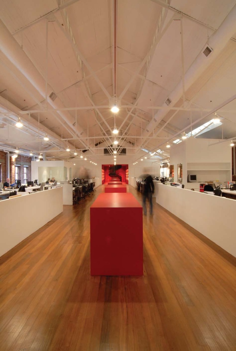
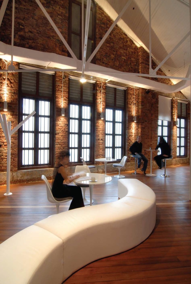
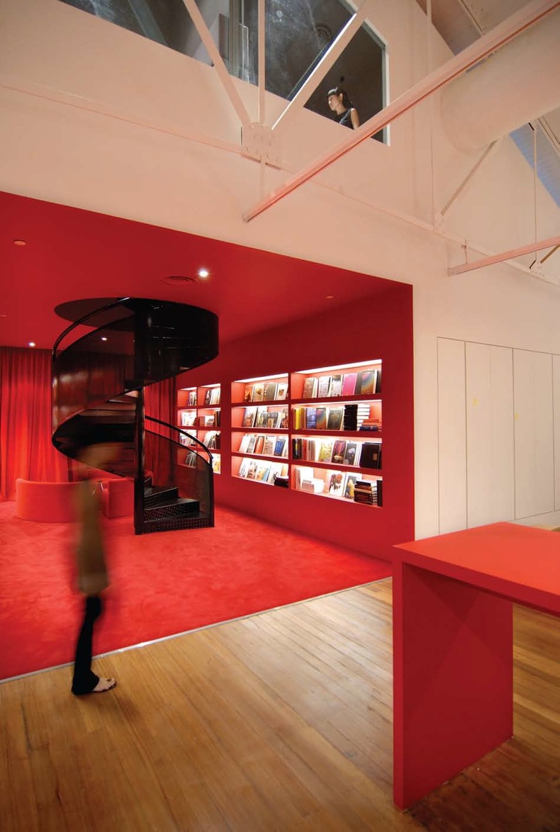
It was precisely this ‘glocal zeitgeist’ that led to an invitation by world-renowned advertising agency BBH to design their Singapore office in a distinctive, pre-war warehouse adjacent to the Singapore River. Inspired by the site’s rich context, the MOD team sought to preserve the historic ensemble of redbrick walls, solid timber floors and an exposed steel truss structural system as a backdrop against which to redefine the modern creative office. The team describes it as ‘historic warehouse space meets cutting-edge global client’.
The Client’s enlightened design brief challenged the conventions of corporate hierarchy, focusing instead on maximizing the creative processes underlining its progressive attitude.
One of the main elements of the brief was the call for a solution to the perennial advertising agency predicament: how to give the copy writers and art directors their own thinking space some of the time, but also to keep them physically integrated with the rest of the team most of the time.
MOD’s solution was a series of ‘dream lofts’ that soar over the main office space and to which creatives could retreat for inspiration. House on two mezzanine lofts, the dream spaces float physically and figuratively over the open office floor, showcasing the creative process and forming the core workspace where ideas are formulated and hot-housed. These havens of creativity are such a hit that even the non-creative staff ask to use the space.
The other key aspect of the brief was the client’s request for ‘openness’. Eschewing the prized corner office, typical warren-like work cubicles and the associated notions of territory and hierarchy, the MOD team conceptualized this further by creating an unfettered seating plan for maximum interaction, with hot-housing areas dotting the landscape. This arrangement brings the office staff together as a community with a variety of shared spaces; six dream lofts, three meeting rooms, two meeting pods, two media rooms and a cool lounge/bar with table soccer, music and drinks.
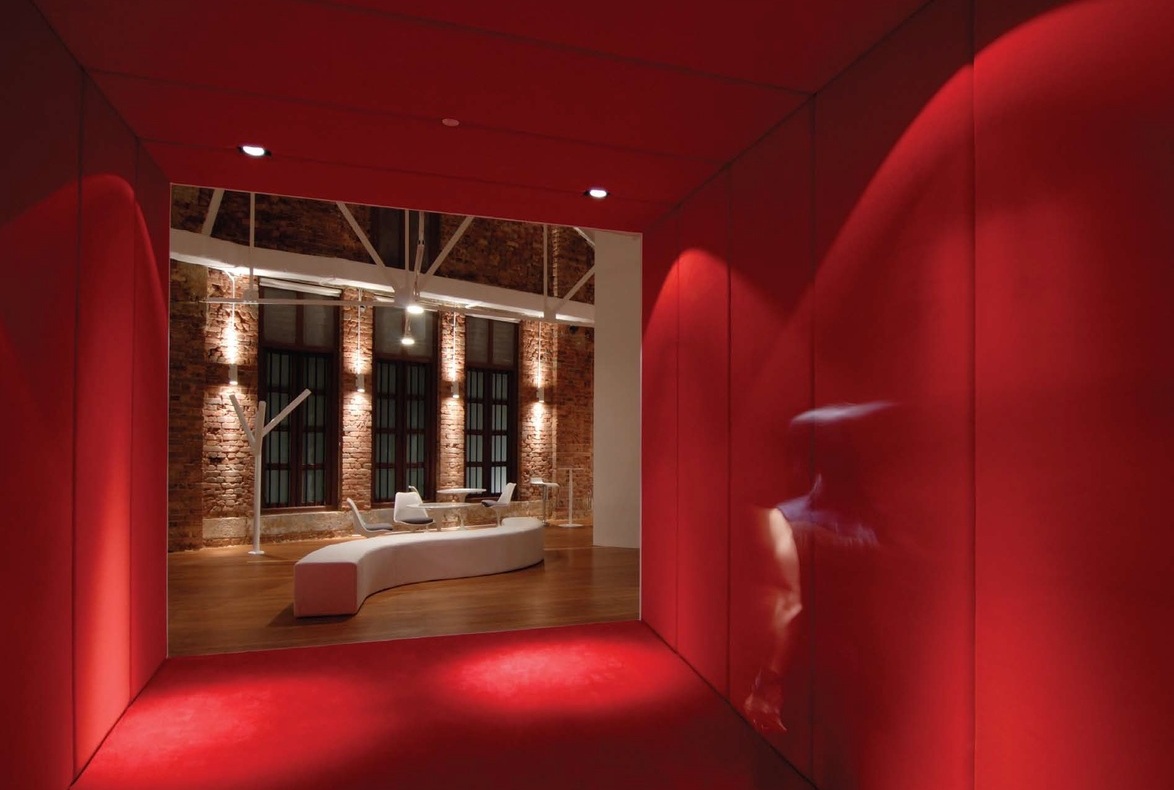
The overall result is a design in which both function and experience-specific spaces are choreographed across a conceptual creative flow that spans two floors and 1,050 square metres of double-height redbrick warehouse space. A bold palette of primary colours is paired with simple but surprising geometries, creating signature experiences and key spaces that link seamlessly.
Private discussions are conducted in free-standing meeting pods that dot the open office floor, while a 40 metre-long sculptural desk cuts a striking axis through this space, linking the entry reception bar on one end with the library lounge on the other.
According to the team, the conceptualization and planning for the project happened fairly quickly. It was the actual construction that took about six weeks, although they acknowledge that this was, in fact, quite a speedy turnaround for such a large space.
Given that the space had formerly functioned as a warehouse, the challenges the MOD team faced were mainly structural, in particular with the mezzanine levels, which were originally in the middle of the main space. The decision was made to move these to the ends of the office to free up more space in the centre, without additional structural columns so that the seating area would feel open.
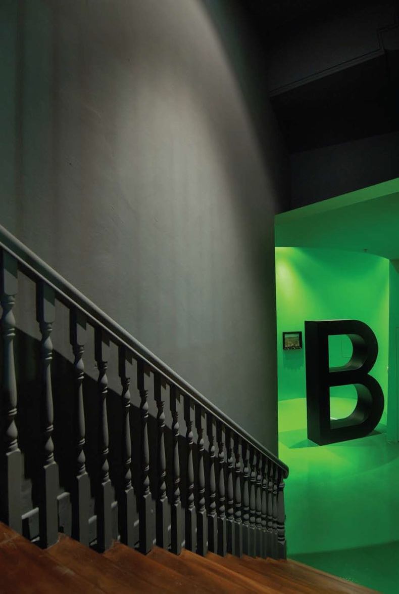
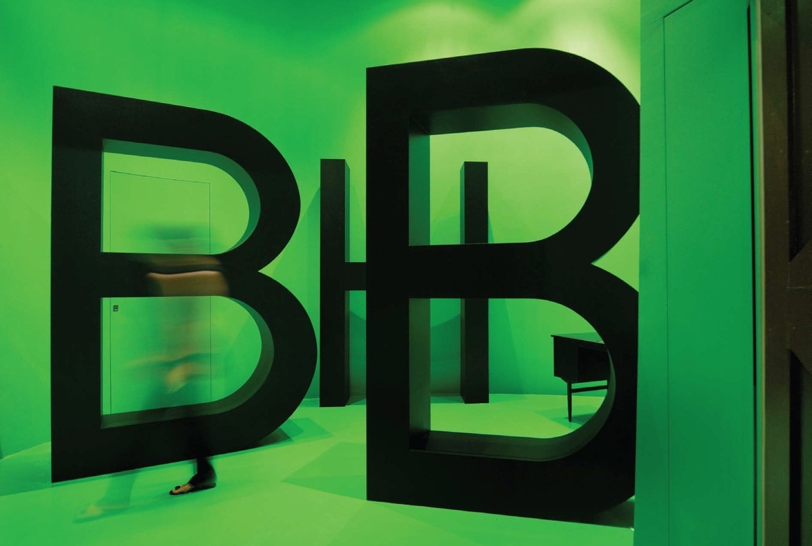
Several features of the project stand out for the team. Among these are the strong conceptual grounding behind the spatial planning, and the floating dream lofts. The large open-seating gallery for up to 100 people makes excellent use of the warehouse space, while the red-hot desk that ‘flows through the centre like a streak of flaming lava’, as one admirer put it, has brilliant visual impact as well as functionality. Most of all, the office entrance, with its green epoxy floors, ceiling and walls, bears the MOD mark of function with fun: ‘We designed it for them to be able to change the colour every season!’
At the end of the day, MOD found the client’s satisfaction with the final product to be the most gratifying aspect of the project, and an indication that they had fulfilled the design brief perfectly. ‘From the managing director to the copywriter and the IT guy – their testimony of being really glad to come to work everyday is a real encouragement.’
READ MORE
ABOUT THE DESIGNER
READ MOREINTERIOR DESIGNERS
Colin Seah
Kevin Leong
Chong Xiaoran
Ministry of Design Pte Ltd
CLIENT
BBH
Insights from the Recipient
Citation
Jury Citation
The BBH office is a huge office that used to be an old warehouse. The most striking thing about the project that has impressed the Jury most is how the designer followed the client’s brief closely and delivered results that exceeded expectations. From the brilliant application of colour to the material used, the space is conducive to effective workflow, and the design is of exceptional quality. Every corner of the office has been thoughtfully considered and exquisitely executed. The designer complements the simplicity and functionality of the space with excellent spatial development in the form of an intriguing modulation of enclosures that function as work and meeting rooms.
The design of the office radiates an aura of being a great place to be in, and a wonderful place to work in. It also projects a light-hearted and relaxed ambience, which is especially important for an advertising agency like BBH. The Jury unanimously agrees that the designer delivered the brief beautifully.
Nominator Citation
John Hadfield
Managing Director
Bartle Bogle Hegarty
World-Class. This was our brief when we looked for a design company to help us move to a new office space in Singapore. We’d commissioned Klein Dytham for our new Tokyo office, and our Sao Paulo, Shanghai, New York and London businesses all had impressive designs.
On first look, it appeared that we had to use a foreign design company, something that we didn’t want to do. But then we met MOD.
Not only did they bring a strong design aesthetic to our new office that is plain for all to see, more importantly, they really got under the surface of our business and process issues and helped us to isolate our ‘functional’ design problem.
An agency is part-bar and part-library, a mixture of social space for team interaction and private space for quality thinking time, which is especially essential for the creatives. But how do you foster a sense of teamwork in an agency when you have to put the creatives in offices? This is the perennial agency conundrum.
MOD’s unique solution was to honour both-having everyone anchored in an open plan, yet also providing unique ‘hot’ spaces in the attics of the office to truly allow thinking in the clouds. A world-class solution to a worldwide problem.
BBH are a world class, world renowned advertising agency with six offices in six of the most important cities of the world. We work with Clients as diverse as Levi’s, Johnnie Walker, Vodafone, Unilever and British Airways.
